Match wits with the Riddler as Edward Nygma presents his personal puzzle box for you to solve.
The Riddler: Puzzle Box by Edward Nygma is made by McFarlane Toys, and as such expectedly looks fantastic. The 5-6 inches a side box has great detailing and largely looks like worn/distressed metal rather than the plastic it’s made of. It’s just plain cool to look at and play around with.
Solving puzzle boxes is often made more enticing by including a prize locked within, and the encased prize here is awesome. Solving each of the three sections is rewarded with a piece of a hefty metal “1:1” batarang replica. They went all out with this aspect of the box.
The website description claims the Riddler Box “features 4 challenging Batman themed puzzles.” To be perfectly blunt, this is not even remotely true. These are some of the easiest puzzles imaginable, made more difficult only by so-so implementation. One puzzle is solvable completely by accident. One I solved without the required tool, leaving me confused as to what that tool was for throughout the experience. One puzzle is a tad misleading on when the player should be trying to solve it, which led me to have the right solution but thinking it was wrong because I had to do something else first.
All that said I had a fun time with the box despite its imperfections. The puzzles are conceptually and thematically good even if easy, and I found it all interesting and engaging despite its flaws.
Which brings us to the puzzling aspect of this puzzle box as a purchase. The detail, inherent nature of making a puzzle box with hidden mechanisms, and high quality prize all add to the cost. But with a msrp of $100, which admittedly is entirely reasonable for what it is in total, people are likely to expect more from the actual puzzle box itself.
Now this has been out a while and at it’s currently available price (under $40) it’s *easily* worth it for Batman and/or puzzle box collectors. But to be completely fair with the review I’m not sure I’d have been as happy with it at full retail price.
Overall this is a great collectible containing an equally great collectible as a bonus prize, with an ok puzzle experience attached. Score one for Edward Nigma.
Thanks to everyone who’s given this a read. 2024 was a sporadic return for this blog and I hope to have more regular updates going forward in 2025. Derailments of Thought currently updates on Wednesday and Saturday.
If you enjoy the blog any support is appreciated, including shares on social media and simply continuing to read. If you happened to be inclined and able to help out monetarily please see my Ko-fi page. Every little bit helps.
Perhaps the best comic book hero one could ask for is one who isn’t bound by the rules of the very comics he inhabits. Such a hero might truly be invincible…
MiSTER iNViNCiBLE: Local Hero collects Mister Invincible #1: Justice and Fresh Vegetables and Mister Invincible #2: Local Hero as originally published.
Pascal Jousselin’s everyday adventures of an extremely unusual superhero takes a creative core idea and runs with it to great effect.
Mister Invincible’s powers are simple in concept: he alone is aware he’s in a comic and can transcend the framework everyone else is trapped in. He can see and act into other panels, across pages, and so on.
It’s Jousselin’s incredible use of the premise that makes the comic shine. From Mr. Invincible helping himself fight in other panels, to explaining to confused police that he needs to wait for the page to turn before he can solve their current problem, to many other endearingly absurd page breaking situations everything is fascinating and amusing at the same time. There are times when things get surreal, but it’s captivating to unravel what’s happening more than confusing.
The true genius of it all is how Mr. Invincible uses his powers as a part of his everyday life just as often as he does for fighting crime. The mundane uses are just as interesting, such as a great page where he uses a paper airplane traveling up the page to “remind” himself to add something to his grocery list before he’s told to get it.
I can’t speak to the original French version, but the translation seems quite good. Everything flows well and sounds natural and I’m pretty confident I’m getting as close to the full experience as a translation can provide.
Mr. Invincible is light and fun while also being mind-bendingly clever. It’s as enjoyable for an adult reader as it would be for the publisher’s noted middle grade target demographic (with an older reader perhaps more likely to catch more of the genre bending subtleties). Highly recommended.
Thanks to everyone who’s given this a read. 2024 was a sporadic return for this blog and I hope to have more regular updates going forward in 2025.
If you enjoy the blog any support is appreciated, including shares on social media and simply continuing to read. If you happened to be inclined and able to help out monetarily please see my Ko-fi page. Every little bit helps.
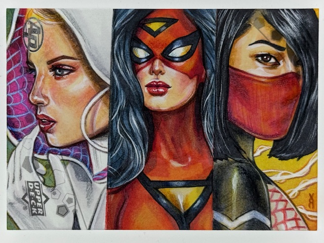
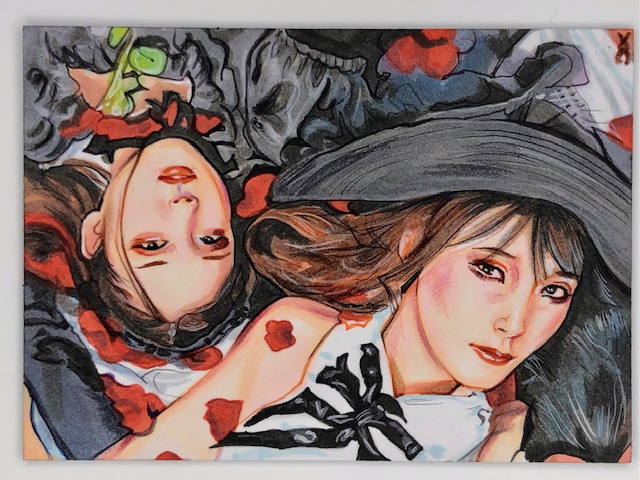
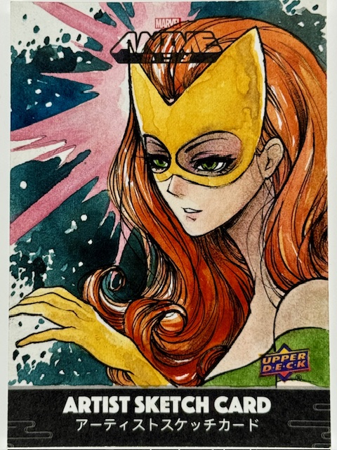
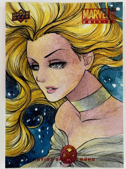
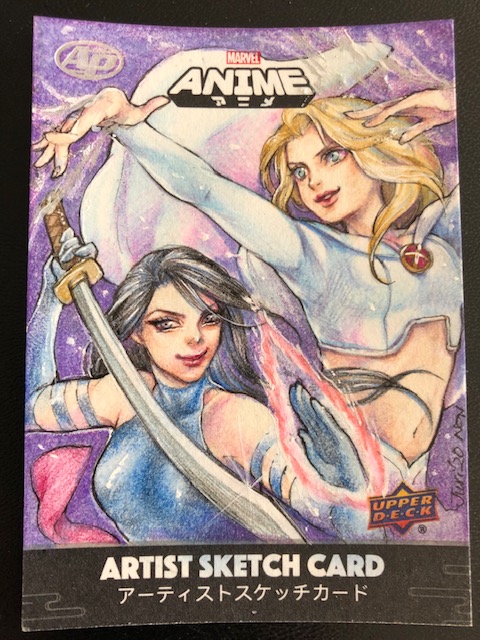
I’ve had a surprisingly difficult time finding the proper words to open this look at the work of a truly special artist. There’s something indescribable that jumps out of Veronica O’Connell’s art and demands attention. So I decided to let the stunning depiction of Psylocke above make the first impression.
Ghost Spider, Spider-Woman, & Silk AP by Veronica O’Connell
I honestly don’t recall when I first saw Veronica’s work, but I do remember being blown away with her versions of Marvel characters and immediately putting her art on my collection list.
There is an incredible balance of realism and the fantastic in her illustrations. Her takes on comic characters simultaneously look like they could step right off into the real world while still feeling appropriately larger than life.
The qualities that initially caught my eye are on full display in the above gorgeous Spider-Women triptych, which is mind boggling. All the art I’ll be showing in this blog is directly drawn on blank trading cards. So each of the three characters shown above (Spider-Gwen, Spider-Woman, and Silk) is drawn on a third of a 3.5″ x 2.5″ work area. The detail and impact she’s able to achieve under such conditions is phenomenal.
There is so much style infused into Veronica’s work. Her use of color and lighting is exquisite and a big part of what makes her art so eye catching. It also underlies her emphasis of mood and atmosphere, making the same subjects feel different in different pieces depending on what she’s chosen to convey while retaining their core essence.
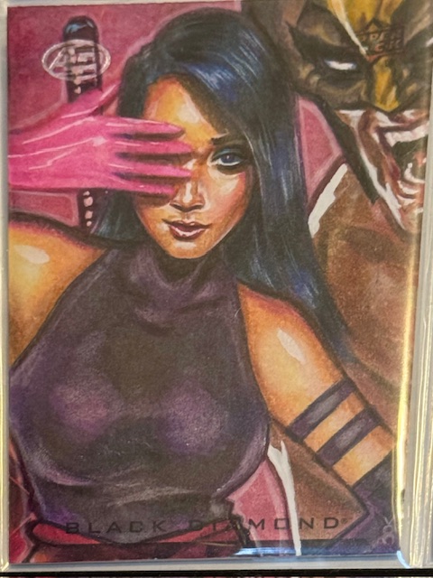
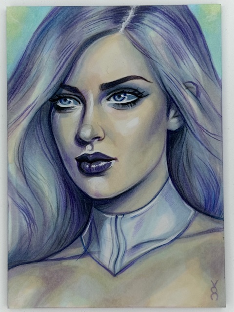
I have multiple cards by her of some of my favorite comic heroines, including Psylocke, Emma Frost, and Spider-Gwen, and the contrast between equally captivating depictions of the same character is fascinating to see.
Spider-Gwen PSC by Veronica O’Connell
My discovery of Veronica’s art through her Marvel work eventually led to the great opportunity to get some Personal Sketch Cards (PSCs) done as part of another key subset of my card collection.
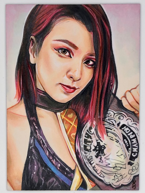
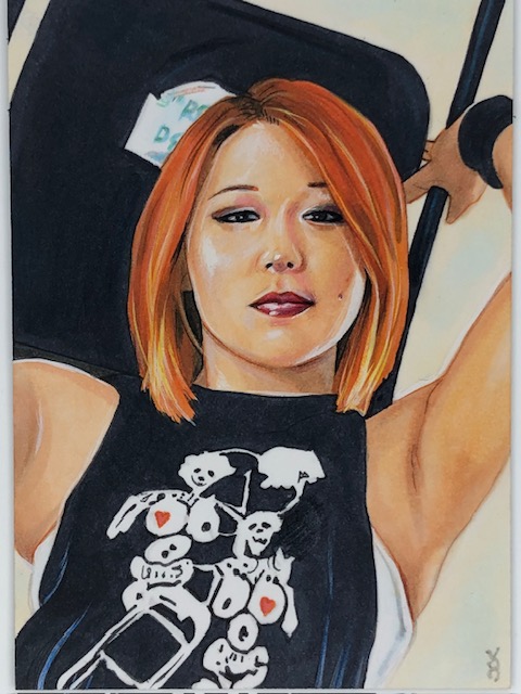
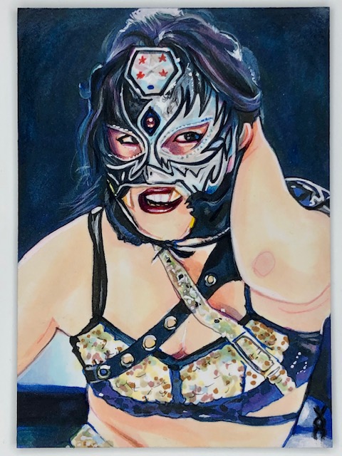
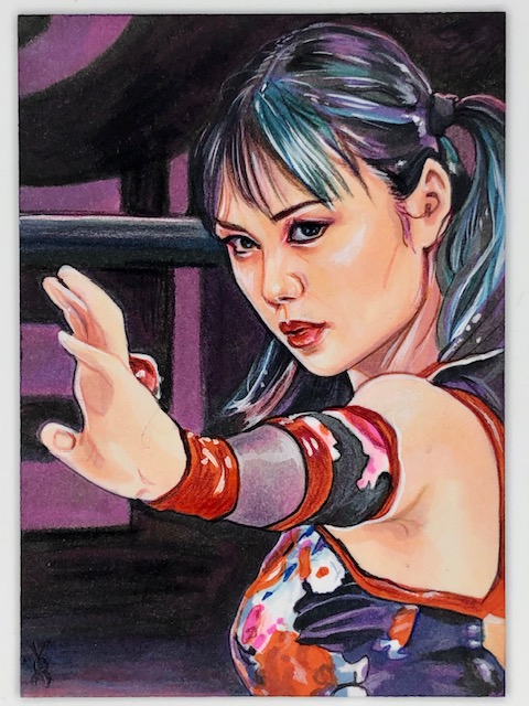
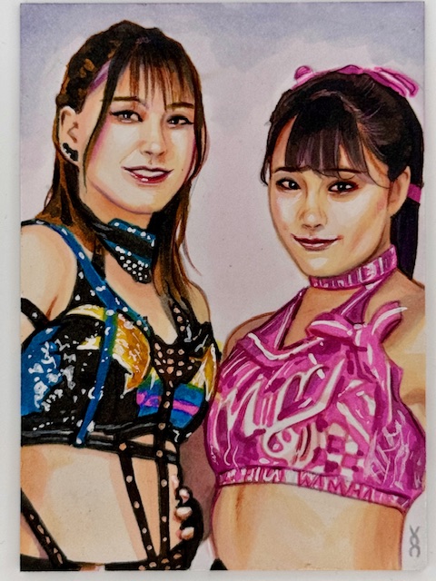
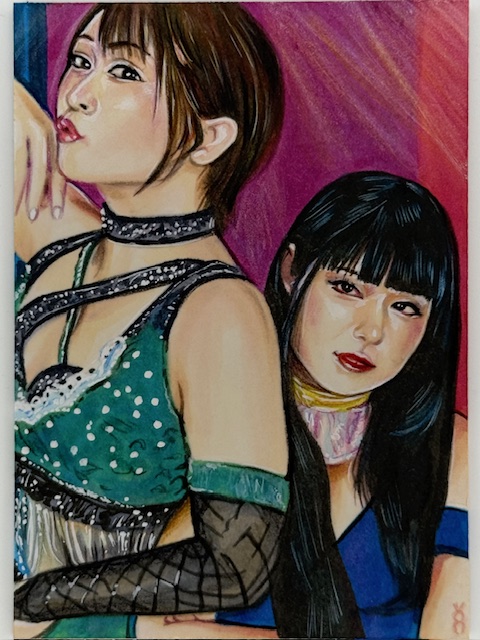
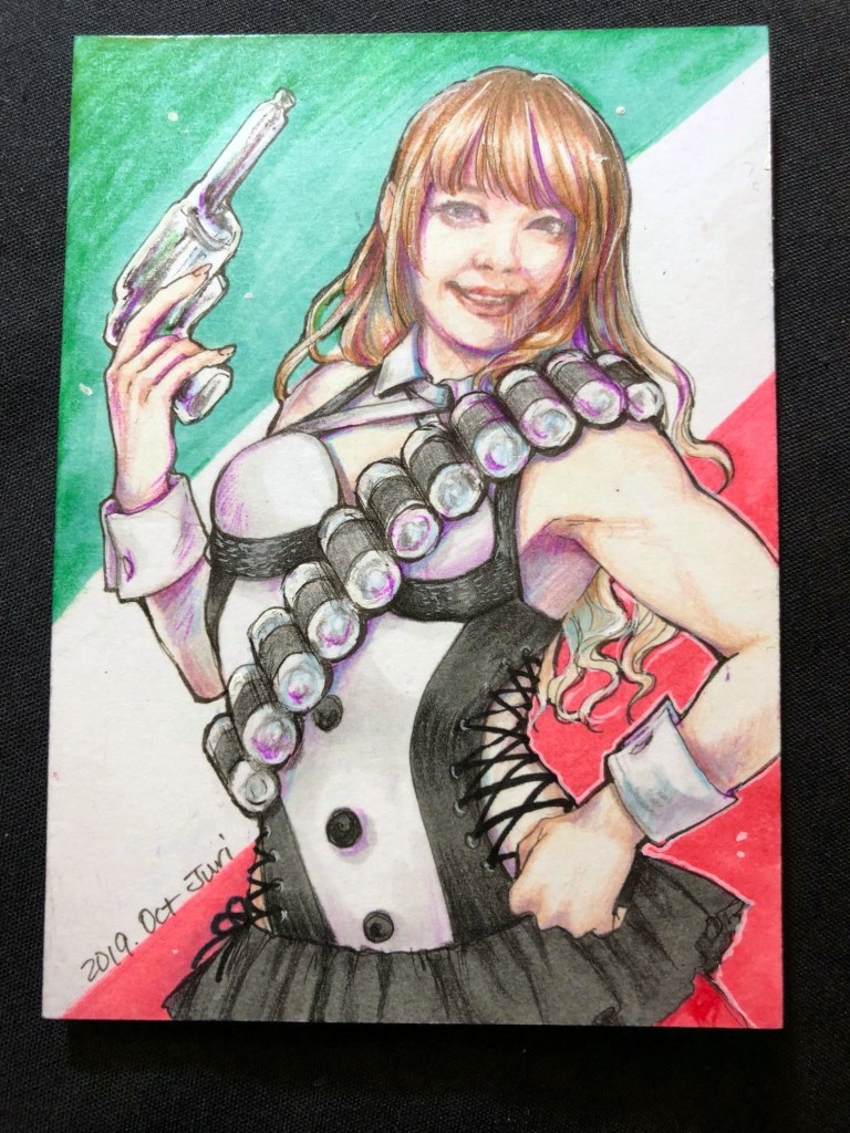
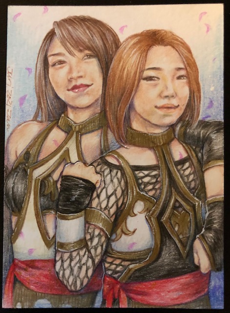
I have followed and enjoyed Japanese women’s professional wrestling (joshi wrestling) for over a decade and collect related art in a number of forms. Veronica is the third artist to create PSCs for this collection, along with Juri H. Chinchilla and Miki Okazaki
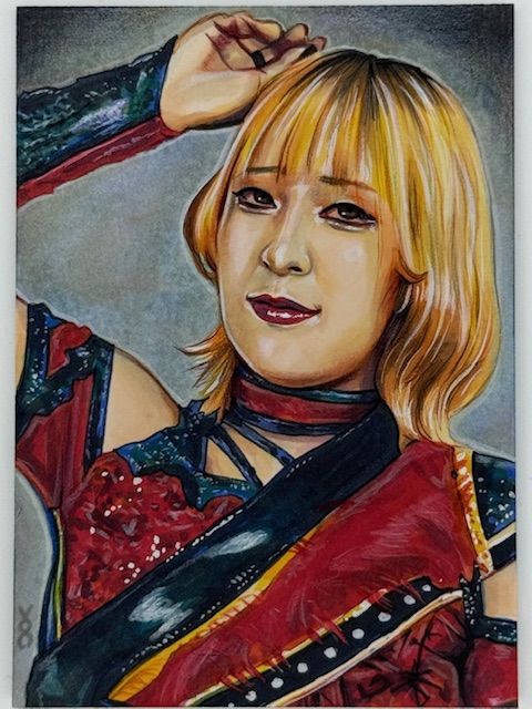
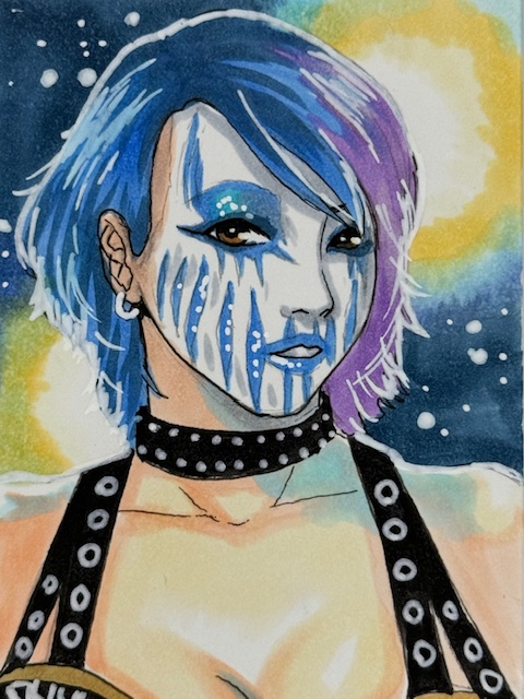
Kairi Sane PSC by Veronica O’Connell
Veronica’s renditions of the wrestlers she’s drawn for me are absolutely stunning. She achieves an amazing level of detail, capturing the subtleties of her subjects expressions and doing an exceptional job representing their intricate wrestling gear.
Perhaps most impressive is her ability to create such incredible likenesses on such small workspaces. From a distance these precise works could be mistaken for photographs, while up close the aspects that make the depictions hyper realistic elevate them even further.
Over time I’ve gotten 24 wrestling PSCs from Veronica, featuring a total of 30 wrestlers. Only 8 of those wrestlers had been drawn for me before on PSCs by other artists, meaning 22 of the wrestlers she drew for me were first time subjects for my sketch card collection.
All of the repeats were drawn in different gear and/or with different partners than the other cards I have, and it was a treat to get Veronica’s take on recurring collection subjects like WWE’s Asuka, AEW’s Riho and Hikaru Shida, and Sendai Girl’s DASH Chisako. Likewise awesome was adding in wrestlers I’d been meaning to have drawn like Asuka’s tag partner Kairi Sane and Stardom’s Starlight Kid.
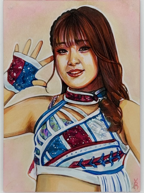
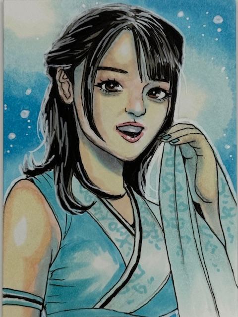
Juria Nagano PSC by Veronica O’Connell
The vast majority of the wrestlers I had drawn for the first time were a large number of roster members and regular guests from two of my favorite promotions.
From Tokyo Joshi Pro Wrestling (TJPW), Veronica did wonderful cards of now former roster members Juria Nagano and Sakisama (with Mei Saint-Michel), tag teams Miyu Yamashita & Maki Itoh (121000000) and Himawari & Wakana Uehara, long time roster members Mizuki and Yuki Kamifuku (Kamiyu), and the Up Up Girls Hikari Noa, Miu Watanabe, Raku, & Shino Suzuki.
Veronica’s encapsulation of that Up Up Girls lineup is a particularly nice memento for me given the recent departure of my favorite member, Hikari Noa, from both TJPW and the Up Up Girls.
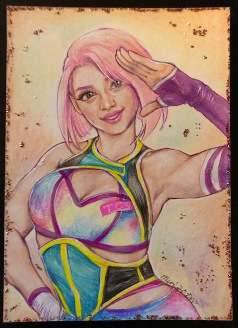
The other big focus among the joshi wrestling cards Veronica’s done for me is a company called Ice Ribbon. One of my most watched promotions, it was a privilege to get Veronica to do related cards for me.
The core IR lineup I got includes brief former roster member Amu Yumesaki, and current roster members featuring second generation wrestler Ibuki Hoshi and impressive newer wrestlers like Tsukina Umino, Mifu Ashida, and Kaho Matsushita.
I was also happy to add former IR regular guests Ram Kaicho (from Triple Six), Saori Anou (now of Stardom), and Tae Honma & Maika Ozaki (SPiCEAP, both freelance), and reigning ICE Cross Infinity Champion YuuRI (from GanPro) to the collection.
As with the comic art, Veronica’s vivd colors, stunning lighting and shading, and delicate touches make all of her wrestler illustrations simply gorgeous. I could not be happier with how they all turned out.
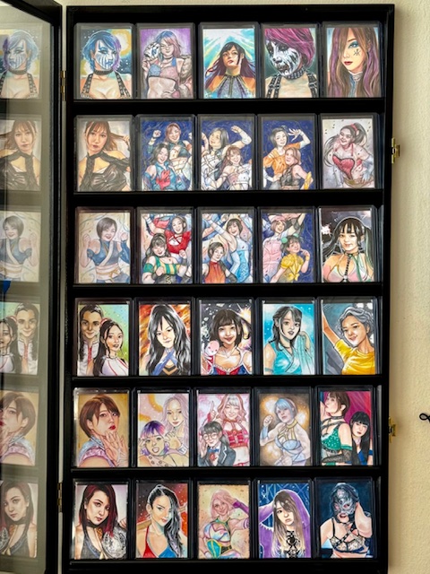
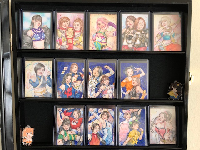
Joshi PSC displays. Art by Veronica O’Connell, Juri Chinchilla, and Miki Okazaki.
I’m extremely thankful to Veronica for all the fantastic art she’s created for me. I hope to continue collecting more in the future.
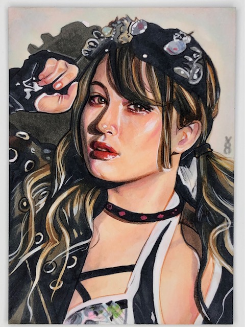
Asahi PSC by Veronica O’Connell
To wrap up I’d like to talk about a particularly special card Veronica’s done for me, although there is unfortunately tragic news attached to it. Early this year Actwres girl’Z reported a 21 year old member of their roster named Asahi had unexpectedly passed away. Asahi started her career in Ice Ribbon and was a personal favorite of mine. Nicknamed the Sunrise of Hope, she was always a joy to watch and is greatly missed. Veronica’s remembrance piece of Asahi is absolutely breathtaking and a cherished keepsake.
Sketch cards are unique pieces of art impressively created on extremely small workspaces. The Marvel comics related subset of these collectibles features a wide variety of styles from a great number of artists, and one of the very best is the phenomenal Lydi Li.
Lydi’s been a longtime favorite artist of mine. There’s something about her work that jumps out and leaves a lasting impression. Her cards are incredibly popular in general and are often prized possessions for those able to get them.
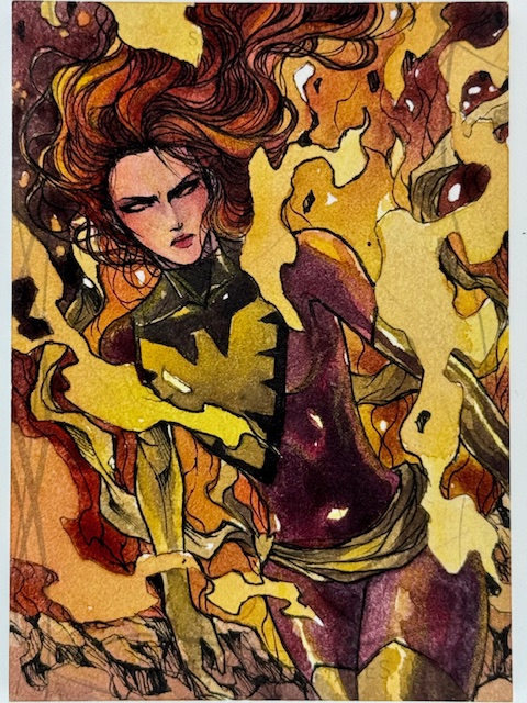
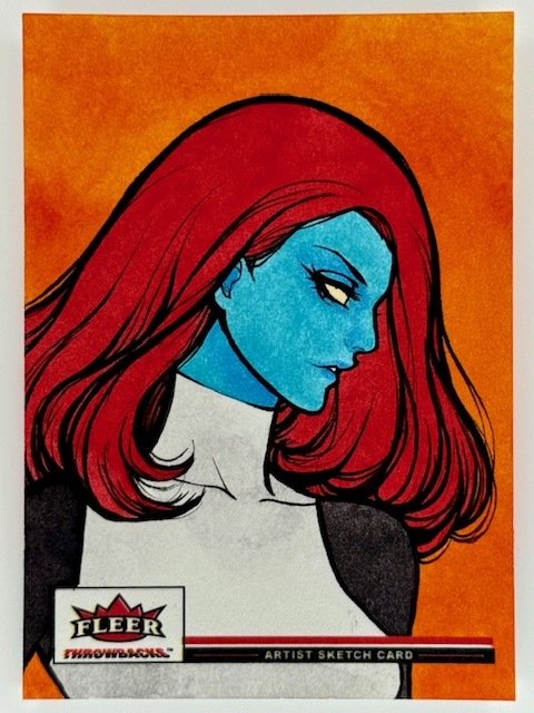
The subtle variety in her art of the same subject over multiple sets is a delight. Differing little touches depending on the theme and mood to be expressed make each masterpiece unique. The bold, saturated coloring on her Mystique from Throwbacks is stunning and perfect for the set.
In contrast her portrayal of the same character for Black Diamond features more muted tones. It’s almost reminiscent of Juri Chinchilla’s work (another absolute favorite of mine). It’s striking in a different way. Both cards are incredible, made even further captivating by their differences.
In general Lydi’s style is a wonderful balance of softness with vibrance. It’s eye catching and immediately recognizable, conveying the essence of the chosen character in a distinct way.
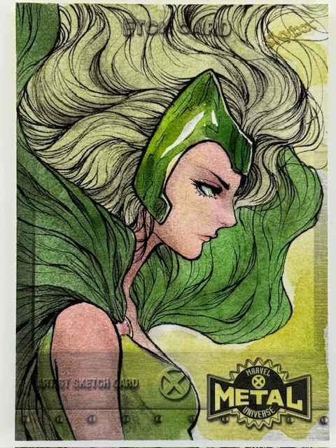
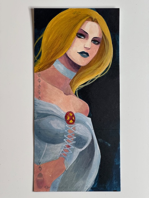
From great depictions of fun secondary characters like Armor to a vivd four card puzzle of powerhouses Scarlet Witch and Rogue every piece I have of hers demands immediate attention. A couple of recently acquired particularly cherished additions to the collection include a gorgeous triple panel of the White Queen Emma Frost and a jaw dropping Thanos framed by his beloved Mistress Death.
There’s a delicate touch to Lydi’s art that makes it evocative, with a sense of atmosphere and emotion simmering just below the surface. Her versatility makes seeing her cards side by side as fascinating as they are beautiful.
I’m extremely lucky to have so many of Lydi’s cards, and greatly appreciate the beauty and depth they add to my collection.
More information about Lydi’s wonderful art can be found on her instagram.
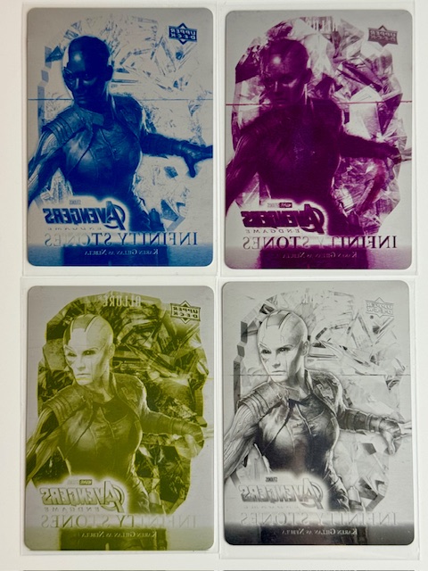
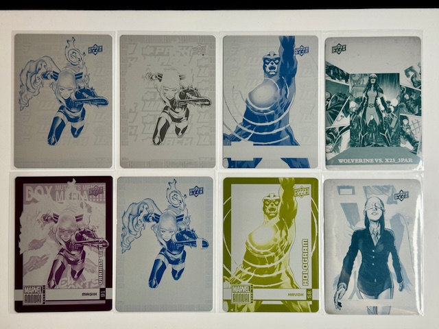
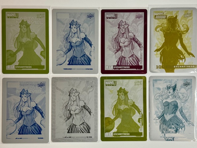
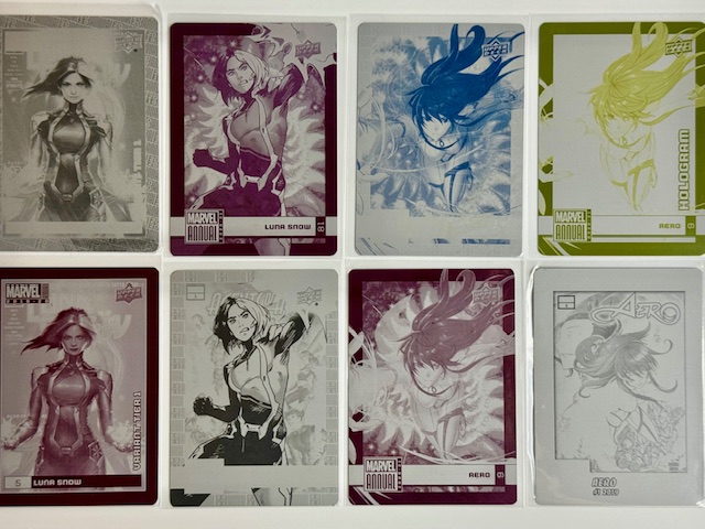
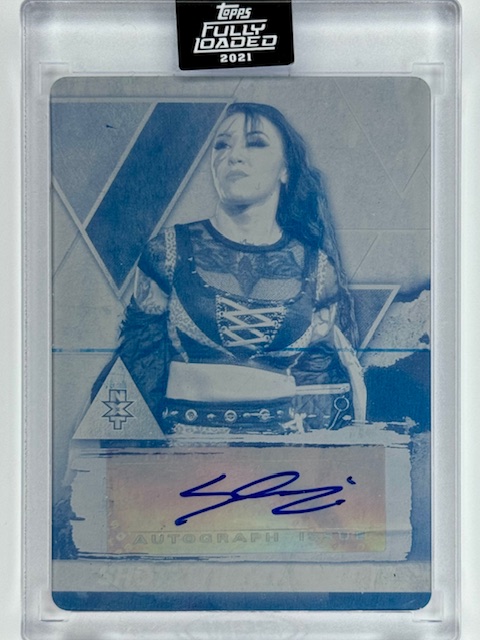
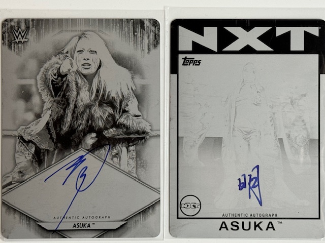
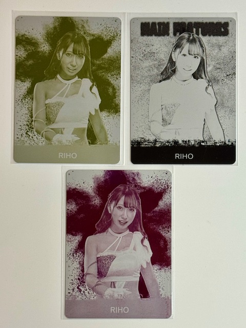
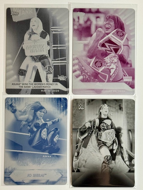
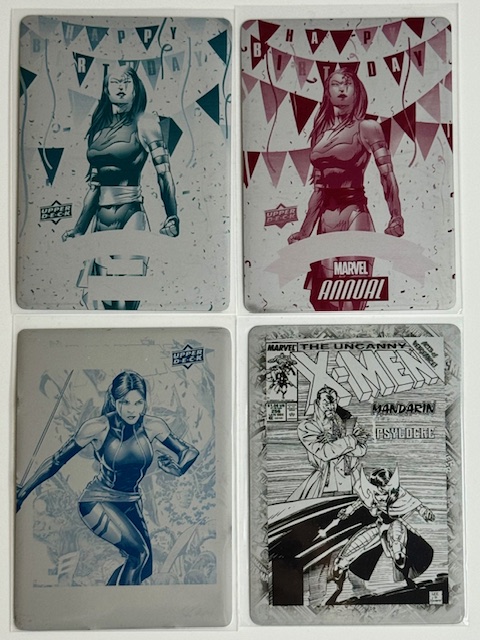
Today I’d like to talk about one of the most unusual and unique trading card related collectibles: the printing plates used to generate the images on the cards.
Printing plates are thin metal sheets used in the printing process of the card they represent. Generally there are four plates for a card corresponding to four basic component colors: black, cyan, magenta and yellow. When distributed plates usually have a sticker affixed to the back with publisher, set, card, and copyright information.
Different colored variants of a card won’t have different plates (changing ink saturation levels produces these versions) but variants with different background patterns, text or logos, etc will. Whether these other versions, or any plates at all, are distributed depends on the manufacturer, set, and distribution method.
Printing plates are extremely unique as a collectible. While many of them are still in great shape, given their nature they are also often imperfect as they may contain smudges, printing lines, blurred images, scratches, or other after effects of the printing process. How much these imperfections affect someone’s desire to collect a particular plate generally depends on the extent and of course personal preferences.
Also certain ink colors may have been practically unused in creating an image and that corresponding plate could be largely blank or an otherwise incomplete image. While rare, this phenomenon is a risk and particularly pops up comic and other art based cards (as opposed to photo based cards, where underlying colors are generally present across the image).
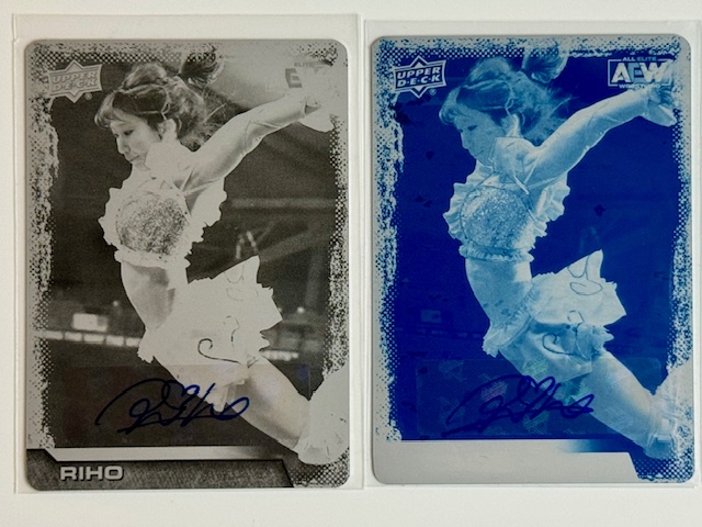
In certain circumstances printing plates may also be distributed with autographs. Actors or athletes depicted, or creators or voice actors of shown characters, sometimes have their autographs on the front of the plates. Usually it’s done via affixing a signed sticker, but direct signatures aren’t unheard of. This is an added layer of collectability and reward for the person who draws the plate.
Peni Paker collection
In addition to printing plates being randomly inserted into packs of their card sets, they are also commonly used as special distribution prizes. Upper Deck often has certain plates set aside to be used as rewards for completing collection goals in their online buying and trading platform ePack.
Sometimes plates used for these purposes are grouped together as sets, occasionally even being collected in connecting booklets. This can be convenient for completionists, as trying to collect all four color plates for a particular card when the plates are separately randomly inserted is a daunting task.
Metal Universe X-men printing plate booklets in custom display cases by Hardball34.
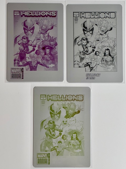
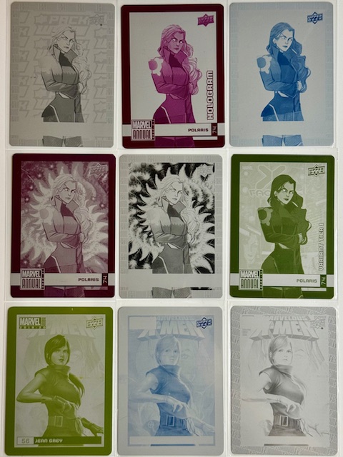
My personal affinity for collecting plates evolved from getting several wonderful booklet collections from the Metal Universe X-men set, as well as drawing some for my favorite characters from Marvel Annual sets and my favorite wrestlers from WWE and AEW sets.
From there I started more proactively chasing/trading for/buying plates and they’ve become a cornerstone of my collections all around. I adore the way the underlying color images look, and there’s just something cool about having a piece of the process.
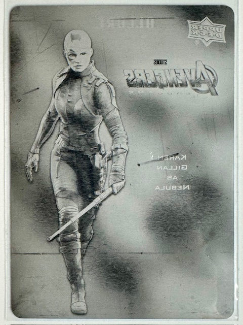
The lion’s share of my plates are Marvel related from Upper Deck (UD), featuring a dazzling array of comic book characters and MCU actors.
However I also heavily collect joshi wrestling cards, and plates of certain wrestlers from UD’s AEW sets as well as Topps WWE sets form an additional, smaller centerpiece of my collection.
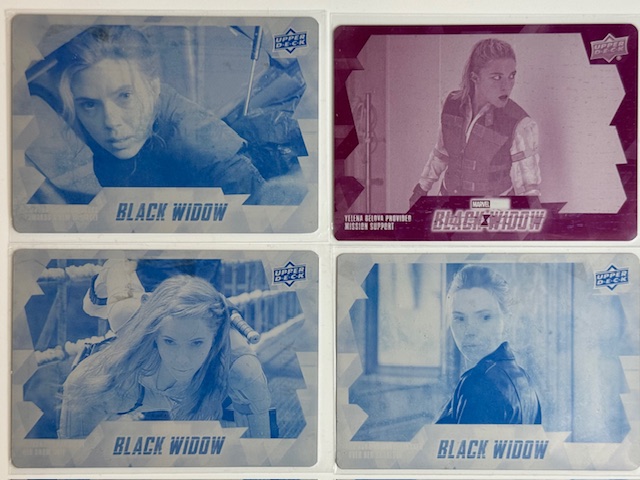
AEW’s Riho, Hikaru Shia, Nyla Rose, and William Regal and WWE’s Asuka and Iyo Sky.Riho plate displayed with AEW 1/1s in a custom frame by Dion Divens.
Chasing plate “rainbows” (a complete color collection of plates for a given card) is a case by case basis for me. For certain images, characters, and wrestlers I collect everything of theirs I can find. In other cases a particular color plate for a particular card jumps out at me and I’m happy just to have that.
Occasionally a plate I’d otherwise want to keep just doesn’t look great to me in that color and/or with its particular imperfections. And of course as with any card related collectible rarity, availability, popularity with other collectors, and luck all greatly influence what actually ends up in the collection.
These little pieces of metal have become some of my favorite collectibles. I love monochrome art in the first place, and the fact that these are essentially art and photos broken down into that format appeals to me greatly. I’m sure I’ll be expanding their numbers for a long time to come.
I hope everyone’s enjoyed the look at my collection of these unusual inserts. Best of luck with wherever your personal collecting tendencies take you.
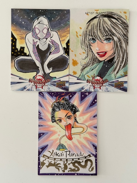
It’s always exciting for me to discover new artists whose work jumps out and appeals to my personal artistic preferences. Today I’d like to highlight the striking art of Miki Okazaki.
Ghost Spider and Gwen Stacy sketch cards from Upper Deck’s Into the Spider-Verse set, and a recently pulled Rokurokubi sketch card from Iconic Creations’ Yokai Parade set. All by Miki Okazaki.
The first time I saw any of Miki’s art was on sketch cards for Upper Deck’s Into the Spider-Verse card set. It made an immediate impression and had an air of whimsy, and when I followed her on Instagram and found out she was open for commission at the time I jumped at the chance to add more of her work to my collection.
Among the various subjects I collect art of, two of the biggest are joshi pro-wrestlers and Marvel’s Mystique mid-transformation. In my first batch of commissions from Miki I was able to add wonderful pieces to both collections.
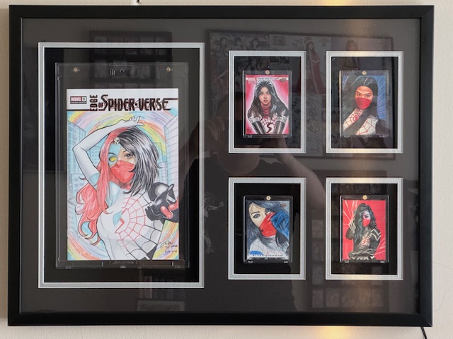
For the incredible Mystique as Silk sketch cover she did for me I specified only the subject. The composition and other specifics were left up to Miki, and she knocked it out of the park with a great dynamic pose and overall awesome general feel.
Miki’s Mystique/Silk cover on display with Silk sketch cards by Effix, Fred Ian, Marcia Dye, and Ash Gonzales in a custom light up frame by Dion Divens.
It’s a great example of her general style with coloring that really pops and a bunch of cool small details, like the exact way things are split between Mystique and Silk around the face and hair, that enhance the overall effect.
I am a huge fan of Japanese women’s professional wrestling, and have an extensive collection of personal sketch cards (PSCs) I’ve commissioned of many of my favorites, including quite a number from Juri H. Chinchilla (whose art I’ve discussed extensively in Beautiful Dreams, Beautiful Dreams 2,Beautiful Dreams 3, and Beautiful Dreams 4).
I was thrilled that Miki was open to doing some of these for me, and my first requests were a combination of wrestlers I’d planned on having done for quite a while in Ice Ribbon’s Kyuri & Maika Ozaki, AEW’s Hikaru Shida, and Marvelous’ Mio Momono & Maria, a perennial favorite in WWE’s Asuka, and even a brilliant up and coming rookie in Gatoh Move’s Miya Yotsuba.
She did an outstanding job with the unfamiliar subjects, and this became just the first of several batches of joshi PSCs I would get from her over the course of 2023. The joshi cards really illustrate Miki’s ability to apply her personal style to her art while still really capturing the essence of the subject.
The next batch included Yappy & Banny from Ice Ribbon, Momo Watanabe from Stardom, Emi Sakura and Best Bros (Mei Suruga & Balliyan Akki) from Gatoh Move, and TJPW’s announcer Sayuri Namba. These are all excellent and the coloring and highlighting really stand out in this group. The backgrounds are masterfully vibrant in a complementary way that doesn’t overwhelm the wonderful depictions of the wrestlers.
Finally around the end of the year I had cards done of TJPW’s Free Wi-Fi (Hikari Noa & Nao Kakuta), and Daisy Monkey (Suzume & Arisu Endo), another up and coming Gatoh Move rookie Nonoka Seto, WWE’s reigning Women’s Champion Iyo Sky (formerly Io Shirai), Stardom’s Yuna Mizumori (formerly of Gatoh Move), and freelancer Momoka Hanazono.
The detail on these is particularly fantastic, and it’s was really cool to see how Miki’s style evolved over such a short period. I know I’m repeating myself to the point of sounding like a broken record, but once again the coloring is impeccable and perfectly spotlights the subjects.
The Nonoka Seto card is particularly special from a few reasons, from the awesome way Miki captured her pointed finger pose in shadow even though the arm is out of frame to the fact that it’s a companion piece to the card Miki did for me of her sister, fellow Gatoh Move wrestler Miya Yotsuba.
I greatly appreciate all the art Miki has created for me and I hope to continue collecting her work in the future.
More information about Miki’s wonderful art can be found on her socialmedia pages.
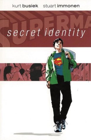
“A story that takes the concept of the secret identity and uses it as a metaphor for our own inner selves, the part of us that most of the world doesn’t get to see, that we share with few others across a lifetime.” – Kurt Busiek’s own description from the forward.
(Note: This was written and shared on Goodreads when I first read the comic in 2013. My opinions stand on reread and am sharing it here for the first time)
Superman was never a character that really called out to me. For “normal” superhero adventures a neigh-invulnerable man never interested me much. But the potential for more was always there, and when creators really embrace the problems someone with super powers WOULD have I find the results are quite spectacular. One such story was For All Seasons, in which Loeb and Sale examine the insecurities a normal farm boy would face when he grew up to be more than normal. For years it was easily my favorite Superman story…
Until Busiek and Immonen produced a tale of a Clark Kent that READ those stories along with me. SI’s Clark is a boy in the real world, who’s been taunted all his life due to his parents’ unfortunate sense of humor and the decision to name him after Superman. His concerns are school, bullies and the girl he likes. Then the unthinkable happens, and Clark finds his both choices and troubles multiplied a hundredfold.
The greatest fiction gives readers something to relate to. Suspension of disbelief becomes easier if the reader cares about what’s happening. Secret Identity, in line with Busiek’s lofty goal from the above quote, shares the journey of a man with extraordinary powers, but worries and problems common to us all. It’s remarkable how genuine and real it all feels given it stars a boy who can fly. We know how Clark feels. We’ve been there in some way. The shared emotion pulls us in and makes us really care about what happens to Clark.
Stuart Immonen’s art is an incredibly vital piece of this accomplishment. The subdued color palette and softer character designs enhance the desired atmosphere of Clark’s world being our own, and the intricacies of Busiek’s nuanced layers to the story would be lost without Immonen’s excellent facial expressions and detail work to convey tone and meaning.
Secret Identity is one of the most resonant comic stories I’ve ever read, and instantly one of my favorites.
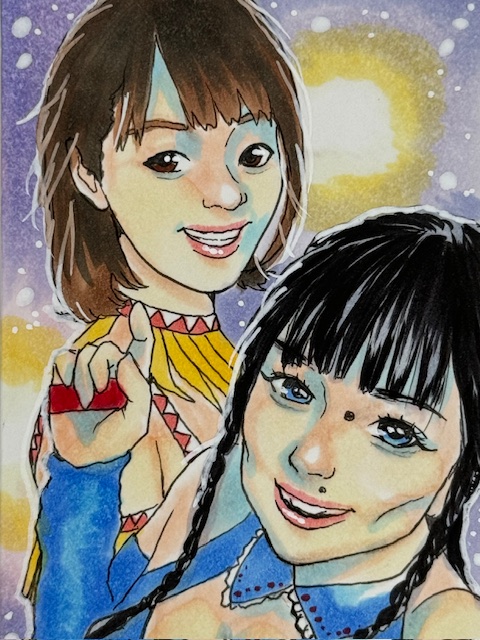
It’s been almost two years (wow 2020 threw off my sense of time) since my last spotlight on the work of my favorite artist, and I’d like to share and talk about more of her incredible work and some of the inspirations behind the pieces. See Beautiful Dreams, Beautiful Dreams 2, and Beautiful Dream 3 for more about Juri H. Chinchilla’s art, including past pieces I’ll be mentioning in this write up.
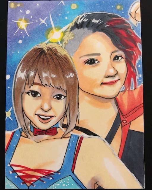
Jenny Rose and Sareee PSC by Juri H. Chinchilla.Tequila Saya PSC by Juri H. Chinchilla.
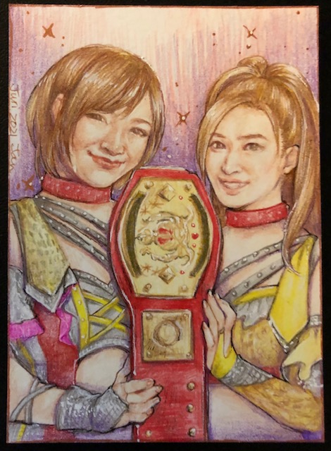
Juri’s Personal Sketch Cards (PSCs) have been a great opportunity to request particular subjects and design elements. One of the more unique requests I’ve made was a card featuring one of my favorite professional wrestlers, and I adored it so much that I’ve followed up with several more since. Juri’s done an AMAZING job depicting these previously unfamiliar to her subjects and these are in many ways the pride of my entire art collection. See Another Wonderful Way Pro-Wrestling is Art 3for more about the above works featuring Jenny Rose & Sareee and retired Ice Ribbon wrestler Tequila Saya.
Gatoh Move 6-PSC puzzle by Juri H. Chinchilla.
Gatoh Move is one of my favorite wrestling companies, and it’s so wonderful to see the roster represented in absolutely stunning form on the above six card PSC puzzle by Juri. The top row of cards feature Sayaka Obihiro & Mitsuru Konno, Emi Sakura & Riho, and Chie Koishikawa & Tokiko Kirihara. The bottom row has Yuna Mizumori & Mei Suruga, Sayuri & Sayaka, and Lulu Pencil & Rin Rin.
The timing on these cards ended up being suitable in many ways. They were completed shortly after Sakura’s 25th Anniversary in wrestling and shortly before a personal favorite of mine, and the wrestler I’ve requested Juri draw the most, Mitsuru Konno retired.
Riho is Gatoh Move’s former ace, and shortly after she left to go freelance the company the core roster doubled in size with the debut of six rookies (Chie, Tokiko, Sayuri, Sayaka, Lulu, & Rin Rin). I love the encapsulation of the company’s past, present, and future around that time on this batch of cards and Juri knocked this out of the park. As usual I only specified the subjects and an occasional small detail like particular gear. The layout, poses, and incredible way these all fit together into a larger scene is all Juri and I couldn’t possibly be happier with how it all came together.
Lilith by Juri H. Chinchilla.Lilith & Morrigan PSC by Juri H. Chinchilla.Morrigan by Juri H. Chinchilla.
One of the first PSCs I got from Juri was an incredible depiction of the Darkstalkers “sisters” Morrigan and Lilith, two of my favorite fighting game characters to play. In the last Beautiful Dreams feature I showed a larger, equally amazingly done drawing of the former. Later on Juri revisited and completed a wonderful Lilith companion piece I am very happy to add to my collection.
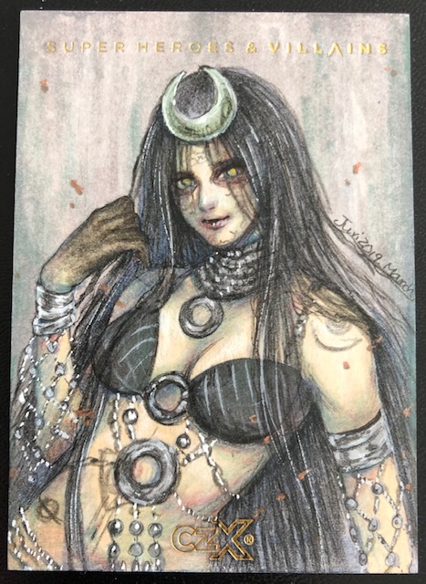
Juri’s range in styles and subjects is highlighted in striking renditions of video game, comic, and movie characters such as Nakoruru from Samurai Showdown, X-men’s Psylocke & Emma Frost, and DC’s Enchantress.
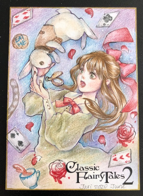
I discovered Perna Studios‘ high quality card sets through Juri’s art, and her work for them continues to be incredibly perfect for the subject matter. Her hauntingly beautiful black and white ghost from the Hallow-Ink set and fantastically playful Alice in Wonderland Artist Proof (AP) from Classic Fairy Tales 2.
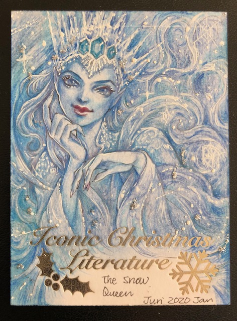
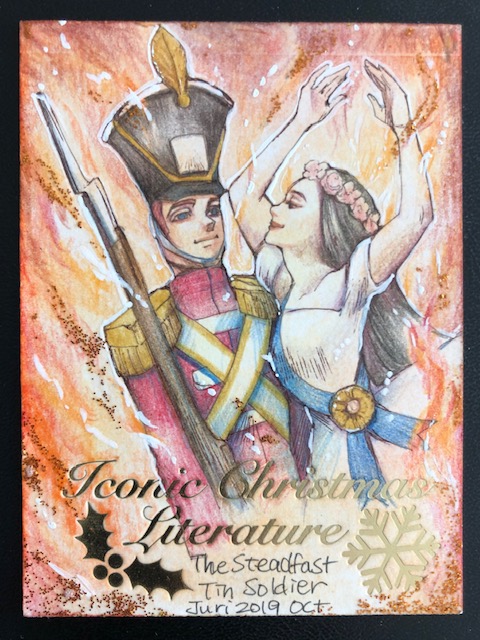
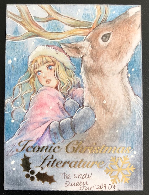
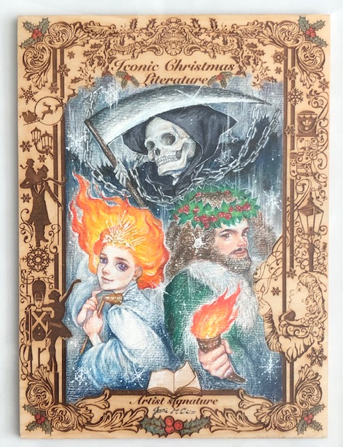
Iconic Creations (which I hope to write about in more detail soon) has been releasing incredible card sets based around literature and legends. Juri’s sketch cards for the sets have been wonderfully evocative of the subject matter, particularly the stunning Snow Queen and swordswoman APs I got from the Christmas Literature and Way of the Sword sets.
Iconic’s sets feature a variety of way to showcase the stunning art they include, including special cards like wood sketch cards and other inventive variants. The prize centerpieces of their sets are the oversized wooden “box toppers.” I was lucky enough to have an opportunity to get Juri’s box topper AP from the Christmas set, and pull her box topper sketch card from Treasure Hunters. Both my requested Ghosts of Christmas AP and Juri’s mermaid are absolutely breathtaking.
Best Friends (Arisa Nakajima & Tsukasa Fujimoto) PSC by Juri H. Chinchilla.Jumonji Sisters (Sendai Sachiko & Dash Chisako) PSC by Juri H. Chinchilla.
I mentioned another favorite company of mine, Ice Ribbon, above in relation to Tequila Saya. Their ace is featured on one of the newest PSCs I’ve gotten from Juri. It’s part of a duo of cards I’ve had planned for a while. During my first trip to Japan I saw a match between two phenomenal teams that remains one of my favorites of all time, and Juri’s renditions of the two pairs are simply incredible.
SEAdLINNNG’s Arisa Nakajima & Ice Ribbon’s Tsukasa Fujimoto, known as Best Friends, are two top tier singles competitors who are even more fearsome as a team. I adore Juri’s illustration of the pair with Ice Ribbon’s International Tag Ribbon Championship Belt.
The Jumonji Sisters, consisting of the since retired Sendai Sachiko & her sister Dash Chisako, were the epitome of poetry in motion. It was a privilege to get to see them in action live a couple of times before Sachiko retired, and the casual confidence and closeness Juri captured in their card is absolutely perfect.
Dash still wrestles for Sendai Girls and is simply incredible. She was previously featured in a solo PSC by Juri mid flight of her jaw dropping Hormone Splash (top rope frog splash).
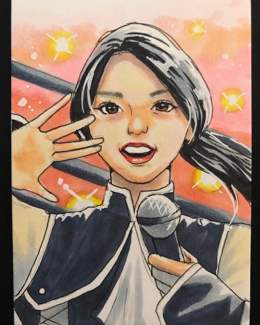
Hikari Noa PSC by Juri H. Chinchilla.Yuka Sakazaki PSC by Juri H. Chinchilla.
Tokyo Joshi Pro is an incredibly fun promotion filled with a wide variety of characters and styles. I’m a huge fan of Hikari Noa, and Juri captured both her idol and wrestler aspects showing off the wonderfully cute side of the deathmatch loving Up Up Girl.
Yuka Sakazaki is arguably the best high flyer in all of wrestling, and always a joy to watch. I love the sense of motion Juri achieved in her beautifully detailed depiction of TJPW’s Magical Girl.
Hana Kimura PSC by Juri H. Chinchilla.
The last card I’ll talk about here card is special, as well as sad. Hana Kimura was an incredible young wrestler who tragically passed away last year due to suicide amid a myriad of online harassment and other factors. Hana was one of my favorite performers in her home promotion and had striking charisma. She was always fun to watch in the ring and always seemed to go out of her way to be friendly to fans and make sure everyone was having a good time
Juri wonderfully captured Hana in a gorgeous card that is a great remembrance to someone dearly missed.
More information about Juri’s art can be found on her artist page. I hope to continue to follow and collect her wonderous creations for a long time to come. 🙂
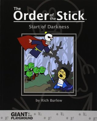
Start of Darkness is a prequel story featuring the villains of The Order of the Stick (OotS) webcomic. It is the second “print-only” OotS book, featuring material not available on the website.
As with the other print-only collections, this trade is in greyscale due to cost concerns (except for a 9 page section in the middle).
Start of Darkness is 112 pages long, and features background on Xykon and Redcloak. It’s got light touches of humor, but is mostly a dark tale, as befits the embodiments of evil plaguing our heroes. Without going into spoilers, there is a TON of information here that gives great insight into the characters and their motivations.
Although I recommend reading all of the OotS books, I found On the Origin of PCs (Start of Darkness’s hero analog) enjoyable but not strictly necessary. In contrast, while like with Origin there’s nothing here vital to understanding the main story, there is great depth added to our villains here (particularly Redcloak) that shouldn’t be missed.
A fantastic side story to the central quest, Start of Darkness really is a must read if you’re following the main comic.
While the volume number -1 is appropriate from a “in-comic” time perspective, it doesn’t tell you when you should be reading this volume. As the author states in the introduction it can be read after Volume 2 without spoiling anything, but I’d recommend reading it between Volumes 3 and 4 (along with Origin, if you choose).
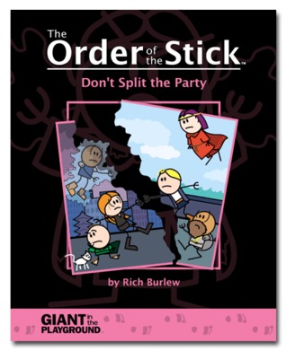
Don’t Split the Party is the fourth volume of The Order of the Stick (OotS) webcomic and contains strips #485-672, plus a number of new comics and author commentaries.
** Note: there are no spoilers for Don’t Split the Party in this review but are MAJOR spoilers for the first three OotS volumes. **
This being the fourth volume I am going to assume anyone reading this review is familiar with the basic concept of OotS. If you are not I highly recommend going back and starting with the first collection (Dungeon Crawling Fools).
The events of War and XPs cut our heroes to the bone (and further) and this volume picks up following their defeat at Azure City, with Haley and Belkar left hiding out in the city and Durkon, Elan and V having escaped with the paladin fleet (and Roy… well, you’ve read War and XPs. RIGHT?). Their stories move in parallel, highlighting the difficulties the Order has when forced apart and the toll events up to this point have taken on them. Some of the supporting cast grow into more prominent roles, and most of the Order have pivotal character moments within these pages.
Don’t Split the Party has a somewhat different feel than the rest of the strip up to this point, since the team is not working (nor even adventuring) together. This doesn’t hinder it though, as the personal journeys are important to the characters’ growth and their ability to function when rejoined, and as usual everything is OotS carefully lays groundwork for future events.
Familiarity with D&D will add depth, but is not necessary to read and enjoy. The humor grows fairly organically out of the characters and situations, and by this point readers should have an idea if it’s to their tastes.
As always OotS’s art uses “fleshed out” stick figures. See the cover for an example. This “simplified” art style is used to great effect and fits the comic perfectly, and even with this style you can see the evolution and refinement of the art as time progresses.
I highly recommend Order of the Stick in general, and Don’t Split the Party continues to reenforce it’s excellence.