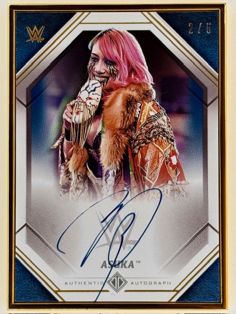
I talked about some trading cards that go beyond usual card stock material previously in a look at various cards made of metal. Another even more unusual variation are wooden cards.
It’s as straightforward as it sounds here. Let’s look at some interesting examples of trading cards made of wood.
Wooden cards are generally significantly thicker than their cardboard counterparts, and the main distinguishing characteristic besides the material itself is that images are generally etched or engraved on the card.
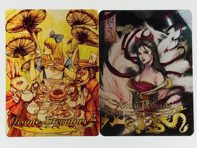
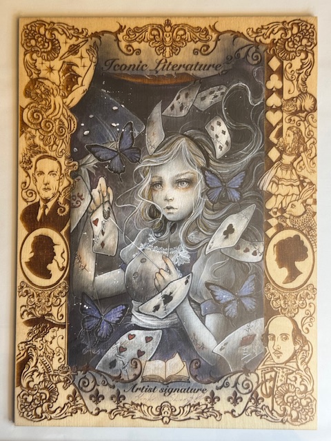
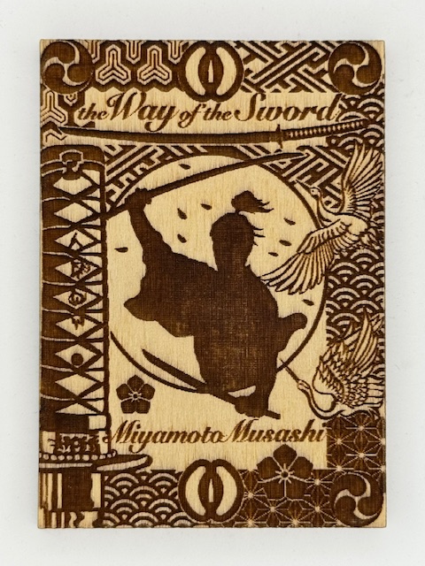
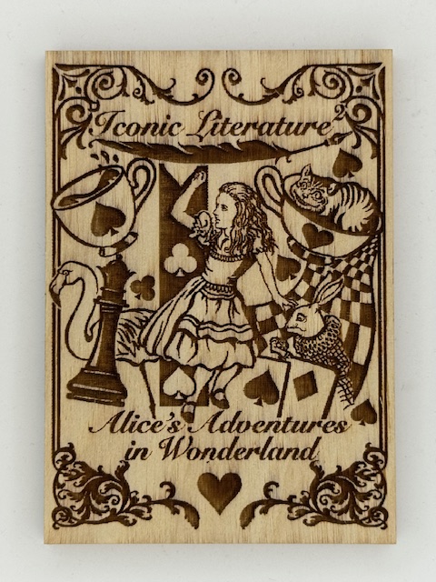
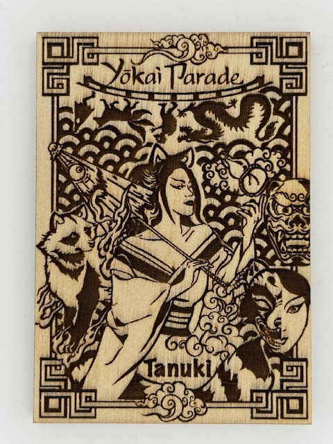
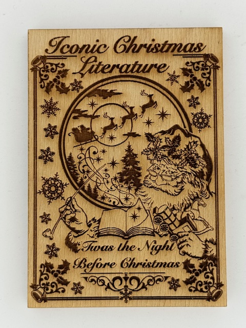
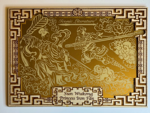
Iconic Creations is a card company headed up by Achilleas Kokkinakis (whose art I’ve spotlighted before). Their sets featured classic stories and historical and mythical figures, ranging from themes taken from classic literature to treasure hunting to Japanese folkloric monsters.
Iconic Creations did more with wooden cards and their variations than any other company I’m familiar with. The main chase subset in many of their sets were wooden cards matching the set’s theme, but with different art than the base cards. These cards make great use of contrast to present striking images.
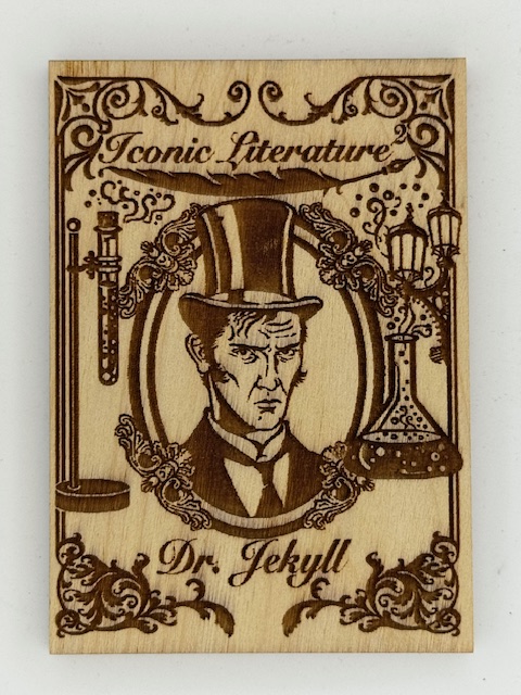
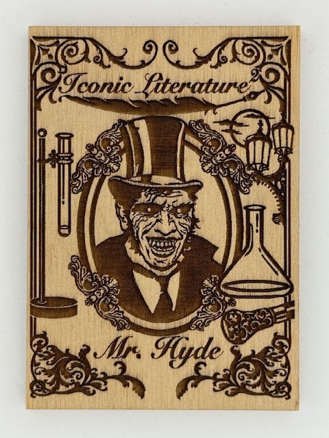
For a few choice cards, when thematically appropriate like the above Jekyll and Hyde card, there were contrasting images on both sides of the card.
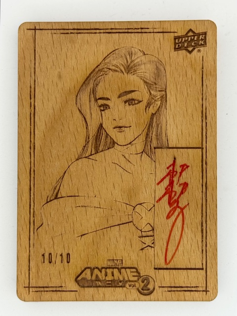
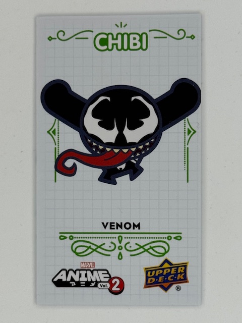
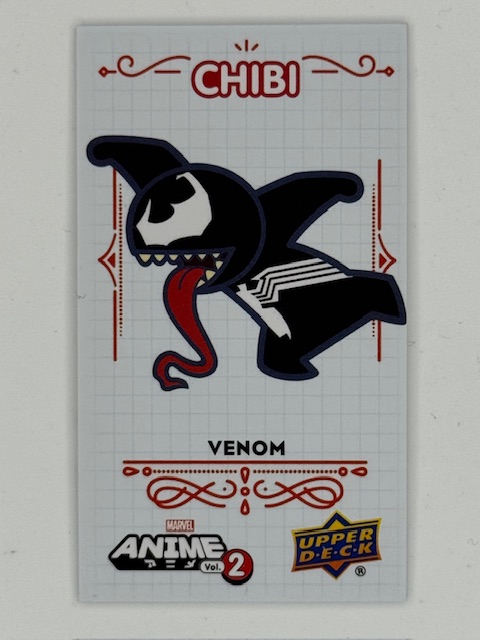
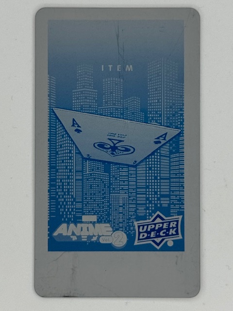
Upper Deck’s Marvel Anime 2 had a wonderful subset called Woodblock Echoes. These wooden cards had etched images that called back to the printed art of the first Upper Deck Marvel Anime set done by Peach Momoko. There were also limited variants of these signed by Peach.
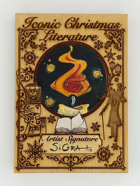
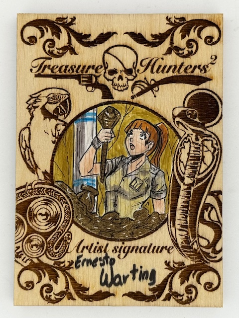
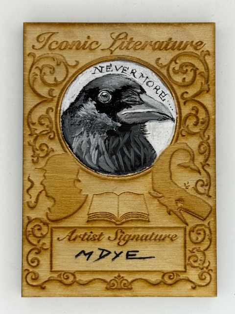
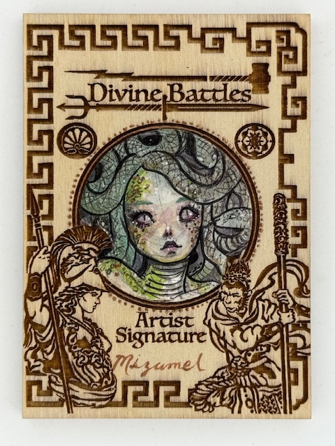
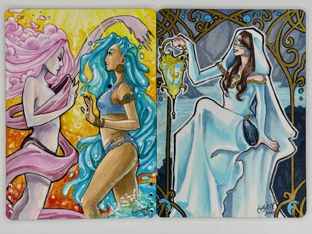
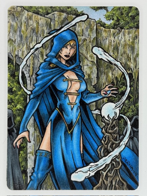
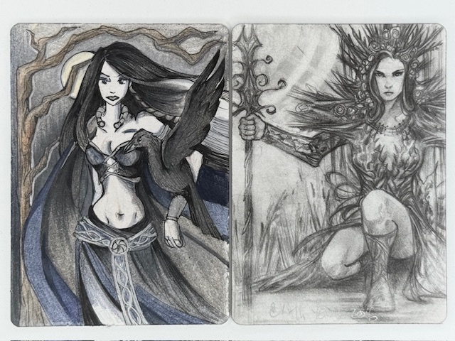
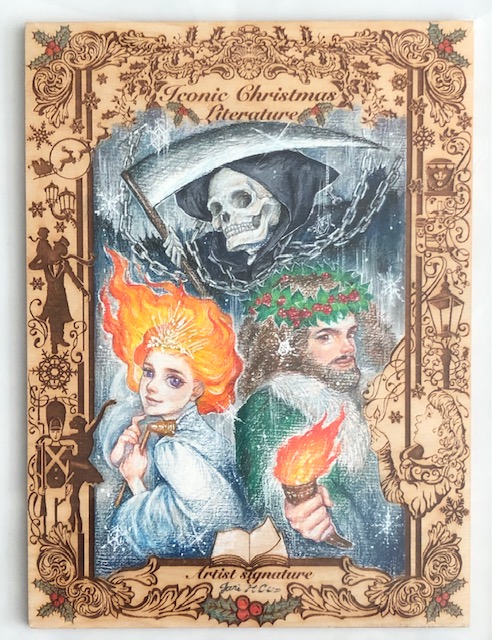
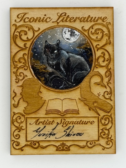
Going back to Iconic Creations for the remainder of this feature, sketch cards of different types were the centerpieces of these sets. Sketch cards are unique pieces of art where an artist has drawn directly on the cards. Perhaps surprisingly Iconic Creations’ sketch cards also had a subset of wooden versions.
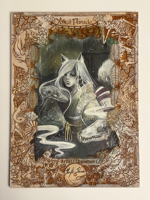
Their normal sized wooden sketch cards were general designed with etched art framing a circle reserved for the art and a separate space for the artist’s signature.
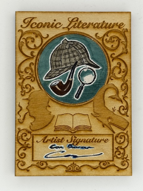
While the format provides an even smaller workspace than the already limited size artists generally have for sketch cards, it highlights the art nicely and the artists all did a great job making the most of the constraints.
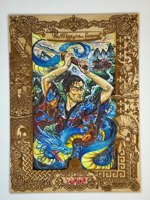
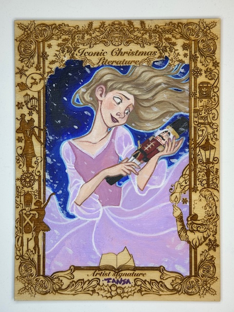
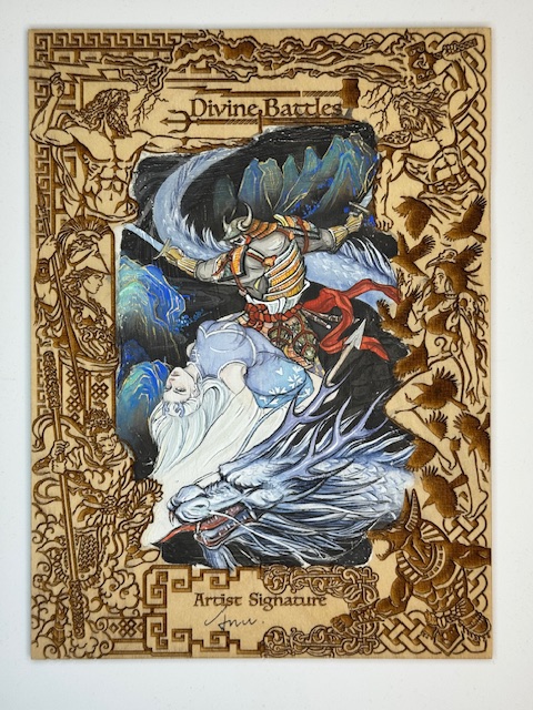
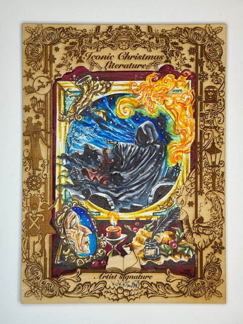
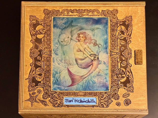
I described above Iconic Creations’ “normal sized” wooden sketch cards. The distinction was made in contrast to another type of wooden sketch card in those sets. The main bonus of Iconic Creations’ premium boxes (more on those to come) was a random pull of one of their “box topper” wooden sketches.
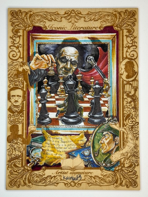
These beauties measure 6.5″ x 8.5″ and are absolutely stunning. A set specific etched border surrounds a large central area for the artist to work on.
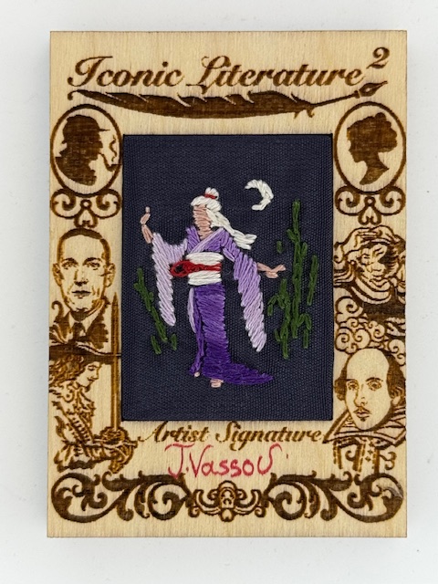
In certain sets a small number of the most unique subset I’ve come across were inserted. These wooden cards had a cloth section in the center featuring hand stitched art by either Niki Konstantinou or Triantafillia Vassou. The creativity and craftsmanship that went into these is phenomenal.
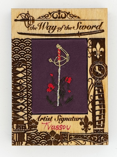
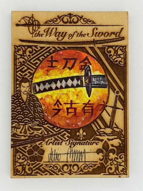
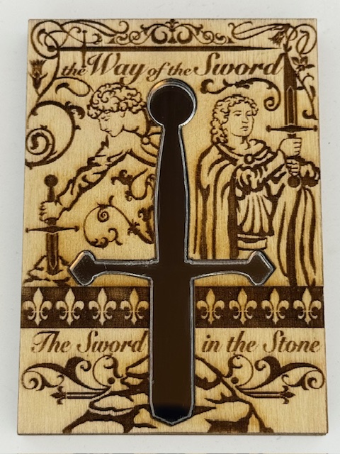
Another really creative way Iconic Creations used wooden cards was the occasional insertion of mirrored surfaces. The Way of The Sword set featured a a simple and elegant mirror chase card with a cutout in the center of the wooden card for a mirror in the shape of a sword.
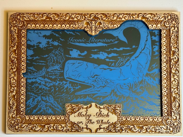
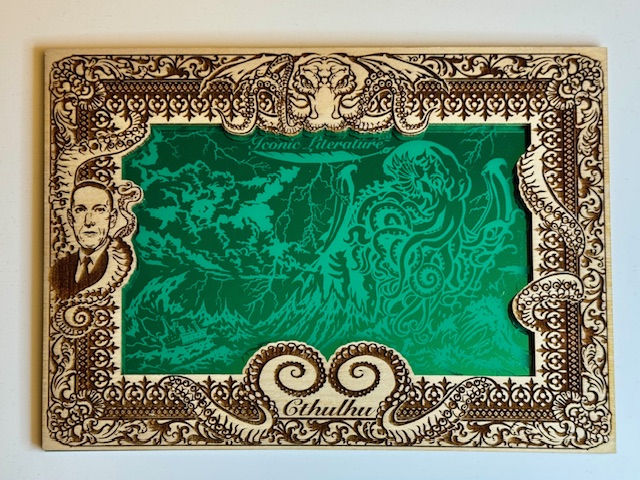
The secondary bonus for the premium boxes was often an oversized metal card, but for Iconic Literature 2 it was one of three large colored mirror images on a wooden card with the usual impressive etched borders.
While not cards themselves, the premium boxes I’ve mentioned are another incredible card set related use of wood. The boxes the “box topper” sketches came with were large wooden storage boxes with intricate designs on the top and sides.
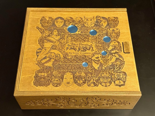
The designs varied, with some sets having entirely etched tops and others featuring metallic overlays with a few different images from set artists. These boxes were fantastic works of art in their own right.

That’s it for this look at some of the ways wood has been used in trading card sets. Best of luck with wherever your personal collecting tendencies take you.
Thanks to everyone who’s given this a read. Derailments of Thought currently updates sporadically, but more regular posts will hopefully be on the way soon.
If you enjoy the blog any support is appreciated, including shares on social media and simply continuing to read. If you happened to be inclined and able to help out monetarily please see my Ko-fi page. Every little bit helps.