Categories
Art Cards Comics

Tiny Treasures: Mini and Chibi Cards

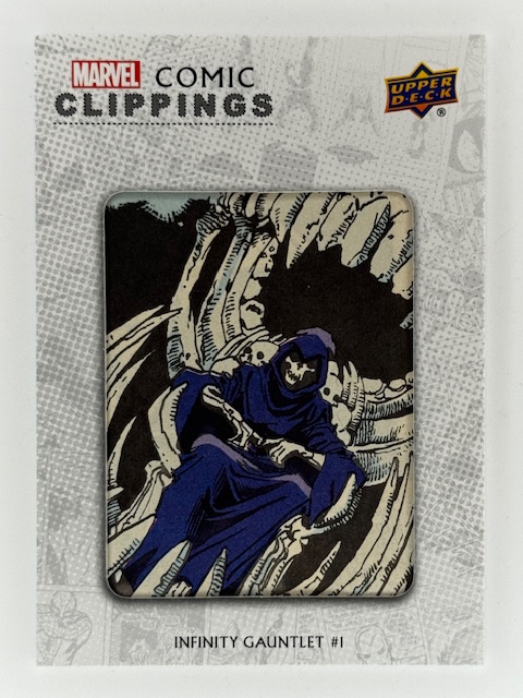
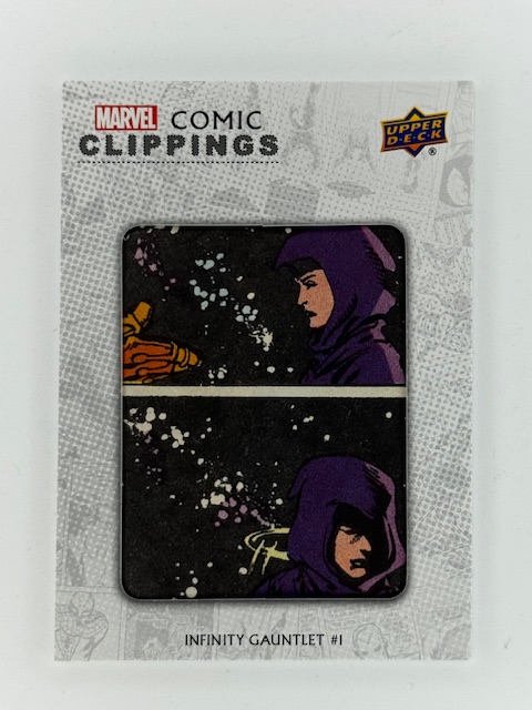
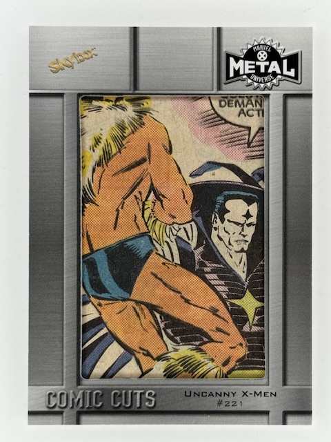
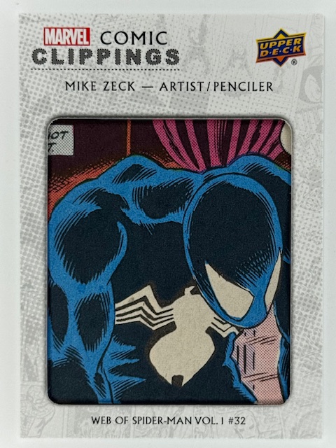
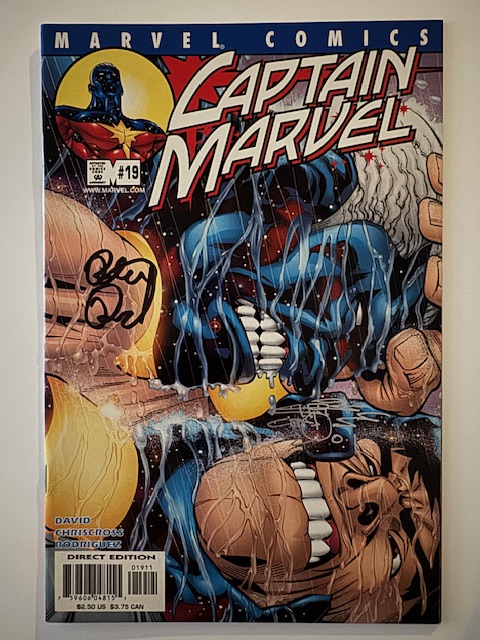
Unlike more unusual fare I’ve previously featured like metal cards and comic cuts, minis are one of the most straightforward subsets of trading cards. They’re simply cards that are smaller than the standard 2.5 x 3.5 inch (6.4 x 8.9 cm) size.

For clarity, this spotlight is about small cards with a traditional rectangular shape (although the ratio of the sides can vary). Die Cut cards that can end up smaller due to odd shapes and/or pieces of a standard card being cut away are a different matter that will likely get their own entry in the future.

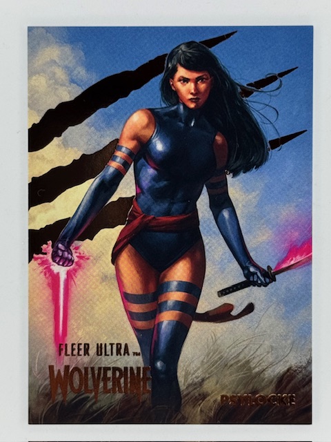
Sometimes a mini subset will literally be a smaller version of another card in the set (often a base card). Just an unusual variant for collectors to chase. The numbered minis from Fleer Ultra Wolverine, for example, were 2″ x 2.75″ versions of certain base cards.

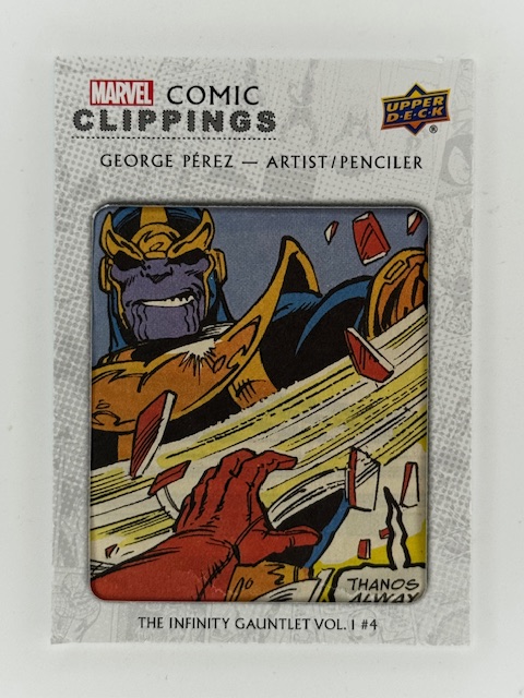
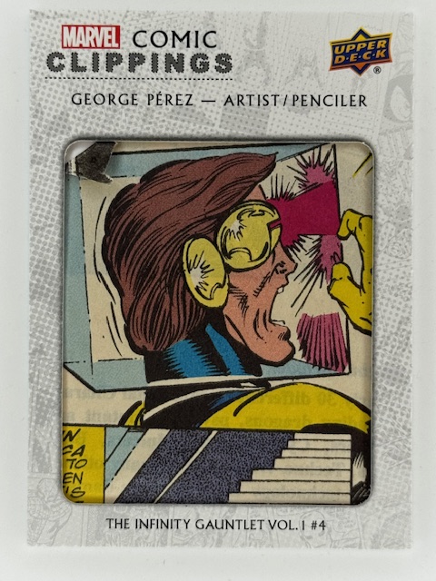
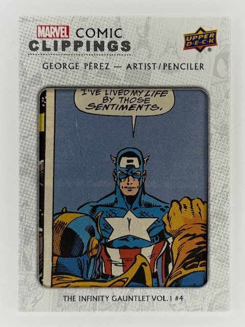
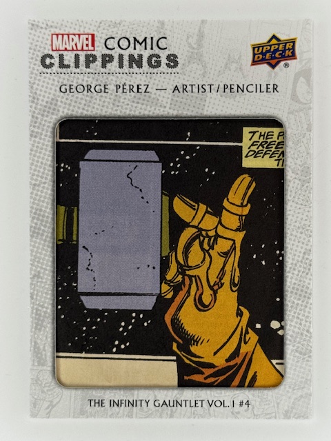
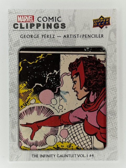
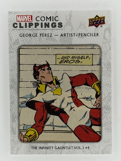
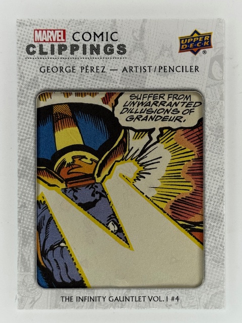
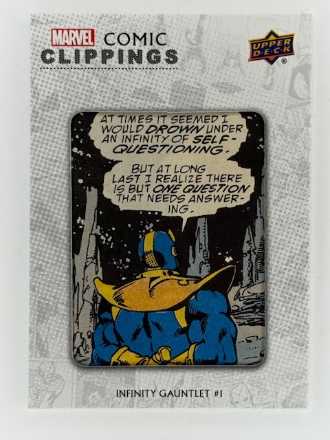
Other mini subsets are unique, with art not otherwise used in the set.

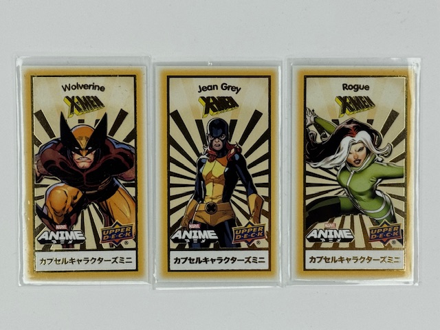
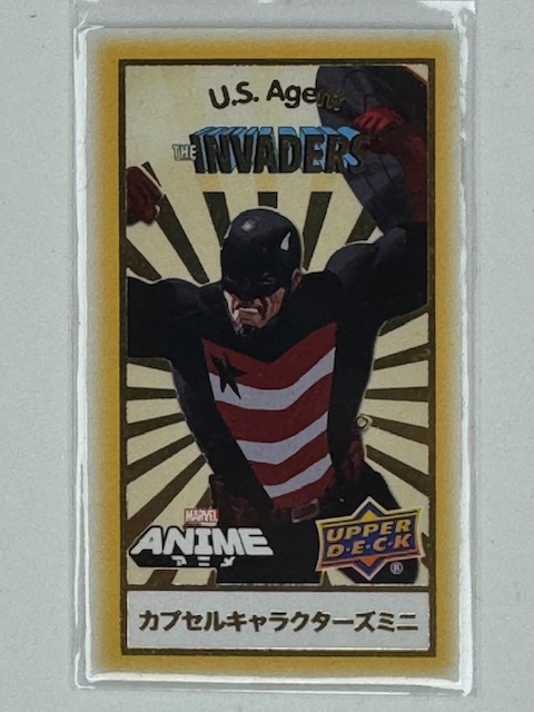
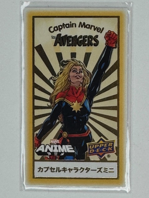
In Upper Deck’s Marvel Anime sets there were both “minis” and “chibis” subsets of tiny 1.5″ x 2.625″ cards. Minis focused on certain teams of heroes or storyline events and were grouped by theme.

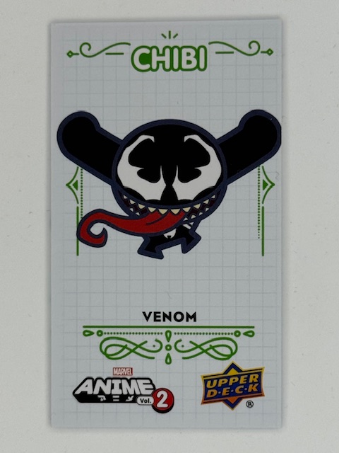
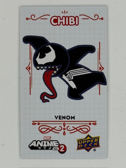
Chibi translates literally as small, but is used colloquially as slang affectionately describing small and/or cute things. As an art style it’s also called super deformed and is characterized by large heads, small bodies, and exaggerated features within simplified designs. The chibis subsets featured chibi versions of popular Marvel characters.

These types of minis/chibis (and similar variations in other sets) were usually released in a card within a card format. A standard sized card with a perforated section on the back is what’s actually inserted into packs. The perforated section tears away to reveal the randomized mini within. These minis are often categorized and randomized within a themed capsule card, such as by team, comic storyline, etc.

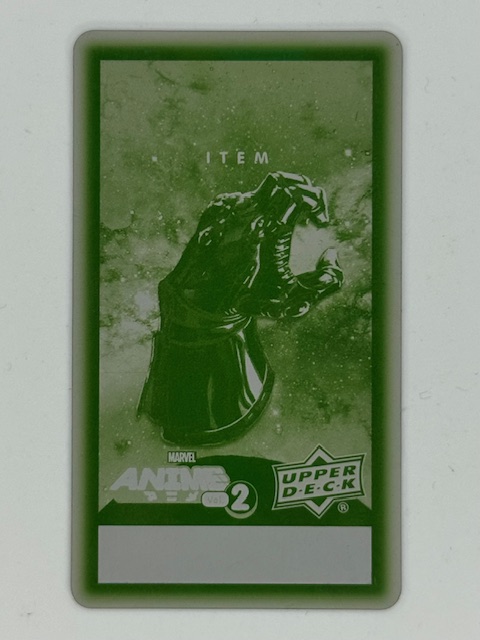
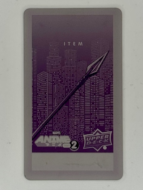
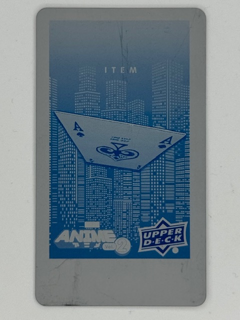
As I’ve written about before, printing plates are thin metal sheets used in the printing process of the card they correspond to. Printing plates for the minis subsets of Upper Deck’s Marvel Anime 2 were available as ePack achievements (prizes for completing certain trading/collecting goals within Upper Deck’s online platform). They’re really unique and interesting pieces of the set.

One of the more inspired uses of mini cards in comic related trading card sets recreate comic corner boxes. In the past these boxes appeared in the upper left corner of comic books with Marvel’s logo, character art, and issue information.

They severed as a quick identifier of the Marvel brand and key characters featured in the comic to catch the eye of potential buyers on crowded newsstand shelves and racks.

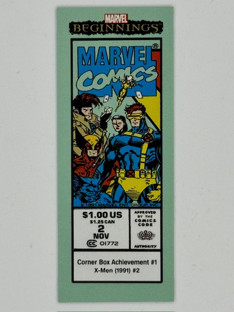
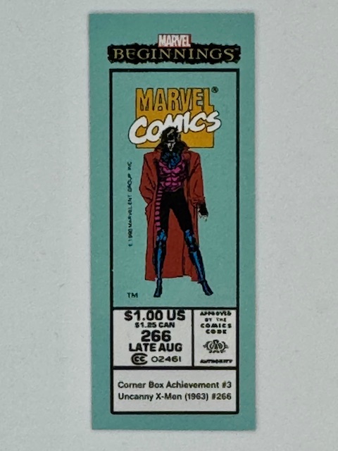
These corner box cards measure 1″ x 2.5″ and contained card set information around a replicated corner box from key past issues.

Size comparison to a standard sized trading card.

That about does it for this look at trading cards’ smaller siblings. Best of luck with wherever your personal collecting tendencies take you.


Thanks to everyone who’s given this a read. Derailments of Thought currently updates sporadically, but more regular posts will hopefully be on the way soon.

If you enjoy the blog any support is appreciated, including shares on social media and simply continuing to read. If you happened to be inclined and able to help out monetarily please see my  Ko-fi page. Every little bit helps.

Categories
Art Cards Comics

Clipping Memories: Comic Cut Cards

Comic card collecting is normally another format to view and appreciate images of comic book characters. Art can be original for the card set or reproduced from associated comics and can be shown on a variety of materials, but cards are usually a step removed from the inspiring items. However there are types of cards that directly tied to the original material in a physical sense: comic cuts.

Comic Clippings / Comic Cuts are exactly what they sound like. Some portion of actual printed comics cut out and put into a card. The cardstock has an opening on the front side to frame/show the clipping.

Clippings used to this are most often a single panel that can be spotlighted on the small surface of the standard 2.5 x 3.5 inch size for trading cards.

Comic cuts can be controversial, as some collectors don’t see the point of them and/or object to comics being cut apart to make them. I’m not going to wade into a debate of the merits. I personally like them as unique and unusual chase insert subsets.

Like many other collectors of this type of insert, I concentrate on collecting cuts of favorite characters and storylines. Infinity Gauntlet, which I read as it came out when it was originally published in 1991, remains one of my favorite comic stories of all time. It contains the broad strokes storyline that was the basis for Thanos’ role in the MCU. A good chunk of my comic cut card collection feature panels from that six issue series, with special focus on Thanos himself, Lady Death, and Nebula’s brief time with the gauntlet.

Other cuts I’ve sought out relate to specific favorites, including Emma Frost, Psylocke, and a host of other X-Men characters.

I adore cuts of characters that visually stand out. In particular the Spider-Man related cuts in my collection tend to focus on black suit Spidey and Venom. The design is striking and looks great spotlighted in this format. A couple of these cuts come from another classic, favorite storyline of mine, Kraven’s Last Hunt.

One of the cooler variations of comic cuts feature autographs of creators of the comic issue the cut is from. These can be from the artist of the shown panel, but also the writer or editor of the issue.

Occasional, rare dual signature cards are signed by writer/artist or writer/editor pairs. I have several with signatures by Jim Starlin, many on Infinity Gauntlet panels and a couple duals from Warlock with editor Marvel Wolfman, as well as some by legendary X-Men writer Chris Claremont.

These cuts feature smaller clippings, as the border surrounding the cut needs to leave room for the autograph. Autos are typically done via sticker rather than directly on card for these likely for both space and production reasons.

Perhaps even more so than regular cards a comic cut’s desirability varies wildly from person to person due to a variety of factors. Personal taste is of course foremost, with individual meaning to stories and characters as discussed above often having even more significance than normal due to these containing actual pieces of the comics.

But there are numerous other considerations as well that don’t apply to other inserts. Cuts from issues that are rare or particularly significant can become more sought after. The condition of clipping is important, as older comics paper quality can have declined and the printed image san fade. Printing mistakes, imprints, or other imperfections can also affect perceived value.

One of the most interesting aspects that’s largely unique to cuts is how well the panel stands on its own. Uncluttered images and poses of popular characters tend to work best as opposed to half cut off panels overrun with text bubbles.

That said some collectors don’t mind mid-story text heavy cuts, and in certain cases a bit of context via speech bubbles or captions can more strongly tie back to the comic the cut was taken from.

Card design varies from set to set, which affects the shape and size of the opening and amount of border that will be surrounding it. This will impact how the cut looks and feels, as panels are very rarely going to measure the exact same as the display opening. As mentioned above pieces of other panels encroaching on the featured image can be less than ideal.

On the other hand cuts forced into displays smaller than the panel can sometimes provide a more dramatic focus on the subject. And so on. These are highly individualized collectibles that have a million little details that can determine whether any particular card speaks to a collector.

Beyond just the graphic design of the card set, there are some variations on the idea of comic cuts that make for unique implementations.

One interesting insert type is Upper Deck’s “Coinage,” in which actual coins are imbedded into the cards. For their comic related sets that had this subset they featured classic comic cuts as well, with the imbedded coin(s) equal to the cover price of the comic the clip is from when it was originally published.

Another interesting variation on the comic cut concept are cover cuts. Cover cuts feature an entire cover from a comic divided into card sized pieces, forming a multi-card “puzzle” that together show the original cover.

Cover cuts are usually only available via special redemption methods that allow multiple cards to be awarded together, such as ePack achievements, so that the collector is getting the whole cover and not just one random 16th of it. These were rewards for difficult to complete collecting tasks.

Milage on these varies, and they are even more susceptible to some of the things I’ve been discussing than normal cuts. Card borders are even more attention grabbing when they are crisscrossing a larger combined image, and can block key parts of the cover. Sometimes obscuring character’s faces, or otherwise hiding key portions of the image.

That said I personally think they look pretty great in some cases, and having a couple of them of key issues of favorite characters is one of the highlights of my collection.

I hope everyone’s enjoyed this look at a literal intersection of cards and the comics they spotlight. Best of luck with wherever your personal collecting tendencies take you.


Thanks to everyone who’s given this a read. Derailments of Thought currently updates sporadically, but more regular posts will hopefully be on the way soon.

If you enjoy the blog any support is appreciated, including shares on social media and simply continuing to read. If you happened to be inclined and able to help out monetarily please see my  Ko-fi page. Every little bit helps.

Categories
Books Comics

Goodbye, Writer of Stuff

“There are no such things as happy endings. Never. They’re totally manufactured by fiction writers who choose to end the story on a high point.”

Peter David was self described a Writer of Stuff, and it’s really the perfect epithet. He was a mainstay in comics for decades, also a prolific writer of novels and short stories, and shared opinions of all sorts over the years in essays, blog posts, and his But I Digress column.

Peter was one of my favorite writers and I’ve read a ridiculous amount of his stuff, starting pretty early on in his career.

I was an avid comic reader when I was young, and I am one today. In between my interest and ability continue with them waned, except for Peter’s work. There was a period where his comic were pretty much all I was reading, remaining thoroughly engrossed in titles like Aquaman, Supergirl, X-Factor, and Young Justice.

While he did great work on a number of popular characters, one of the things Peter is known for was taking second string characters and making something special with the freedom such things involve.

One great example of this was his work on X-Factor, spanning three different conceptual iterations featuring different lineups of misfits over the course of years. During his first run on X-Factor, he’d write one one of the most interesting and beloved single issue stories of all time. X-Factor #87 portrayed his government sponsored X-Factor team going to mandated therapy sessions in the aftermath of an X-men crossover event. It was an unusual aspect of Earth shaking events in comics that was captivating to see explored. Peter dug deep into the characters and created an enduring, compelling tale will little more than 36 pages of characters talking to each other.

The Incredible Hulk itself, the comic Peter’s best known for, was a low selling title before he originally took it over leading to an award winning run. During that run he notably explored the concept of Hulk as an aspect of Banner’s fractured psyche, leading to his creation of the Banner Hulk combined version of Hulk that would eventually inspire MCU’s “Smart Hulk.”

One of my favorite stories of all time is David’s two part Future Imperfect from 1994, showing the Hulk faced with his own dark potential.

Echos of his work also reverberate through the stories that followed and adaptations, such as Miguel O’Hara’s appearance in Across the Spider-Verse. Peter co-created and was the primary writer of Spider-Man 2099.

Peter pushed boundaries in his work, willing to test limits of subject matter, creative direction, and format.

One of his early comic stories that groundbreaking at the time and helped establish Peter as a writer, The Death of Jean DeWolff, created waves off the bat by proclaiming its intention to kill a popular supporting character in the title of the story.

His work crossed and combined genres and styles. Sometimes his over the top humor with mountains of wordplay and puns inundated the reader. Sometimes drama and heavy topics anchored his stories. And often those elements are more combined in ways no one else would dare.

His approach and convictions sometimes led to controversy and conflict, and occasionally didn’t land in the stories themselves, but Peter always kept trying and overall things came together into an incredible catalog of writing that will endure.

Another of Peter’s strengths was fitting stories within past continuity without heavy reconning, attempts to add context and depth between existing stories. Several of his well loved Star Trek novels took this approach.

A lot of his later work also focused on this concept, including writing stories that fleshed out Spider-Man’s time unknowingly wearing the alien symbiotic costume that would later become Venom. Given Peter’s start as a comic writer was in the aftermath of the original symbiote comics (when Peter was wearing a cloth replica of the black suit), it was nice bookend to an incredible career.

Peter had been facing severe health issues for quite some time, and passed away on May 24, 2025.

Thank you for a lifetime of stories Peter. Rest in Peace.