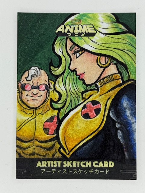
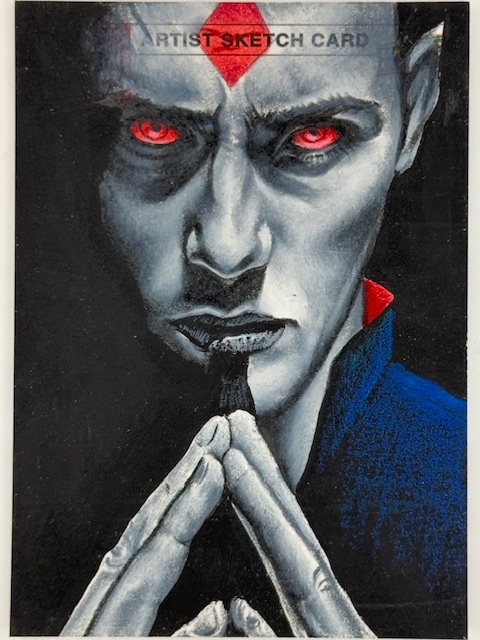
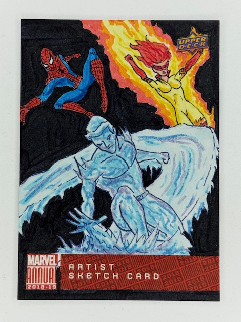
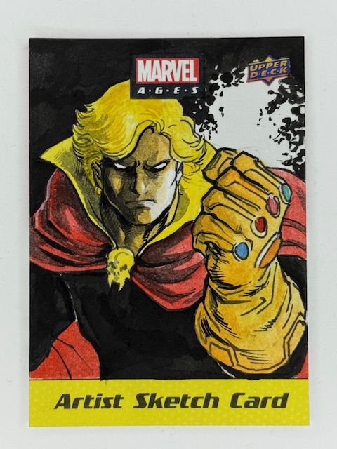
Short spotlight here where I’m going to let the pictures do most of the talking.
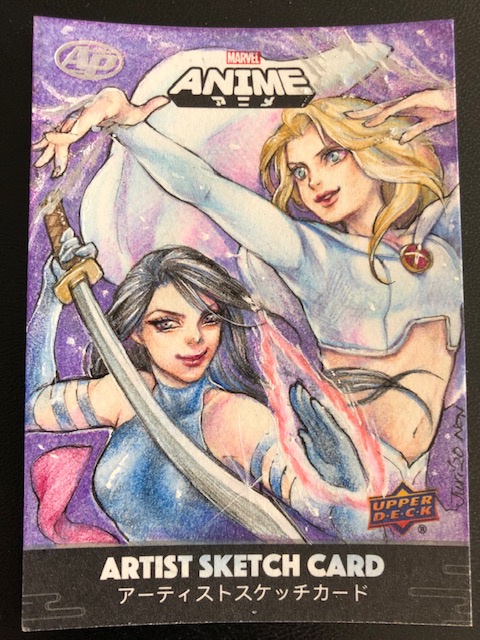
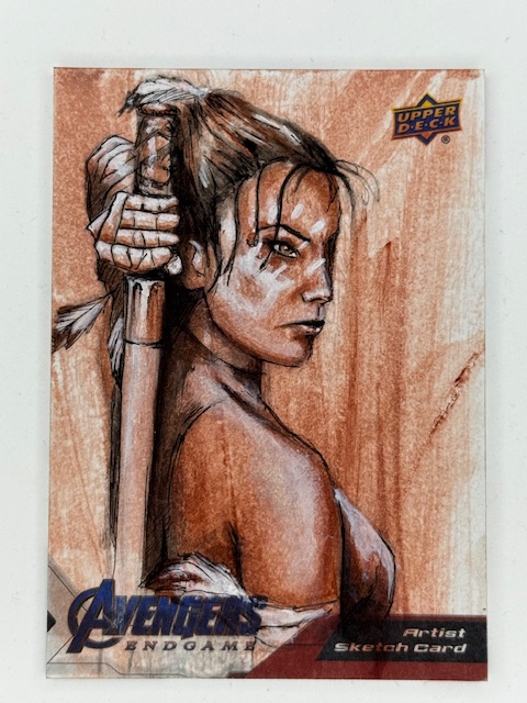
During my appearance on That Card Collectors Podcast I showed a handful of cards and discussed many more. Here’s a look at many of the cards and pieces of art mentioned.
A previous post I did with more details about that appearance, including where to listen or watch and links to several mentioned blog posts, can be found here. Please check the podcast out for more context on the wonderful cards and artists featured below.
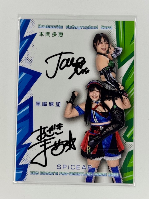
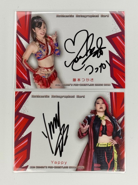
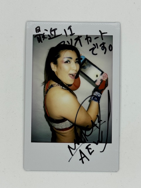
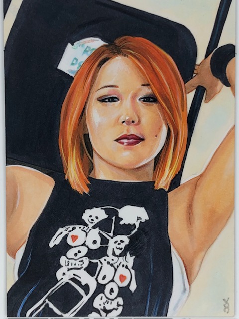
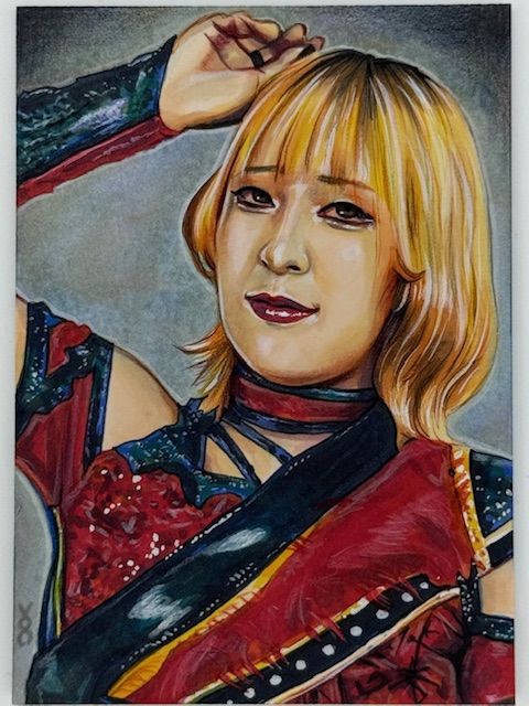
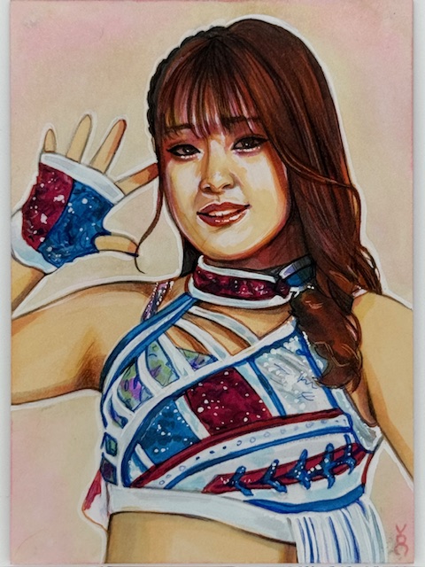
A variety of chekis from BBM’s Women’s Wrestling sets:
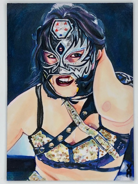
Joshi wrestler PSC collection:
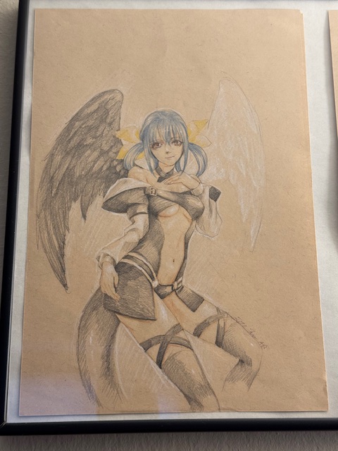
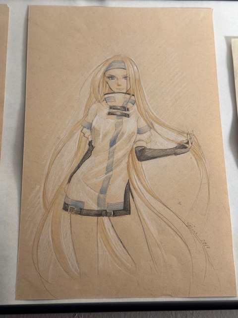
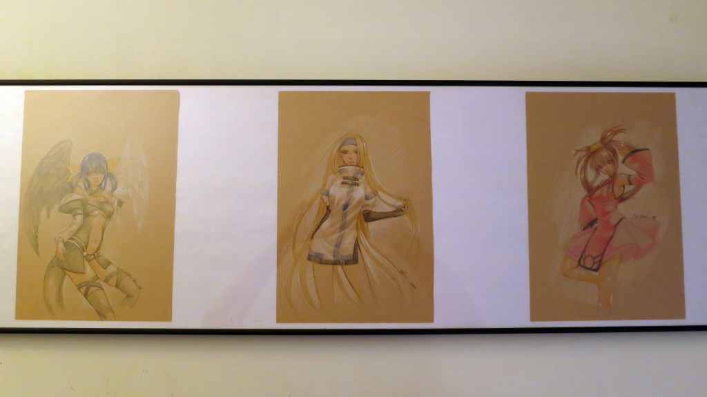
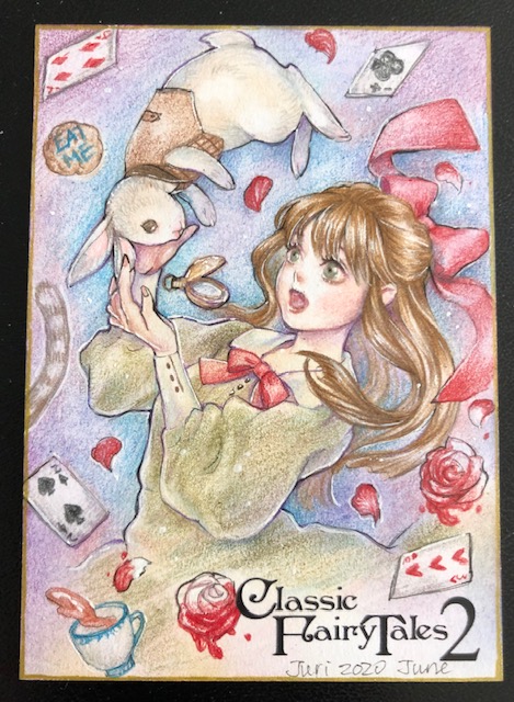
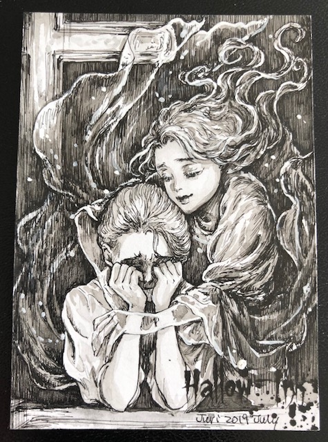
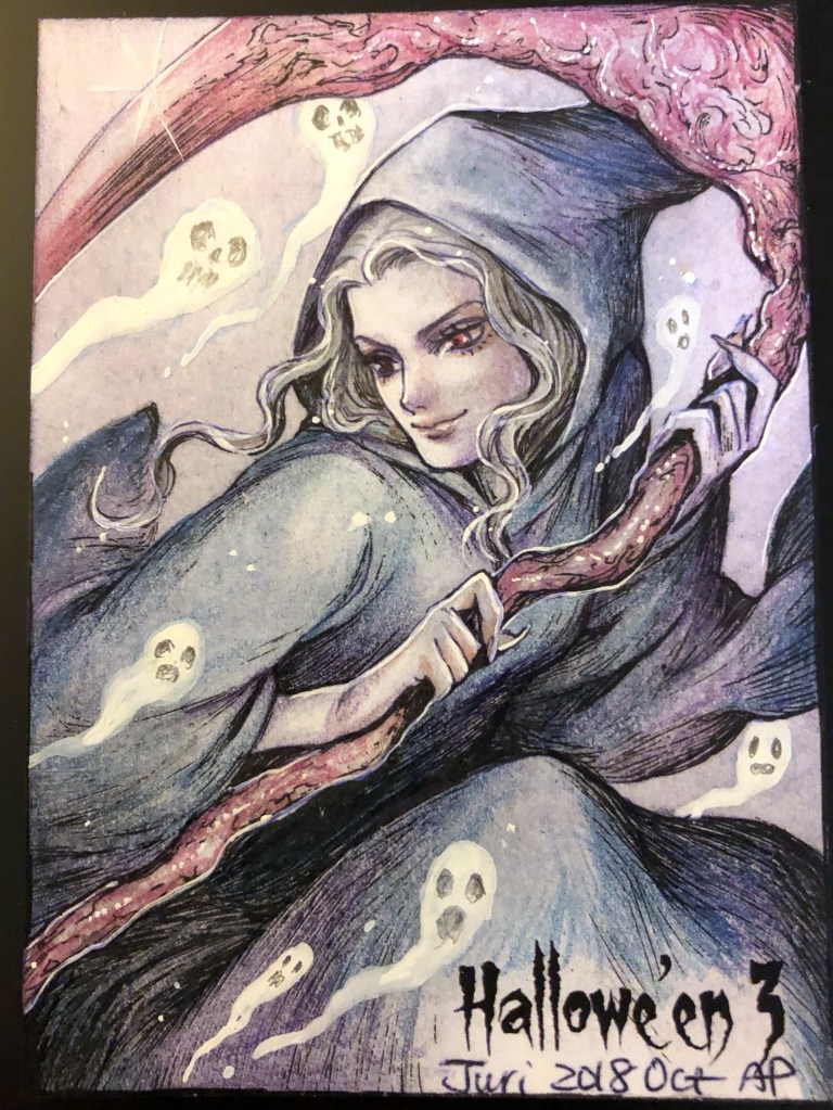
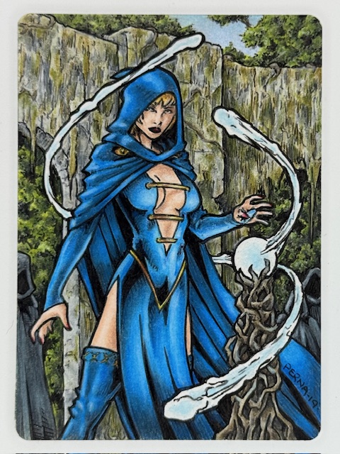
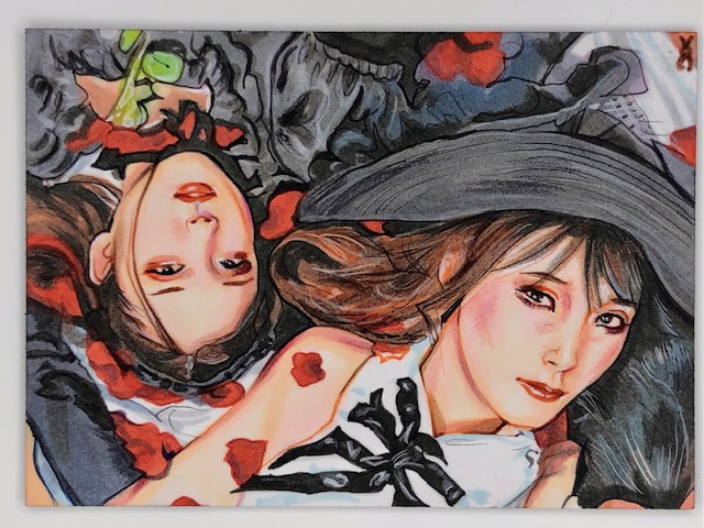
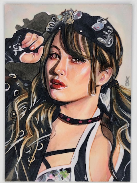
The first art commissions I ever got from Juri Chinchilla:
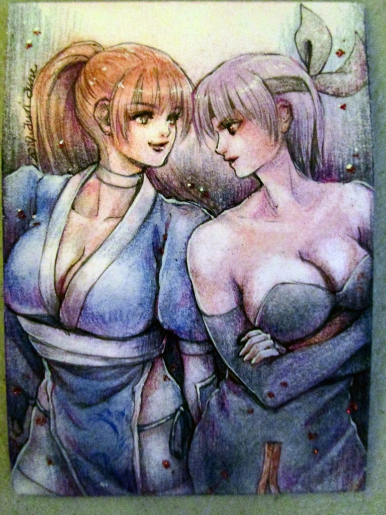
Dizzy, Millia Rage, and Jam Kuradoberi from Guilty GearKasumi and Ayane PSC by Juri Chinchilla.
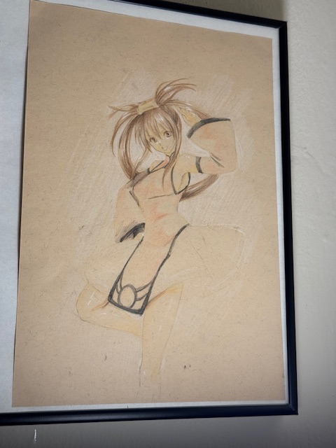
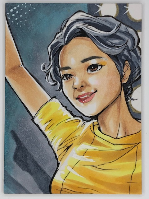
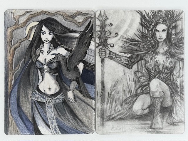
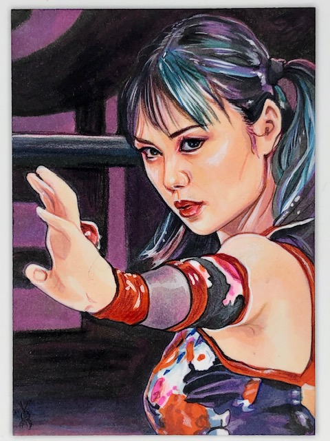
Nonoka Seto PSC by Miki Okazaki.
Best of luck to everyone with whatever shape your collection takes.
Thanks to everyone who’s given this a read. Derailments of Thought currently updates sporadically, but more regular posts will hopefully be on the way soon.
If you enjoy the blog any support is appreciated, including shares on social media and simply continuing to read. If you happened to be inclined and able to help out monetarily please see my Ko-fi page. Every little bit helps.
Quick bit of cross promotion in case anyone’s interested.
I recently chatted about my card collection with Ian and Josh on That Card Collectors Podcast. See that page for links to the episode on Spotify and iTunes, and find it (audio version) on YouTube here.
A video version where a lot of the cards we discussed were shown is also up on their YouTube channel here.
It was a fun time chatting with them about collecting. Please check it out (and see related blog links below).
Nonoka Seto PSC by Miki Okazaki.
We talked a bit about this blog and a number of card related posts I’ve done, including articles about specific card types and sets as well as spotlights on some incredible artists. Here are those posts for easy reference if anyone’s interested in further details.
Ghosts of Christmas “Box Topper” Wooden Sketch Card AP by Juri Chinchilla
Best of luck to everyone with whatever shape your collection takes.
Hikaru Shida cheki.
Thanks to everyone who’s given this a read. Derailments of Thought currently updates sporadically, but more regular posts will hopefully be on the way soon.
If you enjoy the blog any support is appreciated, including shares on social media and simply continuing to read. If you happened to be inclined and able to help out monetarily please see my Ko-fi page. Every little bit helps.
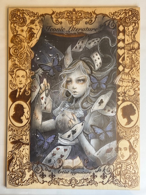
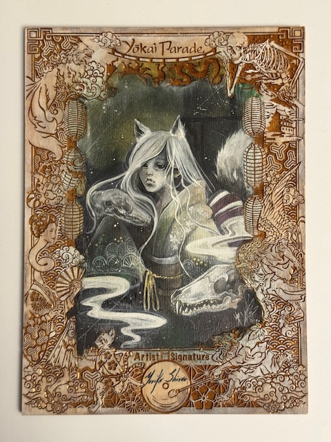
Alice in Wonderland “Box Topper” wooden sketch card by Yuriko Shirou.
I talked about some trading cards that go beyond usual card stock material previously in a look at various cards made of metal. Another even more unusual variation are wooden cards.
It’s as straightforward as it sounds here. Let’s look at some interesting examples of trading cards made of wood.
Wooden cards are generally significantly thicker than their cardboard counterparts, and the main distinguishing characteristic besides the material itself is that images are generally etched or engraved on the card.
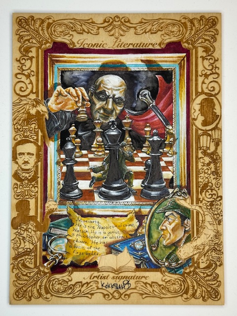
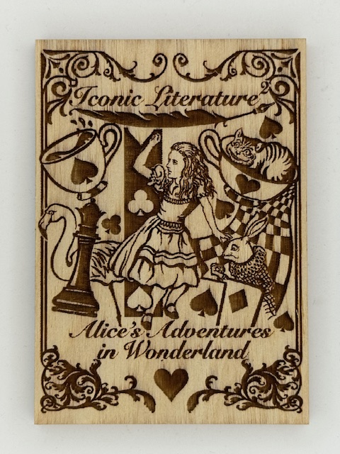
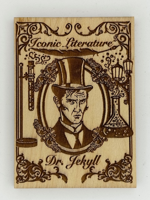
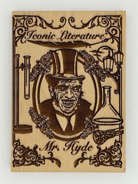
Iconic Creations is a card company headed up by Achilleas Kokkinakis (whose art I’ve spotlighted before). Their sets featured classic stories and historical and mythical figures, ranging from themes taken from classic literature to treasure hunting to Japanese folkloric monsters.
Iconic Creations did more with wooden cards and their variations than any other company I’m familiar with. The main chase subset in many of their sets were wooden cards matching the set’s theme, but with different art than the base cards. These cards make great use of contrast to present striking images.
For a few choice cards, when thematically appropriate like the above Jekyll and Hyde card, there were contrasting images on both sides of the card.
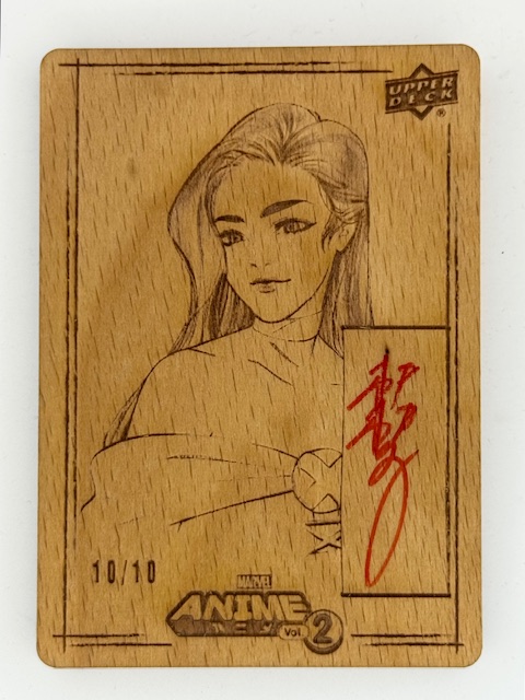
Upper Deck’s Marvel Anime 2 had a wonderful subset called Woodblock Echoes. These wooden cards had etched images that called back to the printed art of the first Upper Deck Marvel Anime set done by Peach Momoko. There were also limited variants of these signed by Peach.
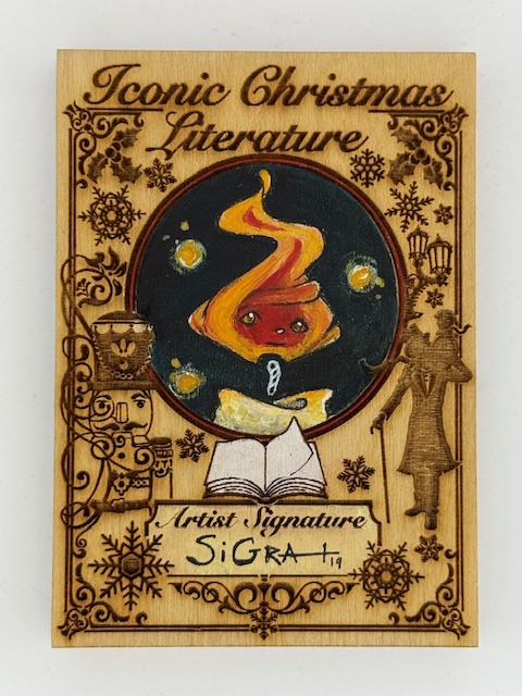
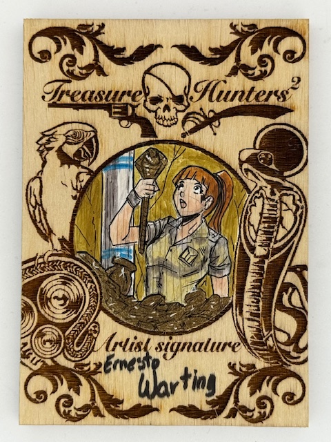
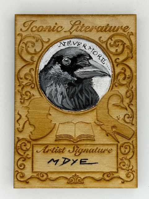
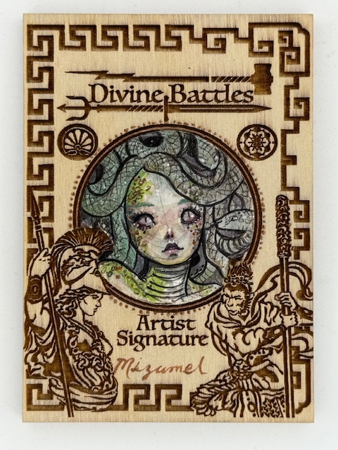
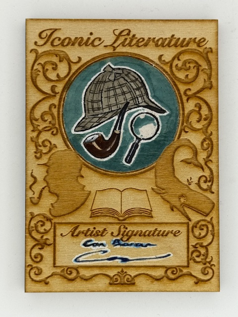
Going back to Iconic Creations for the remainder of this feature, sketch cards of different types were the centerpieces of these sets. Sketch cards are unique pieces of art where an artist has drawn directly on the cards. Perhaps surprisingly Iconic Creations’ sketch cards also had a subset of wooden versions.
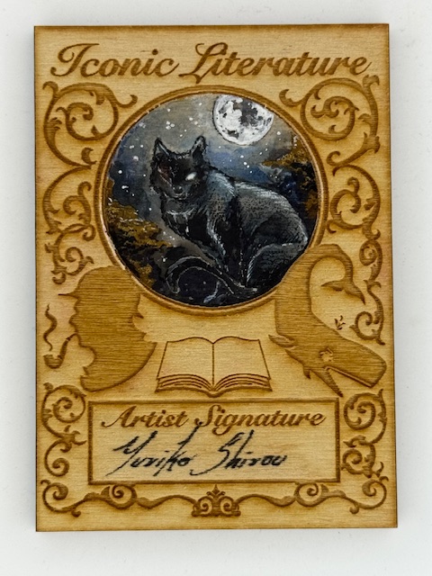
Their normal sized wooden sketch cards were general designed with etched art framing a circle reserved for the art and a separate space for the artist’s signature.
While the format provides an even smaller workspace than the already limited size artists generally have for sketch cards, it highlights the art nicely and the artists all did a great job making the most of the constraints.
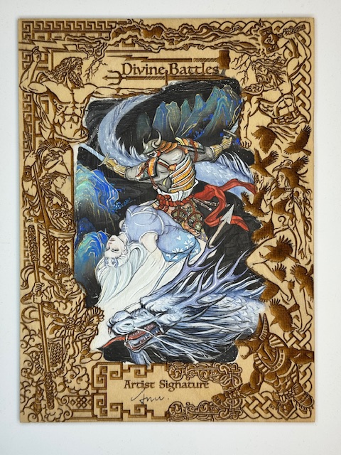
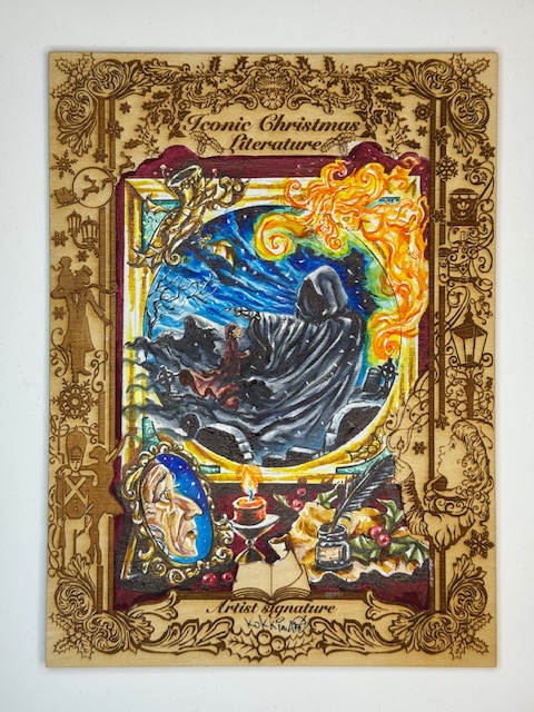
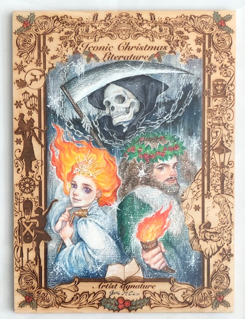
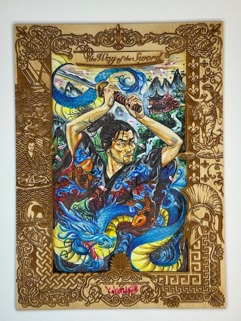
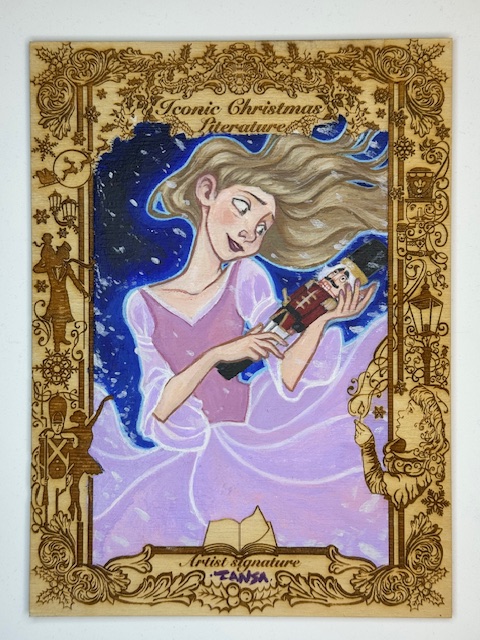
I described above Iconic Creations’ “normal sized” wooden sketch cards. The distinction was made in contrast to another type of wooden sketch card in those sets. The main bonus of Iconic Creations’ premium boxes (more on those to come) was a random pull of one of their “box topper” wooden sketches.
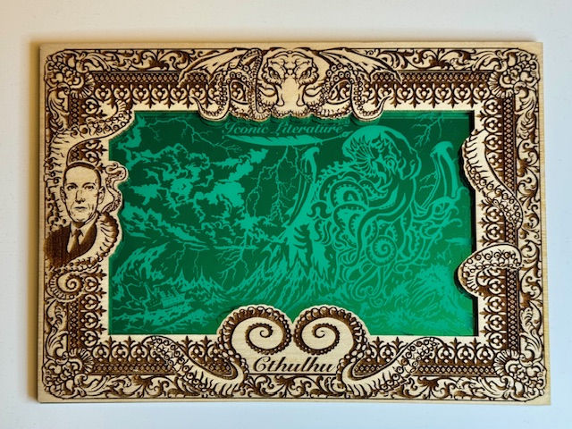
Sherlock Holmes “Box Topper” wooden sketch card by Achilleas Kokkinakis.
These beauties measure 6.5″ x 8.5″ and are absolutely stunning. A set specific etched border surrounds a large central area for the artist to work on.
Ghosts of Christmas “Box Topper” Wooden Sketch Card AP by Juri Chinchilla
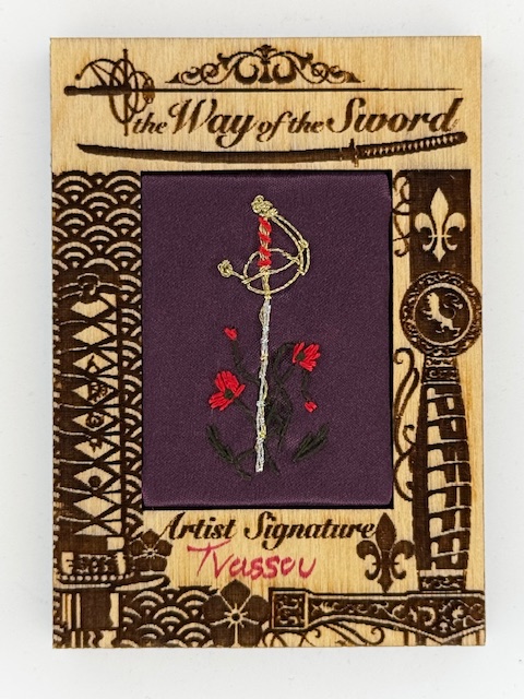
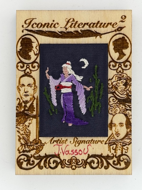
In certain sets a small number of the most unique subset I’ve come across were inserted. These wooden cards had a cloth section in the center featuring hand stitched art by either Niki Konstantinou or Triantafillia Vassou. The creativity and craftsmanship that went into these is phenomenal.
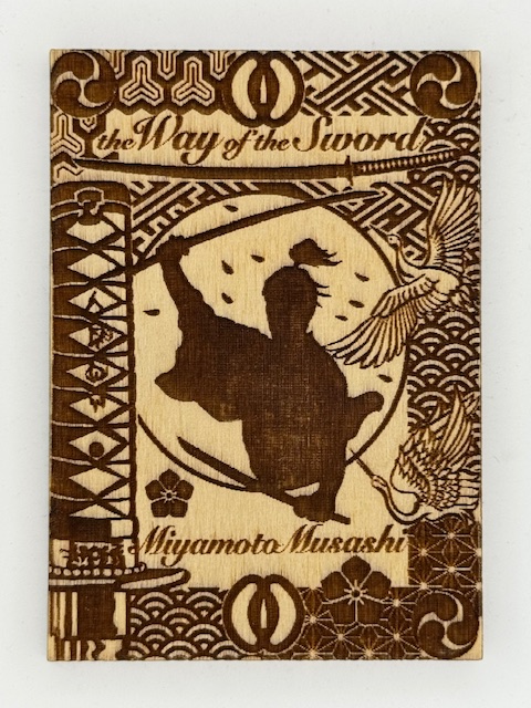
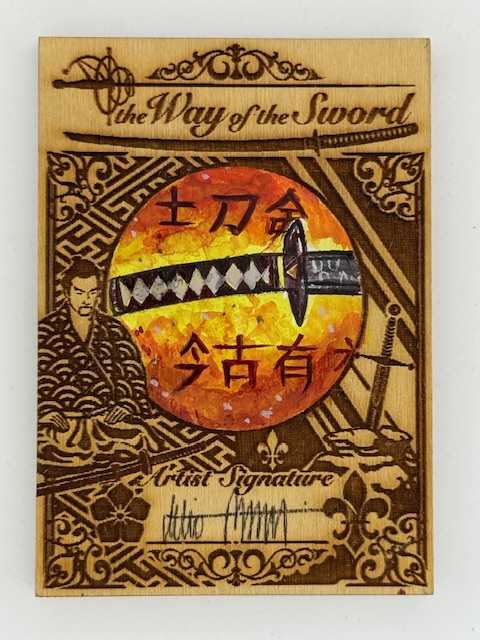
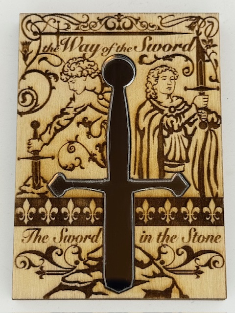
Another really creative way Iconic Creations used wooden cards was the occasional insertion of mirrored surfaces. The Way of The Sword set featured a a simple and elegant mirror chase card with a cutout in the center of the wooden card for a mirror in the shape of a sword.
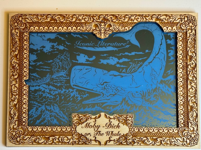
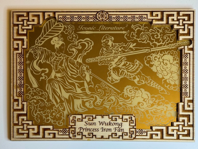
The secondary bonus for the premium boxes was often an oversized metal card, but for Iconic Literature 2 it was one of three large colored mirror images on a wooden card with the usual impressive etched borders.
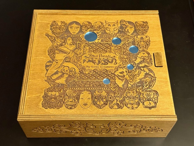
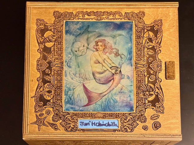
While not cards themselves, the premium boxes I’ve mentioned are another incredible card set related use of wood. The boxes the “box topper” sketches came with were large wooden storage boxes with intricate designs on the top and sides.
The designs varied, with some sets having entirely etched tops and others featuring metallic overlays with a few different images from set artists. These boxes were fantastic works of art in their own right.
Mermaid “Box Topper” wooden sketch card by Juri Chinchilla.
That’s it for this look at some of the ways wood has been used in trading card sets. Best of luck with wherever your personal collecting tendencies take you.
Thanks to everyone who’s given this a read. Derailments of Thought currently updates sporadically, but more regular posts will hopefully be on the way soon.
If you enjoy the blog any support is appreciated, including shares on social media and simply continuing to read. If you happened to be inclined and able to help out monetarily please see my Ko-fi page. Every little bit helps.
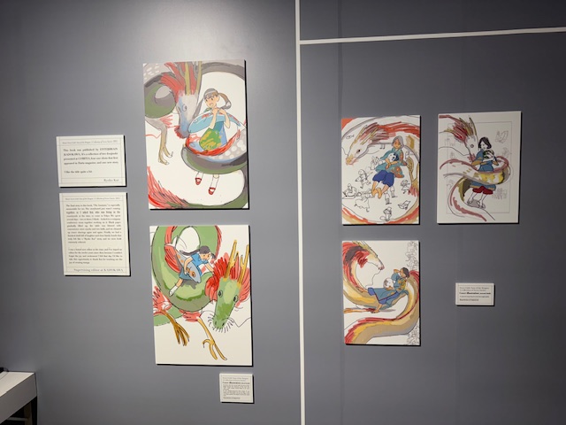
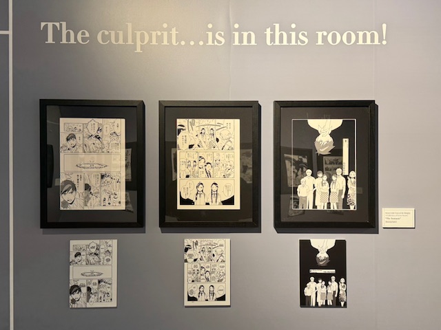
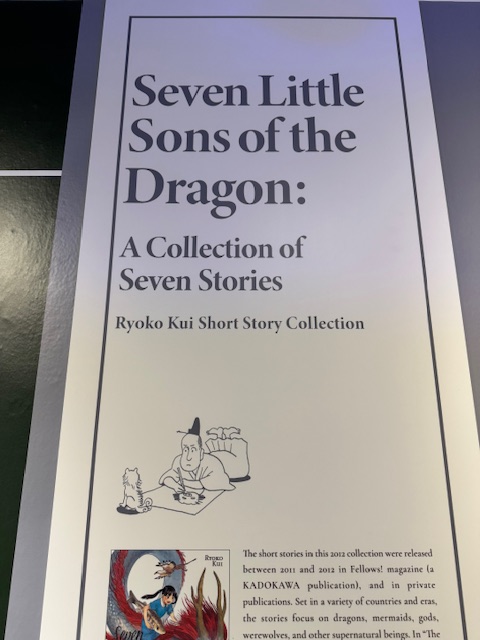
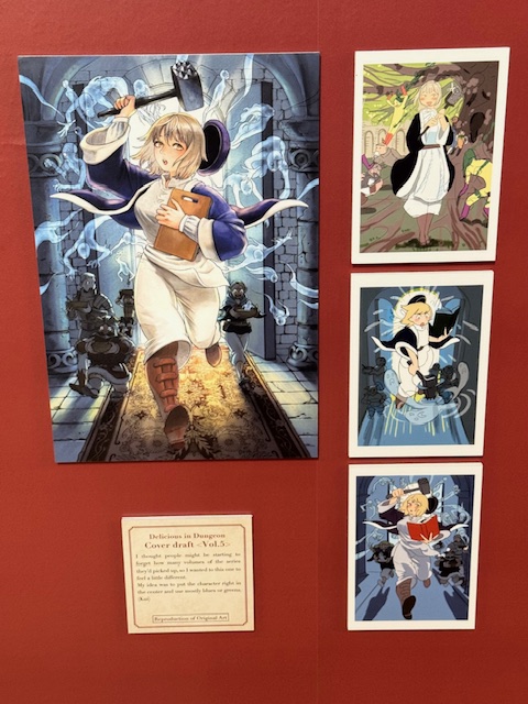
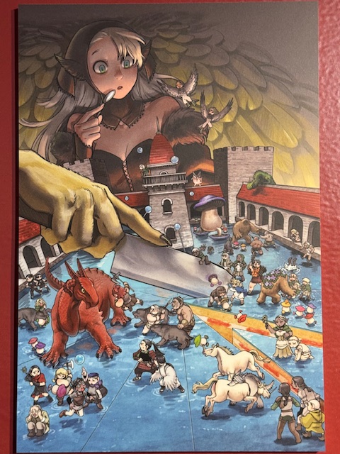
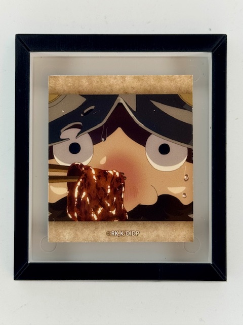
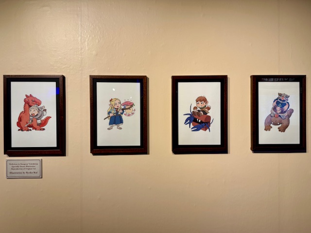
Featured in NYC for a limited time is a combined exhibition spotlighting both early works of Ryoko Kui and her big hit Delicious in Dungeon. I’m extremely limited in my ability to go out nowadays but was lucky enough to catch this.
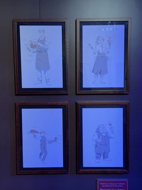
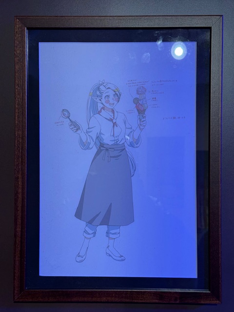
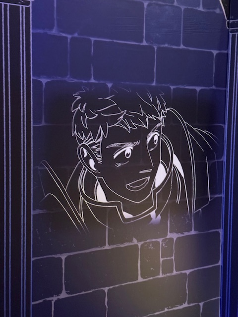
It’s a mid sized exhibit space spanning a couple of long hallways with two small offshoot rooms, but the walls are covered with a sizable number of art and displays providing an extensive collection of things to look at.
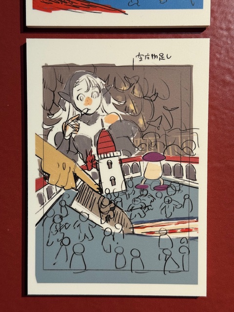
One thing I particularly adore in exhibits like this is when preliminary and concept art are displayed next to corresponding finished art. There was a good amount of that here and it was all really cool to take in. Original volumes of her early manga were also on display to be looked through with a couple even having a translated volume to read (all unobtrusively tethered to keep them by their designated spots).
I’m mostly familiar with Delicious in Dungeon by reputation, having just watched the first episode so far. But that was enough to understand the appeal and I still thoroughly enjoyed looking through everything on display.
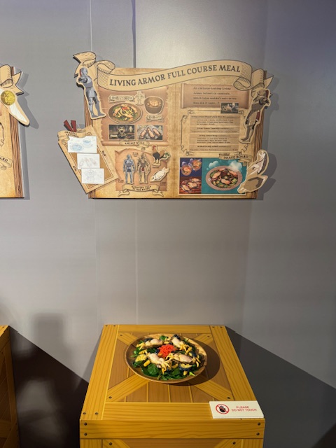
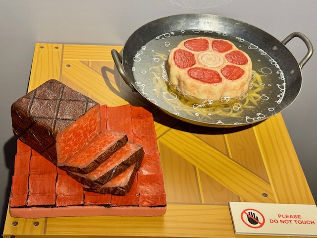
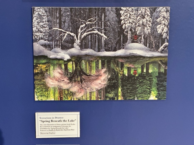
Delicious in Dungeon has become incredibly popular in part due to its unique core concept and visually stunning depictions of the monster based food central to the show.
The section of the exhibit dedicated to this aspect is particularly great. Explanatory posters with an ingredient list and a bunch of pictures were displayed above well done plastic replicas of dishes from the show.
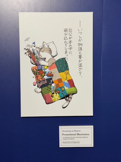
There was a large variety of merchandise available at the store on the way out, including shirts, random pull magnets/pins/keychains, acrylic standees, manga volumes, and so on.
Visitors get a free random (of 8) postcard for attending and can get another (from a different pull set) for posting on social media while there. Pictures are allowed (which admittedly is blindingly obvious this far down in this post) but no video.
I was done in about an hour, but it was still well worth it. This is an extremely well done pop up experience that’s exactly advertised: numerous displays of cool replicas of art and items from the works of Ryoko Kui.
This exhibition is in NYC for just another couple days. Definitely worth a look if you can fit it in. Tickets must be purchased in advance for their their Eventbrite site, but availability permitting it can be done right before going in.
Thanks to everyone who’s given this a read. Derailments of Thought currently updates sporadically as I am able.
If you enjoy the blog any support is appreciated, including shares on social media and simply continuing to read. If you happened to be inclined and able to help out monetarily please see my Ko-fi page. Every little bit helps.
Seems to be tradition at this point that when I manage to do retrospectives for the blog I’m at least a month past the actual anniversary (actually a full two this go round). My sense of time certainly is off kilter nowadays and summer simply blurred by.
And with the pandemic upending the world and me being largely on hiatus for a few years it’s been a while since I did one of these. But better late than never, and my tiny little corner of the internet somehow got to a decade old this past July.
Overview
It’s been four years since my last blog retrospective, which was post #682 at the time. This is post #728 (I’ve deleted exactly 2 entries ever, so my total number of posts written since last time is 48). Under 50 posts in 4 years is on the low side to my previous output, but there was practically nothing from 2021-23, so not too bad overall for my slow and struggling return over the last year and a half.
I did not make 700 posts by end of 2021 as I hoped to. In fact I didn’t write anything else in 2021 after the retrospective, had only 3 entries in 2022, and nothing in 2023. My chronic illnesses and others things have impacted my life in big ways. But this blog is a passion project of mine, I enjoy being able to share my thoughts on my hobbies, and I’m glad to be back, sporadic as it’s been.
In early 2024 I was preparing to return to the blog with another retirement piece and some art related content. Instead those came later and my first post in a year and a half was an emotional farewell to one of my favorite wrestlers who unexpectedly passed away extremely young. I had the privilege of attending Asahi’s debut match in person, and was a big fan of the effort and emotion she poured into her wrestling. She is greatly missed. Rest in peace, Sunrise of Hope.
Specific Post Details
Looking back in aggregate there was a lot of variety in my posts and there’s a lot to cover in terms of stuff I’d like to highlight. Writing was often a struggle during this time period and it’s nice to be happy with the results of that effort.
While the genres covered are largely the same through the life of Derailments of Thought, the specific manifestations have morphed a bit. With my health limitations in a post pandemic world I’m not able to go out nearly as much as I used to, and I can’t really travel at all. So my Japan trips and the live event coverage that resulted will remain a thing of the past for the foreseeable future.
I was lucky enough to manage a few local events across the last couple years though, including a fantastic NXT Roadblock at MSG and some concerts of the incredibly fun Atarashii Gakko. I also made it to one film of Japan Cuts 2024. Japan Society’s annual film festival was something I attended heavily in the past and was a big part of the early years of this blog, so it was cool to be back in some fashion and share thoughts on Great Absence.
As in the past some of the most special and personal posts are wrestler specific pieces that are usually about retirements, major career changes, or in a few unfortunate cases memorials. Several of my favorites have retired recently, and there are more announced to come.
These are all new posts since last time’s retrospective. Please see that post for links to a great many prior entries of these types.
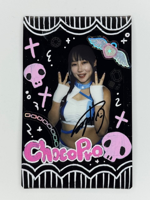
In addition, I wrote a special spotlight early this year about the joy wrestling can bring in general with particular focus on ChocoPro’s newest and youngest member, Kaho Hiromi.
Other wrestling content I’ve done recently focused mainly on match spotlights, ranging from unusual and/or potentially overlooked matches to stuff I wanted to revisit or just caught my eye.
The unique TokyoGameShow matches that happened in 2022 as part of promotional hype for AEW’s video game had never been aired until they were added to Wrestle Universe late last year. These included several once ever matchups featuring favorites of mine crossing paths so were a real treat to finally get to see.
In the last couple months I’ve looked back on some matches wrestlers currently performing in the US had in Ice Ribbon way back when, including Giulia, Stephanie Vaquer, and Asuka. They feature Giulia’s biggest match ever in the promotion she started in, a contentious match of hers against fellow rookie Asahi, Vaquer’s first match in Ice Ribbon as well as her facing one of the company’s rising stars, and a hidden gem of a match with veteran Kana against fiery rookie Yuuka. Was really cool to look back on all of these.
Another big part of the blog lately has been focused on the collecting side of things. I did card spotlights on BBM’s 2024 and 2025 Women’s Wrestling card sets, as well as features on specific types of unusual cards like printing plates, other metal cards, comic cuts, and minis.
Some of the posts I’m happiest about sharing featured several incredible artists from whom I have a wonderful collection of cards and other art. They include Miki Okazaki, Ice Ribbon’s Yappy, Lydi Li, and Veronica O’Connell.
In an effort to avoid mentioning and linking to every single post I did in the last couple years I’m going to gloss over the occasional book/movie/game reviews I did, but they remain an important part of the blog and I got to read/see/play some really cool stuff.
Lastly, one of my all time favorite writers passed away in May after a long battle with health issues. Peter David’s work shaped a ton of my views on what comics and novels could be. Rest In Peace, Writer of Stuff.
Top Posts
Going to approach this part a little different this time, primarily because the top 4 posts are exactly the same as last time, and going nowhere. They all had over 1,200 views then (plus a proportionate handful each since), which is dominant for my meager ramblings that have about 20 regular readers.
On that note, a copied reminder from my last couple retrospective posts regarding my most viewed posts:
“Derailments of Thought is 100% a personal hobby blog, and my little corner of the web is generally pretty modest in terms of views. More than half of my posts garner under 20, and the “highly viewed” posts generally end up with a few hundred. This is fine, and I greatly appreciate everyone who takes the time to read. I’m pointing it out for context for the extent in which a couple of my pieces have deviated from the norm. I’m sharing this short list because I find the mix of subjects and other little details interesting.”
Since last time only 2 posts have overtaken the 587 views 5th place’s Tokyo Joshi Pro 1/4/16 Live Thoughts had then, so I’m going to spotlight them specifically in lieu of rehashing thoughts on the above. Please see last time for more details on those posts.
One last note: my blog homepage itself gets a much larger percentage of the views than it used to, so all of this is highly approximate as there are no counts of what specific posts people read off that or tagged sections. I imagine my artist features are a bit undercounted as I get decent interest for those as I post about them on Instagram, where there’s no direct link to the individual post just a general blog link in my bio.
The TJPW 1/4/16 show is now at 813 views, which would place it 6th now if this was still list format.
Yoshiko 686 views: The first new addition that caught on isn’t actually a new post since last time. It has been published just a few months before and mentioned in that retrospective and was steadily climbing in views. It’s a look back on one of joshi wrestling’s most infamous incidents after several years had passed and presented my thoughts on important context that I felt needed to be considered when looking back on it.
Farewell to the Muscle Idol: Reika Saiki’s Retirement 999 views: The other is amusingly being mentioned and linked to for the third time within this post. The Muscle Idol, Reika Saiki, was incredibly popular as a wrestler, an idol, and in her “muscle” related work and remains so even after retiring from it all. Not surprised this one piques people’s interest, and am glad to share my memories of her career. (Side note: that ridiculously precise view count is legit as of time of writing and was not fudged in any way.)
——-
Asahi PSC by Veronica O’Connell
So that’s a decade down. Wild how time flies.
Thank you to anyone who took some time to read through this retrospective, and I hope you found at least a post or two of interest to check out. I currently can’t guarantee any sort of update schedule, but I have stuff in the works and intend to keep at this as I’m able.
In the not too distant future I’m hoping to do more collecting and/or artist spotlights, as well as maybe continuing with more match features on interesting little moments from the past. There are a TON of recent and upcoming retirements so I’m playing around with a new format to share a few key memories of several wrestlers in one post. We’ll see if that pans out. And of course occasional book/movie/game reviews and other randomness will be sprinkled in.
Here’s to another ten years or so.
Again I’m extremely thankful for everyone who’s read, shared, and or commented on things I’ve written. Doing so is much appreciated, and often needed, support.
If you happened to be inclined and able to help out monetarily please see my Ko-fi page. Every little bit helps.
Unlike more unusual fare I’ve previously featured like metal cards and comic cuts, minis are one of the most straightforward subsets of trading cards. They’re simply cards that are smaller than the standard 2.5 x 3.5 inch (6.4 x 8.9 cm) size.
For clarity, this spotlight is about small cards with a traditional rectangular shape (although the ratio of the sides can vary). Die Cut cards that can end up smaller due to odd shapes and/or pieces of a standard card being cut away are a different matter that will likely get their own entry in the future.
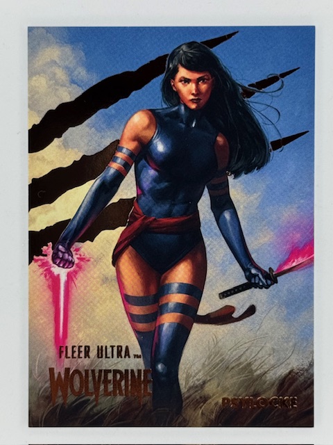
Sometimes a mini subset will literally be a smaller version of another card in the set (often a base card). Just an unusual variant for collectors to chase. The numbered minis from Fleer Ultra Wolverine, for example, were 2″ x 2.75″ versions of certain base cards.
Other mini subsets are unique, with art not otherwise used in the set.
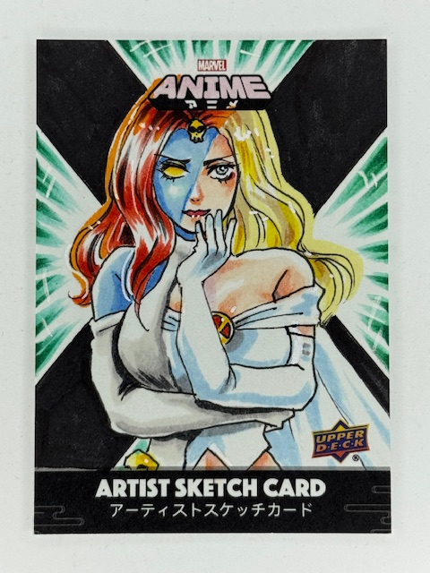
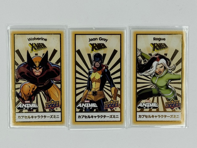
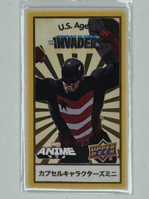
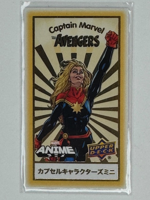
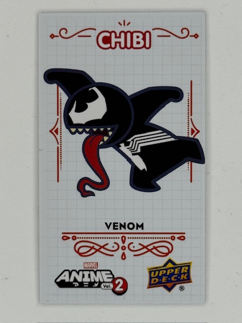
In Upper Deck’s Marvel Anime sets there were both “minis” and “chibis” subsets of tiny 1.5″ x 2.625″ cards. Minis focused on certain teams of heroes or storyline events and were grouped by theme.
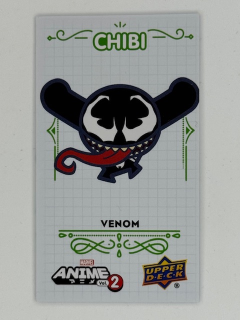
Chibi translates literally as small, but is used colloquially as slang affectionately describing small and/or cute things. As an art style it’s also called super deformed and is characterized by large heads, small bodies, and exaggerated features within simplified designs. The chibis subsets featured chibi versions of popular Marvel characters.
These types of minis/chibis (and similar variations in other sets) were usually released in a card within a card format. A standard sized card with a perforated section on the back is what’s actually inserted into packs. The perforated section tears away to reveal the randomized mini within. These minis are often categorized and randomized within a themed capsule card, such as by team, comic storyline, etc.
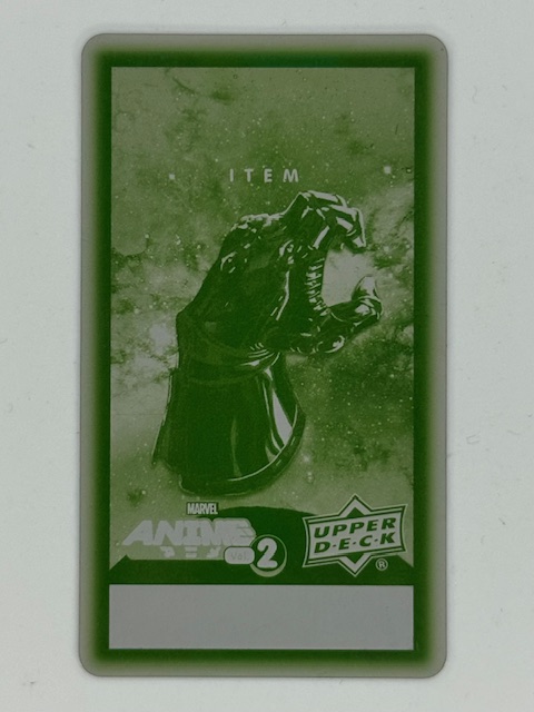
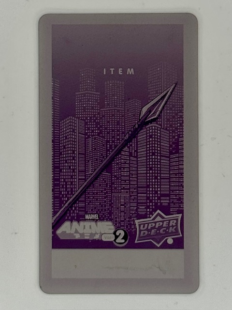
As I’ve written about before, printing plates are thin metal sheets used in the printing process of the card they correspond to. Printing plates for the minis subsets of Upper Deck’s Marvel Anime 2 were available as ePack achievements (prizes for completing certain trading/collecting goals within Upper Deck’s online platform). They’re really unique and interesting pieces of the set.
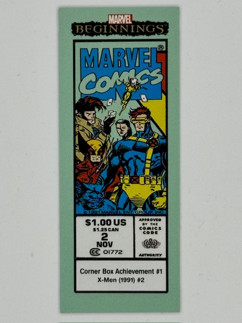
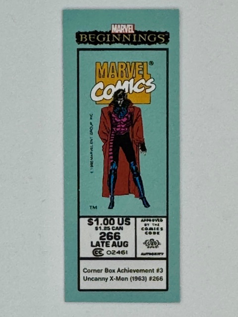
One of the more inspired uses of mini cards in comic related trading card sets recreate comic corner boxes. In the past these boxes appeared in the upper left corner of comic books with Marvel’s logo, character art, and issue information.
They severed as a quick identifier of the Marvel brand and key characters featured in the comic to catch the eye of potential buyers on crowded newsstand shelves and racks.
These corner box cards measure 1″ x 2.5″ and contained card set information around a replicated corner box from key past issues.
Size comparison to a standard sized trading card.
That about does it for this look at trading cards’ smaller siblings. Best of luck with wherever your personal collecting tendencies take you.
Thanks to everyone who’s given this a read. Derailments of Thought currently updates sporadically, but more regular posts will hopefully be on the way soon.
If you enjoy the blog any support is appreciated, including shares on social media and simply continuing to read. If you happened to be inclined and able to help out monetarily please see my Ko-fi page. Every little bit helps.
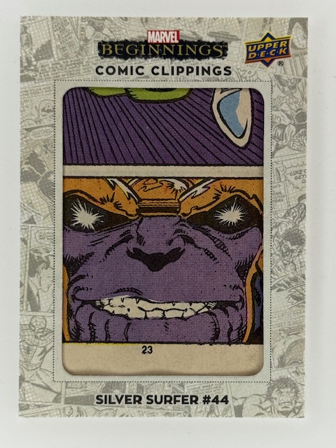
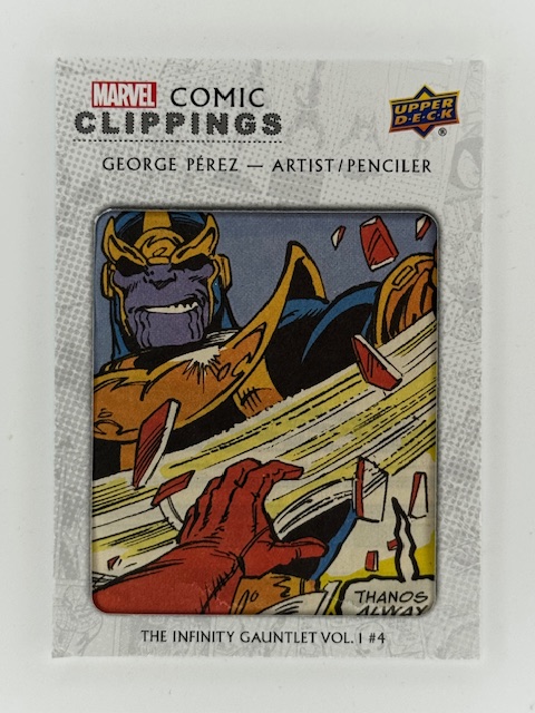
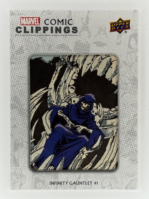
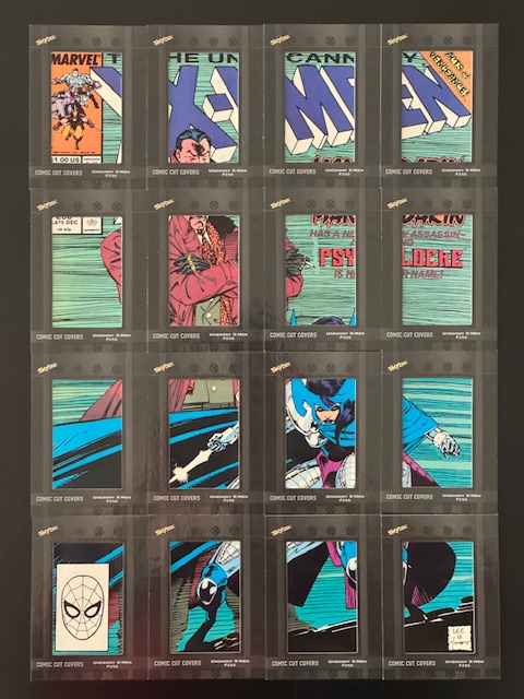
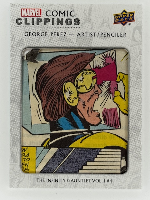
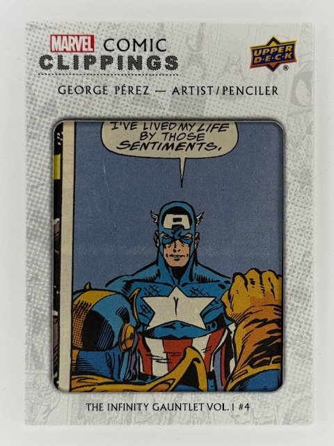
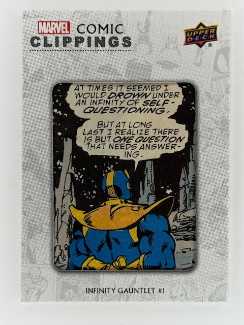
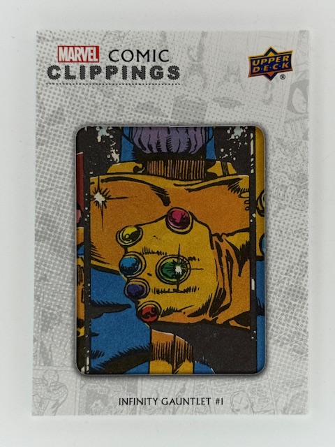
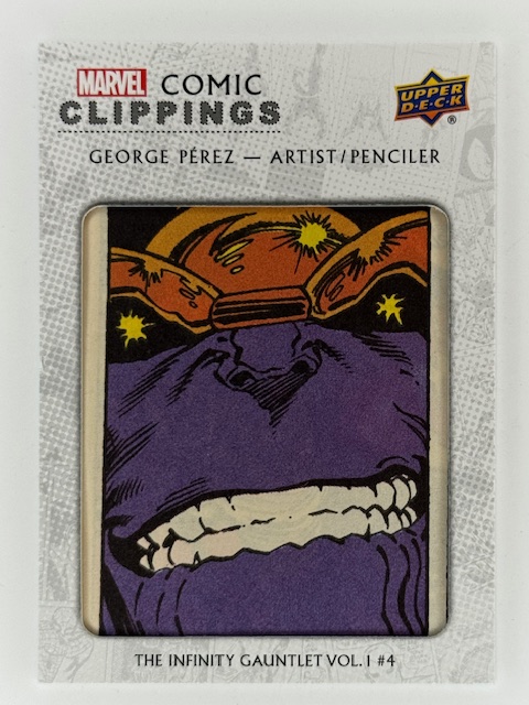
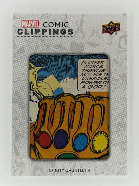
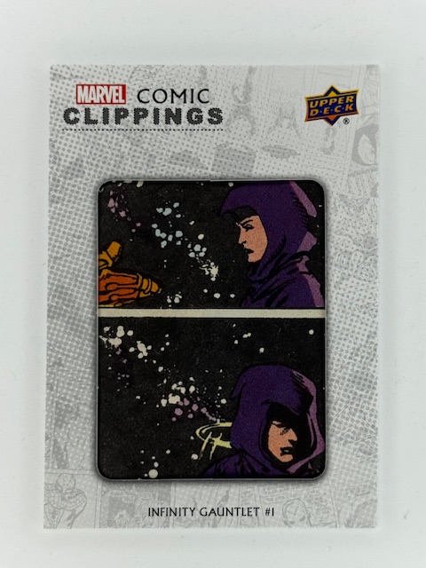
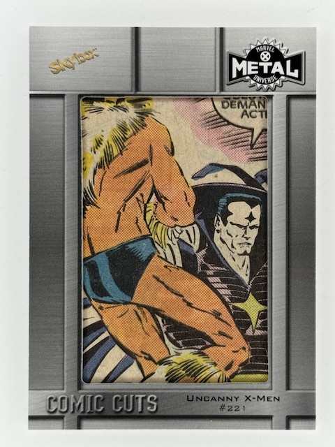
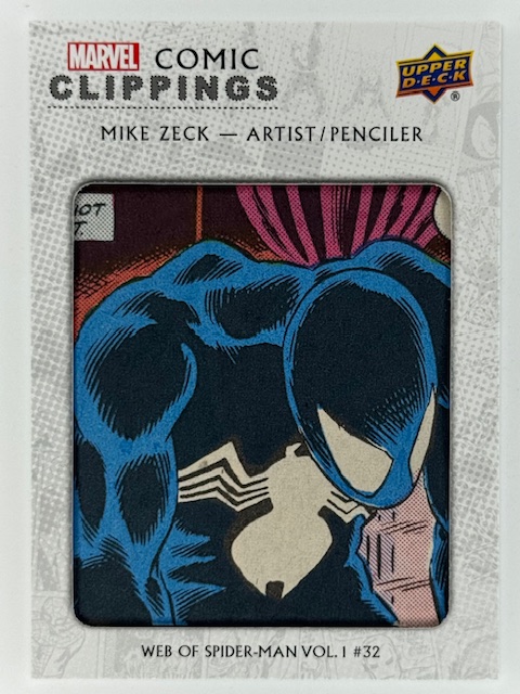
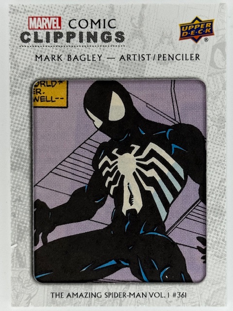
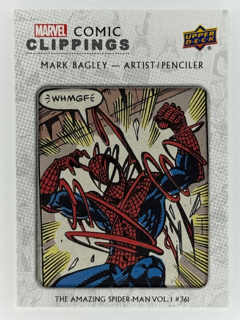
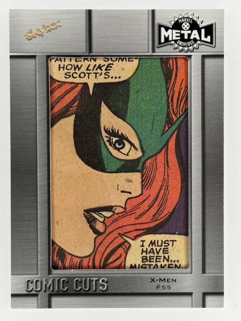
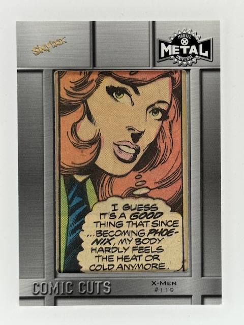
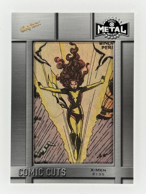
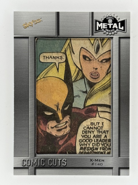
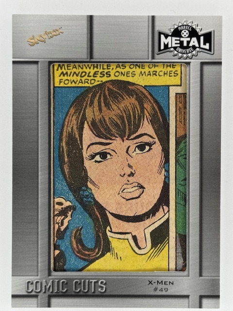
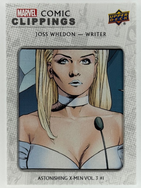
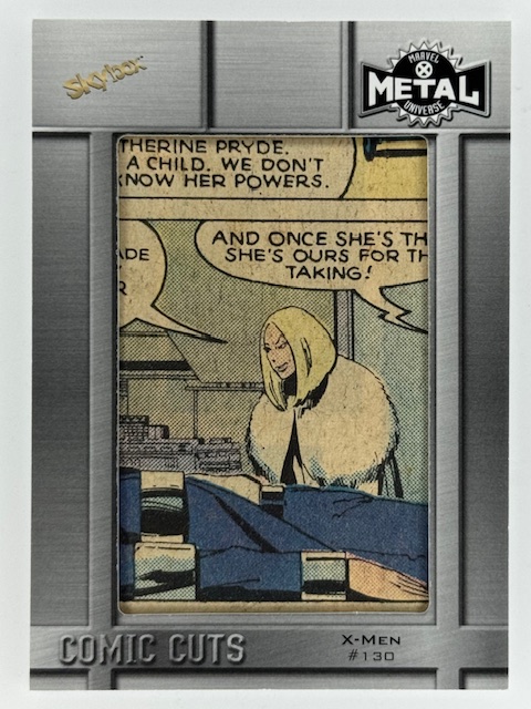
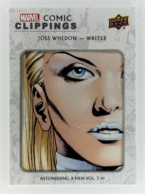
Comic card collecting is normally another format to view and appreciate images of comic book characters. Art can be original for the card set or reproduced from associated comics and can be shown on a variety of materials, but cards are usually a step removed from the inspiring items. However there are types of cards that directly tied to the original material in a physical sense: comic cuts.
Comic Clippings / Comic Cuts are exactly what they sound like. Some portion of actual printed comics cut out and put into a card. The cardstock has an opening on the front side to frame/show the clipping.
Clippings used to this are most often a single panel that can be spotlighted on the small surface of the standard 2.5 x 3.5 inch size for trading cards.
Comic cuts can be controversial, as some collectors don’t see the point of them and/or object to comics being cut apart to make them. I’m not going to wade into a debate of the merits. I personally like them as unique and unusual chase insert subsets.
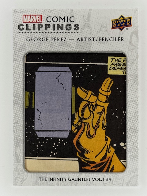
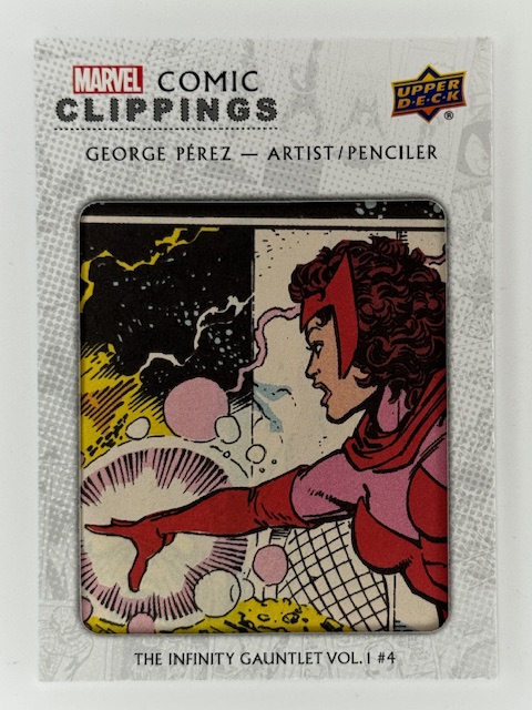
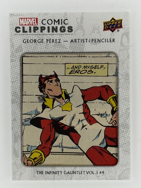
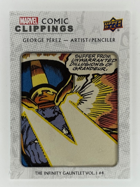
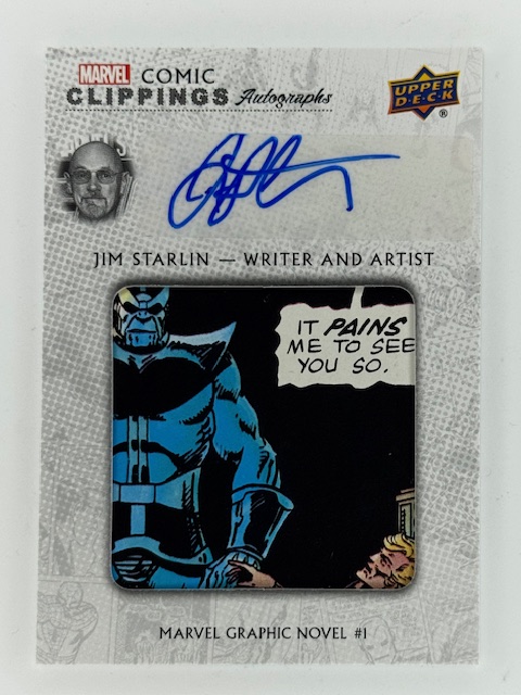
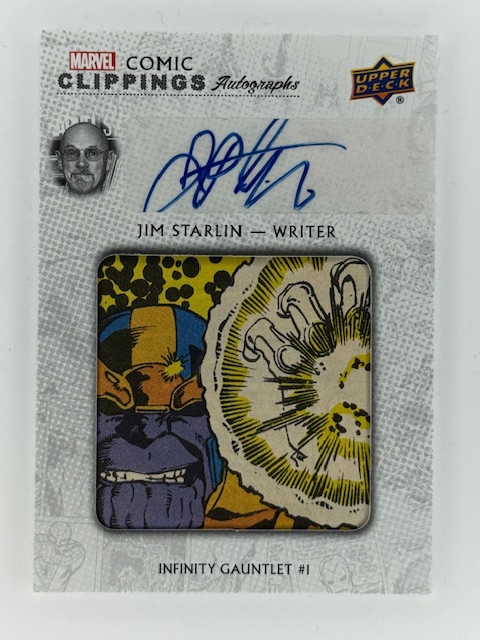
Like many other collectors of this type of insert, I concentrate on collecting cuts of favorite characters and storylines. Infinity Gauntlet, which I read as it came out when it was originally published in 1991, remains one of my favorite comic stories of all time. It contains the broad strokes storyline that was the basis for Thanos’ role in the MCU. A good chunk of my comic cut card collection feature panels from that six issue series, with special focus on Thanos himself, Lady Death, and Nebula’s brief time with the gauntlet.
Other cuts I’ve sought out relate to specific favorites, including Emma Frost, Psylocke, and a host of other X-Men characters.
I adore cuts of characters that visually stand out. In particular the Spider-Man related cuts in my collection tend to focus on black suit Spidey and Venom. The design is striking and looks great spotlighted in this format. A couple of these cuts come from another classic, favorite storyline of mine, Kraven’s Last Hunt.
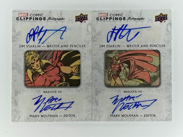
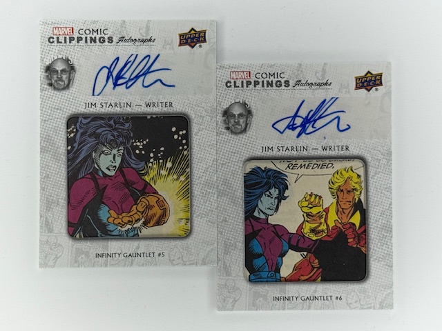
One of the cooler variations of comic cuts feature autographs of creators of the comic issue the cut is from. These can be from the artist of the shown panel, but also the writer or editor of the issue.
Occasional, rare dual signature cards are signed by writer/artist or writer/editor pairs. I have several with signatures by Jim Starlin, many on Infinity Gauntlet panels and a couple duals from Warlock with editor Marvel Wolfman, as well as some by legendary X-Men writer Chris Claremont.
These cuts feature smaller clippings, as the border surrounding the cut needs to leave room for the autograph. Autos are typically done via sticker rather than directly on card for these likely for both space and production reasons.
Perhaps even more so than regular cards a comic cut’s desirability varies wildly from person to person due to a variety of factors. Personal taste is of course foremost, with individual meaning to stories and characters as discussed above often having even more significance than normal due to these containing actual pieces of the comics.
But there are numerous other considerations as well that don’t apply to other inserts. Cuts from issues that are rare or particularly significant can become more sought after. The condition of clipping is important, as older comics paper quality can have declined and the printed image san fade. Printing mistakes, imprints, or other imperfections can also affect perceived value.
One of the most interesting aspects that’s largely unique to cuts is how well the panel stands on its own. Uncluttered images and poses of popular characters tend to work best as opposed to half cut off panels overrun with text bubbles.
That said some collectors don’t mind mid-story text heavy cuts, and in certain cases a bit of context via speech bubbles or captions can more strongly tie back to the comic the cut was taken from.
Card design varies from set to set, which affects the shape and size of the opening and amount of border that will be surrounding it. This will impact how the cut looks and feels, as panels are very rarely going to measure the exact same as the display opening. As mentioned above pieces of other panels encroaching on the featured image can be less than ideal.
On the other hand cuts forced into displays smaller than the panel can sometimes provide a more dramatic focus on the subject. And so on. These are highly individualized collectibles that have a million little details that can determine whether any particular card speaks to a collector.
Beyond just the graphic design of the card set, there are some variations on the idea of comic cuts that make for unique implementations.
One interesting insert type is Upper Deck’s “Coinage,” in which actual coins are imbedded into the cards. For their comic related sets that had this subset they featured classic comic cuts as well, with the imbedded coin(s) equal to the cover price of the comic the clip is from when it was originally published.
Another interesting variation on the comic cut concept are cover cuts. Cover cuts feature an entire cover from a comic divided into card sized pieces, forming a multi-card “puzzle” that together show the original cover.
Cover cuts are usually only available via special redemption methods that allow multiple cards to be awarded together, such as ePack achievements, so that the collector is getting the whole cover and not just one random 16th of it. These were rewards for difficult to complete collecting tasks.
Milage on these varies, and they are even more susceptible to some of the things I’ve been discussing than normal cuts. Card borders are even more attention grabbing when they are crisscrossing a larger combined image, and can block key parts of the cover. Sometimes obscuring character’s faces, or otherwise hiding key portions of the image.
That said I personally think they look pretty great in some cases, and having a couple of them of key issues of favorite characters is one of the highlights of my collection.
I hope everyone’s enjoyed this look at a literal intersection of cards and the comics they spotlight. Best of luck with wherever your personal collecting tendencies take you.
Thanks to everyone who’s given this a read. Derailments of Thought currently updates sporadically, but more regular posts will hopefully be on the way soon.
If you enjoy the blog any support is appreciated, including shares on social media and simply continuing to read. If you happened to be inclined and able to help out monetarily please see my Ko-fi page. Every little bit helps.
Cabinet of Curiosities Treasure metal variant by Yuriko Shirou.
When thinking of trading cards, small collectible pieces of cardboard/card stock immediately spring to mind. But in modern collecting there are a variety of cards that break the mold a bit and are made from other materials.
Let’s take a look at the interesting case of trading cards made from metal.
Last month I wrote about printing plates, thin metal relics from the card creation process turned into collectables. In contrast here I’m highlighting actual cards made for various sets that are themselves made of metal.
One other side note before delving too deep: there are card sets and subsets that use “metal” as a descriptor, such as the Skybox Metal Universe series. It’s a theming/branding thing and the vast majority of cards in those sets are still card stock. Those are different from what I’m featuring here, which again are cards made of metal.
There are two main types of metal cards I’d like to showcase, with some subcategories. Then at the end of this post I’ll share a few tangentially related cards.
First up are the straightforward case of printed metal cards. These are exactly what one would think of as trading cards, simply printed on metal instead of card stock. They are at a minimum a bit thicker than both standard cards and the thin metal printing plates previously referenced.
While metal cards are inherently more sturdy than standard cardboard cards, proper storage and protection can have some additional things to be wary of. For example stacking regular cards is usually fine for temporary sorting, etc. But metal cards can easily scratch each other if care isn’t taken and as such while it may seem counter intuitive it’s even more important to get them immediately sleeved and protected than normal.
Like other special inserts metal cards can be variants of base cards or their own unique subsets, and vary greatly in terms of rarity and design.
A great example of straight up base set variants are the metal cards featured in Iconic Creations’ sets. These cards are identical to their base set counterparts outside of the material they’re printed on. There’s more gloss to the finish on these than Iconic Creations’ base cards, and the hues end up a touch more subdued.
Perna Studios also does some great metal chase subset versions of their base, chase, and promo cards.
By Juri H. Chinchilla.
While some metal cards have both the front and back printed like their cardboard counterparts, like those done by Perna Studios, Iconic Creations and some other publishers use stickers for the backs on metal cards.
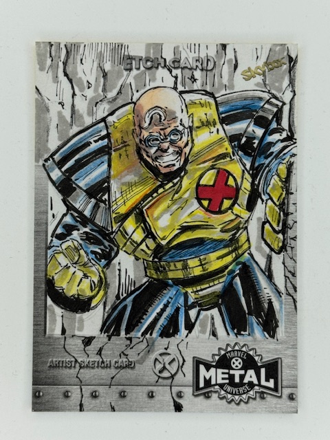
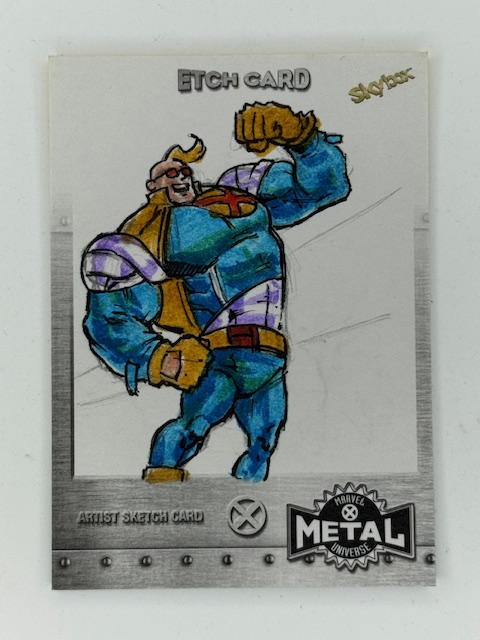
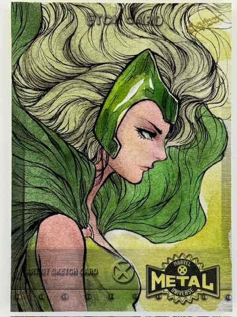
The metallurgy subsets from Marvel Masterpieces are fantastic versions of the base cards from the same sets. The designs on these vary slightly from the base, as the border is more filled in on these and as such the images are slightly cropped compared to the base and other variants.
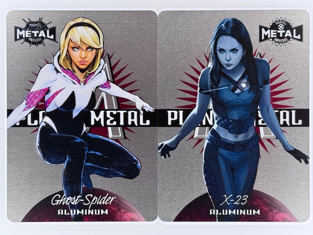
Planet Metal subsets from the previously mentioned SkyBox Metal Universe series (made nowadays by Upper Deck) are an unusual case. In some sets, such as the pictured cards above from Spider-Man Metal and X-Men Metal, they are a metal card chase subset. In others, such as AEW Metal, they are die cut cardboard.
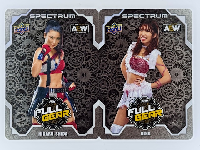
There have been metal AEW cards from Upper Deck in other sets, such as the Full Gear and Chair Shots subsets from AEW Spectrum.
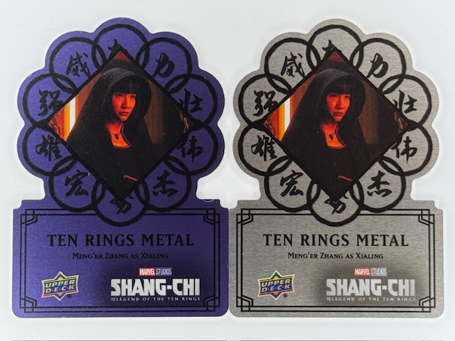
Metal cards can themselves have variants within a set. For example the die cut oval shaped metal cards from Upper Deck’s Shang-Chi set had rarer gold versions, and their logo shaped die cut metal cards had rarer blue variants.
Like “regular” trading cards, special subsets of metal cards are elevated with autographs. Cards may be signed by the athletes or actors featured, by the artist for art based cards, or creators related to the characters or stories referenced for comic related cards.
Often signed metal cards are specific, unique subsets. Although they can also be direct variations on non-autographed metal cards within the same set.
Pictured below is a Black Metal Logo Die Cut card from Upper Deck’s Shang-Chi set featuring Meng’er Zhang as Xialing next to the autographed version featuring the same design and image. Both were available exclusively as achievements via Upper Deck online purchasing and trading platform e-Pack.
Given the nature of the material metal card autos generally feature autographs affixed via sticker. But occasionally there can be direct autographs if done carefully with the right type of markers. The Stainless Stars subsets from Panini’s WWE Impeccable sets are great examples of autos done directly on metal cards.
Meiko Satomura and Io Shirai (now Iyo Sky) blue Stainless Stars cards.
The other major type of metal cards I’d like to spotlight is metal sketch cards.
Metal APs from Perna Studios’ Elementals and Hallowe’en Witchcraft sets by Stacey Kardash. Metal sketch cards/APs by Achilleas Kokkinakis from Classic Mythology III.
Like sketch cards done on card stock these are individualized pieces of art created on the cards. One side of the metal card is prepared with a surface meant for drawing directly on it.
Metal AP from Hallowe’en Witchcraft by Tony Perna.
In past sets Perna Studios had a small number of these metal sketch cards inserted in packs. For those sets artists often had a metal AP (Artist Proof) or two (in addition to their card stock ones) that they could accept commissions for within the content guidelines of the set.
Metal sketch cards/APs by Alexis Sarah Hill and Craig Yeung.
The combination of unique creations on unusual card material made these truly stunning pieces of art.
To wrap up here are a few metal related cards that aren’t exactly either of the types highlighted above, but do involve metal, are all pretty awesome, and are worth a look.
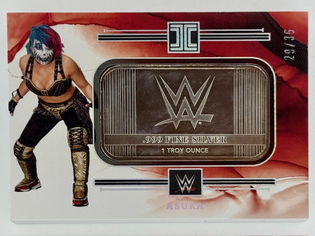
One subset that’s both cool and kind of hilarious is the silver bar cards from Panini Impeccable. There’s just straight up a 1 troy ounce mini silver bar in the card. The card itself is card stock surrounding the bar, but this definitely fits in this feature on metal use in trading cards.
All of the cards in this section are thicker than what most people think of for trading cards. In this case considerably so, as these monsters are 3/8 inch thick.
A really nice looking way to incorporate metal are framed cards. The card itself is still card stock, but it’s encased in a metal border (almost always gold colored in the versions I’ve seen).
Finally here’s an example of a metal card where an image is cast on it rather than printed. The below bronze Psylocke card is a tribute to Joe Jusko’s work on Marvel Masterpieces ’92 and was a reward as part of a Kickstarter for an art book featuring Joe’s images from that set.
That does it for this spotlight on a small sample of the interesting ways metal is used in trading cards. Best of luck with wherever your personal collecting tendencies take you.
Thanks to everyone who’s given this a read. 2024 was a sporadic return for this blog and I hope to sustain more regular updates going forward in 2025. Derailments of Thought currently updates once to twice a week.
If you enjoy the blog any support is appreciated, including shares on social media and simply continuing to read. If you happened to be inclined and able to help out monetarily please see my Ko-fi page. Every little bit helps.
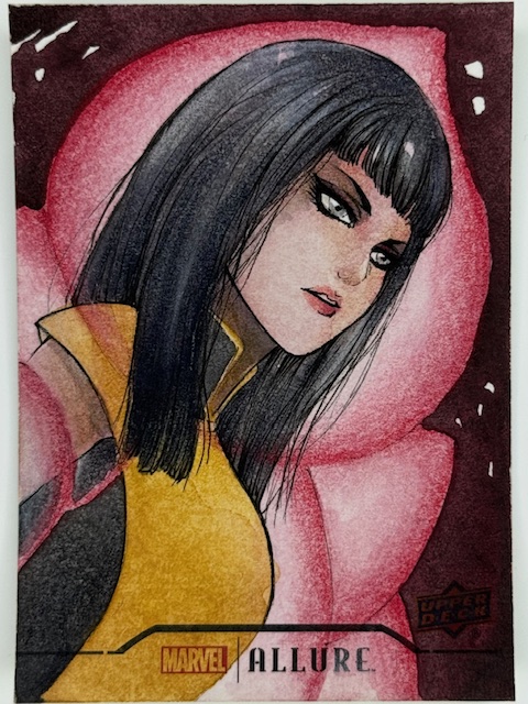
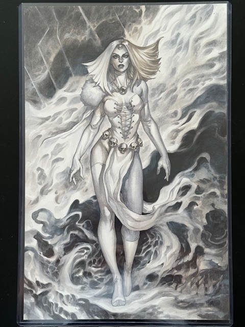
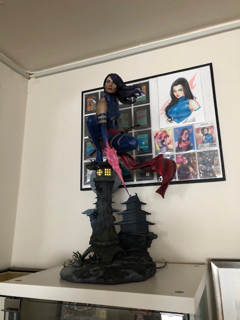
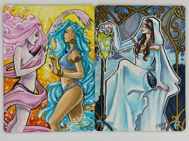
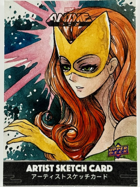
I’ve had a surprisingly difficult time finding the proper words to open this look at the work of a truly special artist. There’s something indescribable that jumps out of Veronica O’Connell’s art and demands attention. So I decided to let the stunning depiction of Psylocke above make the first impression.
Ghost Spider, Spider-Woman, & Silk AP by Veronica O’Connell
I honestly don’t recall when I first saw Veronica’s work, but I do remember being blown away with her versions of Marvel characters and immediately putting her art on my collection list.
There is an incredible balance of realism and the fantastic in her illustrations. Her takes on comic characters simultaneously look like they could step right off into the real world while still feeling appropriately larger than life.
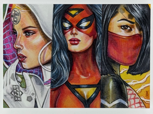
The qualities that initially caught my eye are on full display in the above gorgeous Spider-Women triptych, which is mind boggling. All the art I’ll be showing in this blog is directly drawn on blank trading cards. So each of the three characters shown above (Spider-Gwen, Spider-Woman, and Silk) is drawn on a third of a 3.5″ x 2.5″ work area. The detail and impact she’s able to achieve under such conditions is phenomenal.
There is so much style infused into Veronica’s work. Her use of color and lighting is exquisite and a big part of what makes her art so eye catching. It also underlies her emphasis of mood and atmosphere, making the same subjects feel different in different pieces depending on what she’s chosen to convey while retaining their core essence.
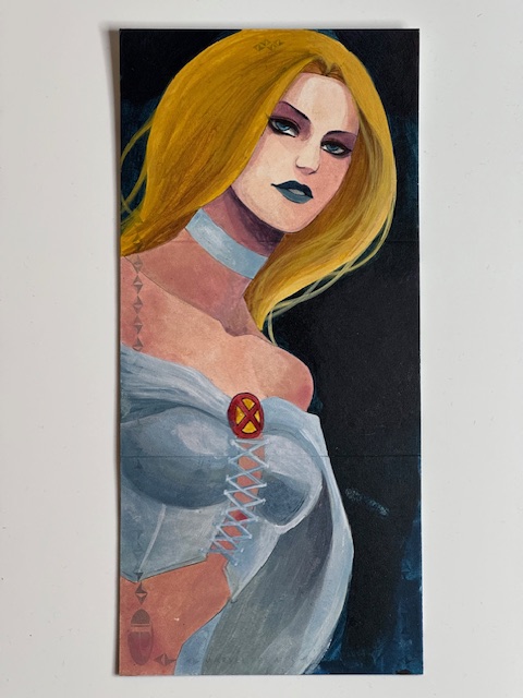
I have multiple cards by her of some of my favorite comic heroines, including Psylocke, Emma Frost, and Spider-Gwen, and the contrast between equally captivating depictions of the same character is fascinating to see.
Spider-Gwen PSC by Veronica O’Connell
My discovery of Veronica’s art through her Marvel work eventually led to the great opportunity to get some Personal Sketch Cards (PSCs) done as part of another key subset of my card collection.
I have followed and enjoyed Japanese women’s professional wrestling (joshi wrestling) for over a decade and collect related art in a number of forms. Veronica is the third artist to create PSCs for this collection, along with Juri H. Chinchilla and Miki Okazaki
Kairi Sane PSC by Veronica O’Connell
Veronica’s renditions of the wrestlers she’s drawn for me are absolutely stunning. She achieves an amazing level of detail, capturing the subtleties of her subjects expressions and doing an exceptional job representing their intricate wrestling gear.
Perhaps most impressive is her ability to create such incredible likenesses on such small workspaces. From a distance these precise works could be mistaken for photographs, while up close the aspects that make the depictions hyper realistic elevate them even further.
Over time I’ve gotten 24 wrestling PSCs from Veronica, featuring a total of 30 wrestlers. Only 8 of those wrestlers had been drawn for me before on PSCs by other artists, meaning 22 of the wrestlers she drew for me were first time subjects for my sketch card collection.
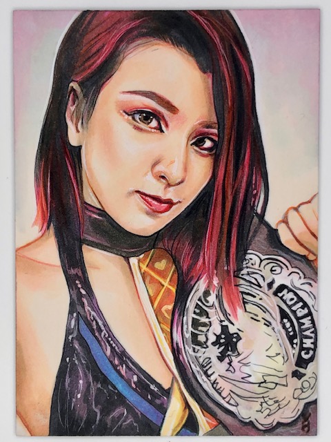
All of the repeats were drawn in different gear and/or with different partners than the other cards I have, and it was a treat to get Veronica’s take on recurring collection subjects like WWE’s Asuka, AEW’s Riho and Hikaru Shida, and Sendai Girl’s DASH Chisako. Likewise awesome was adding in wrestlers I’d been meaning to have drawn like Asuka’s tag partner Kairi Sane and Stardom’s Starlight Kid.
Juria Nagano PSC by Veronica O’Connell
The vast majority of the wrestlers I had drawn for the first time were a large number of roster members and regular guests from two of my favorite promotions.
From Tokyo Joshi Pro Wrestling (TJPW), Veronica did wonderful cards of now former roster members Juria Nagano and Sakisama (with Mei Saint-Michel), tag teams Miyu Yamashita & Maki Itoh (121000000) and Himawari & Wakana Uehara, long time roster members Mizuki and Yuki Kamifuku (Kamiyu), and the Up Up Girls Hikari Noa, Miu Watanabe, Raku, & Shino Suzuki.
Veronica’s encapsulation of that Up Up Girls lineup is a particularly nice memento for me given the recent departure of my favorite member, Hikari Noa, from both TJPW and the Up Up Girls.
The other big focus among the joshi wrestling cards Veronica’s done for me is a company called Ice Ribbon. One of my most watched promotions, it was a privilege to get Veronica to do related cards for me.
The core IR lineup I got includes brief former roster member Amu Yumesaki, and current roster members featuring second generation wrestler Ibuki Hoshi and impressive newer wrestlers like Tsukina Umino, Mifu Ashida, and Kaho Matsushita.
I was also happy to add former IR regular guests Ram Kaicho (from Triple Six), Saori Anou (now of Stardom), and Tae Honma & Maika Ozaki (SPiCEAP, both freelance), and reigning ICE Cross Infinity Champion YuuRI (from GanPro) to the collection.
As with the comic art, Veronica’s vivd colors, stunning lighting and shading, and delicate touches make all of her wrestler illustrations simply gorgeous. I could not be happier with how they all turned out.
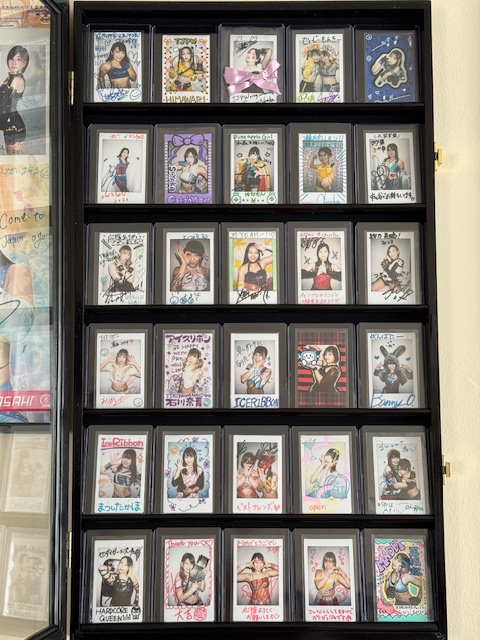
Joshi PSC displays. Art by Veronica O’Connell, Juri Chinchilla, and Miki Okazaki.
I’m extremely thankful to Veronica for all the fantastic art she’s created for me. I hope to continue collecting more in the future.
Asahi PSC by Veronica O’Connell
To wrap up I’d like to talk about a particularly special card Veronica’s done for me, although there is unfortunately tragic news attached to it. Early this year Actwres girl’Z reported a 21 year old member of their roster named Asahi had unexpectedly passed away. Asahi started her career in Ice Ribbon and was a personal favorite of mine. Nicknamed the Sunrise of Hope, she was always a joy to watch and is greatly missed. Veronica’s remembrance piece of Asahi is absolutely breathtaking and a cherished keepsake.
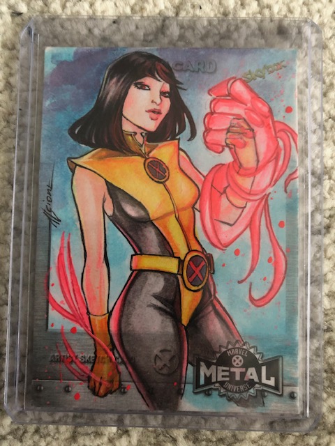
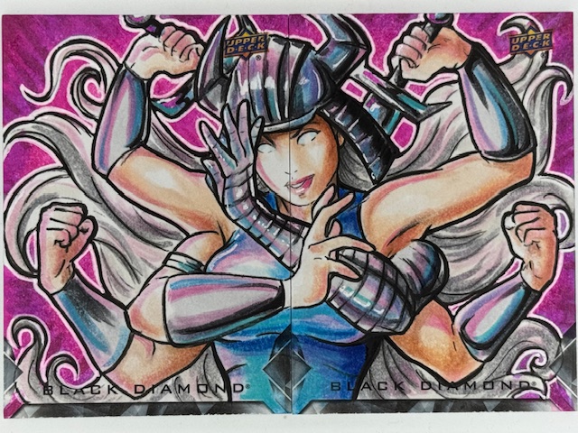
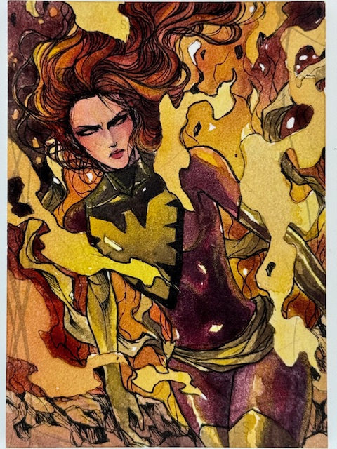
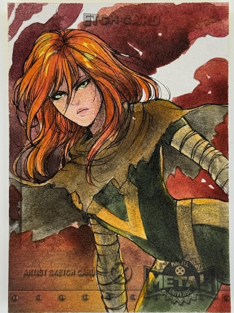
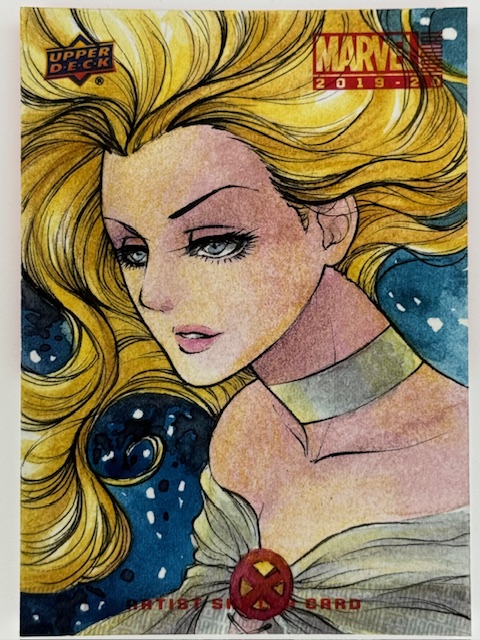
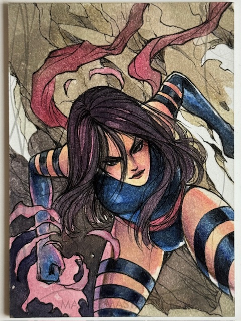
Sketch cards are unique pieces of art impressively created on extremely small workspaces. The Marvel comics related subset of these collectibles features a wide variety of styles from a great number of artists, and one of the very best is the phenomenal Lydi Li.
Lydi’s been a longtime favorite artist of mine. There’s something about her work that jumps out and leaves a lasting impression. Her cards are incredibly popular in general and are often prized possessions for those able to get them.
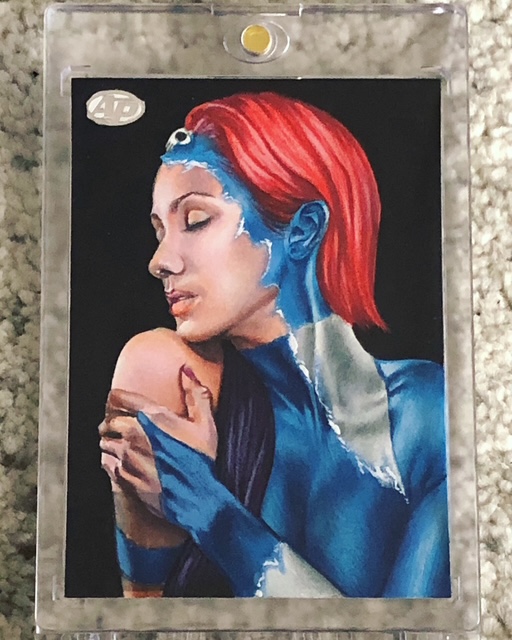
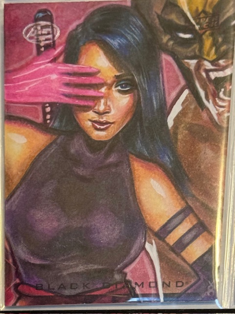
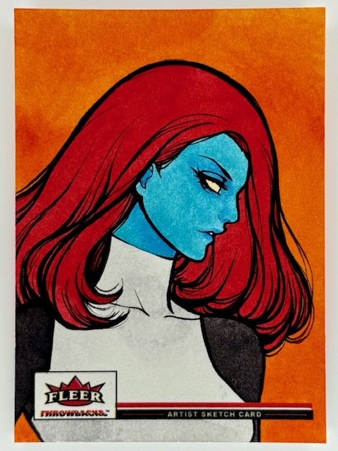
The subtle variety in her art of the same subject over multiple sets is a delight. Differing little touches depending on the theme and mood to be expressed make each masterpiece unique. The bold, saturated coloring on her Mystique from Throwbacks is stunning and perfect for the set.
In contrast her portrayal of the same character for Black Diamond features more muted tones. It’s almost reminiscent of Juri Chinchilla’s work (another absolute favorite of mine). It’s striking in a different way. Both cards are incredible, made even further captivating by their differences.
In general Lydi’s style is a wonderful balance of softness with vibrance. It’s eye catching and immediately recognizable, conveying the essence of the chosen character in a distinct way.
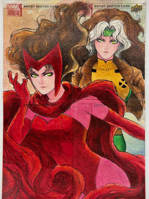
From great depictions of fun secondary characters like Armor to a vivd four card puzzle of powerhouses Scarlet Witch and Rogue every piece I have of hers demands immediate attention. A couple of recently acquired particularly cherished additions to the collection include a gorgeous triple panel of the White Queen Emma Frost and a jaw dropping Thanos framed by his beloved Mistress Death.
There’s a delicate touch to Lydi’s art that makes it evocative, with a sense of atmosphere and emotion simmering just below the surface. Her versatility makes seeing her cards side by side as fascinating as they are beautiful.
I’m extremely lucky to have so many of Lydi’s cards, and greatly appreciate the beauty and depth they add to my collection.
More information about Lydi’s wonderful art can be found on her instagram.