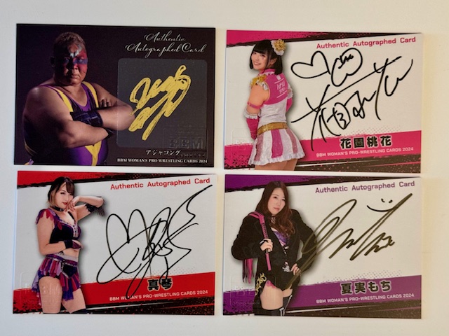
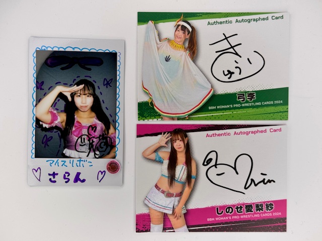
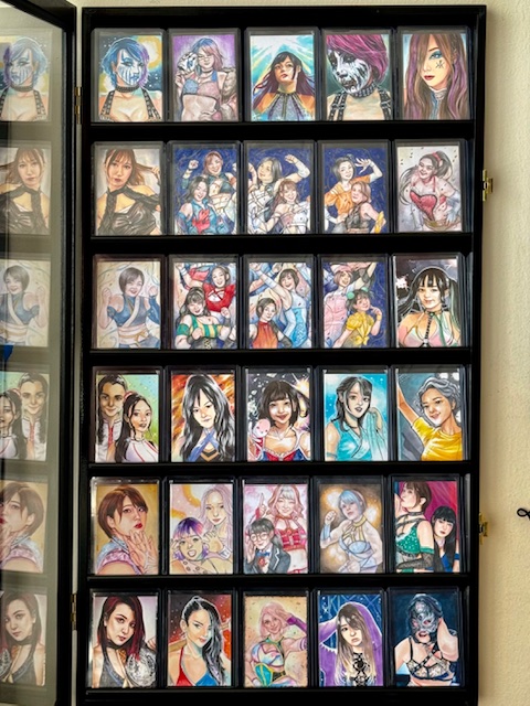
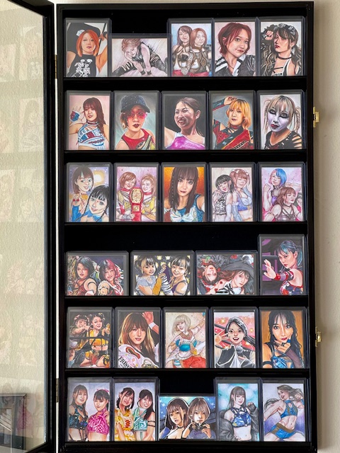
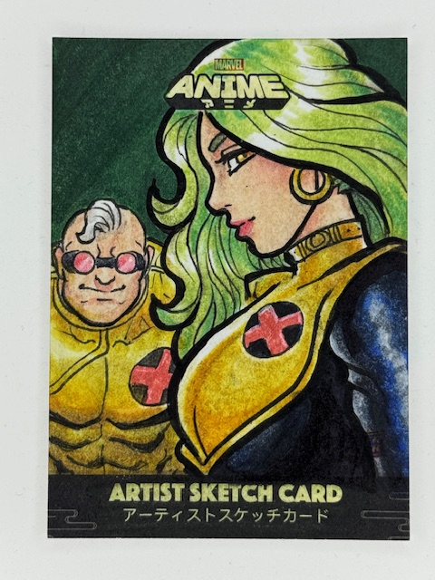
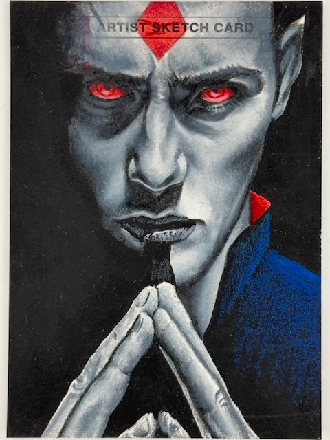
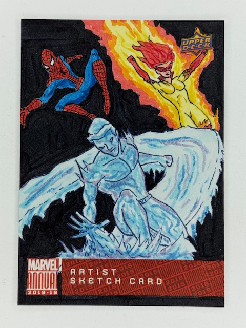
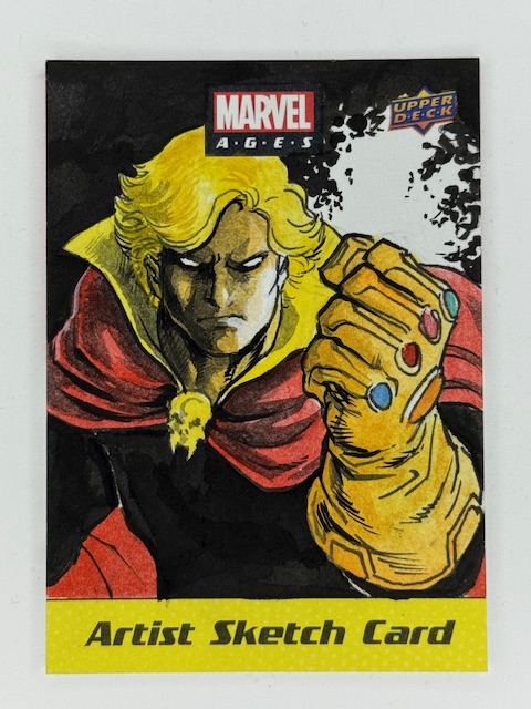
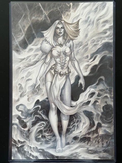
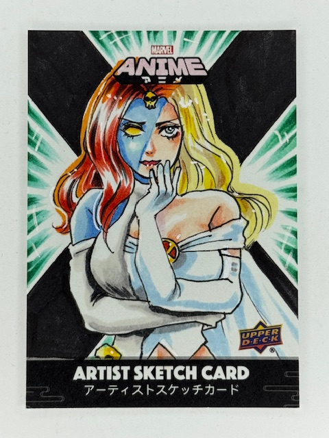
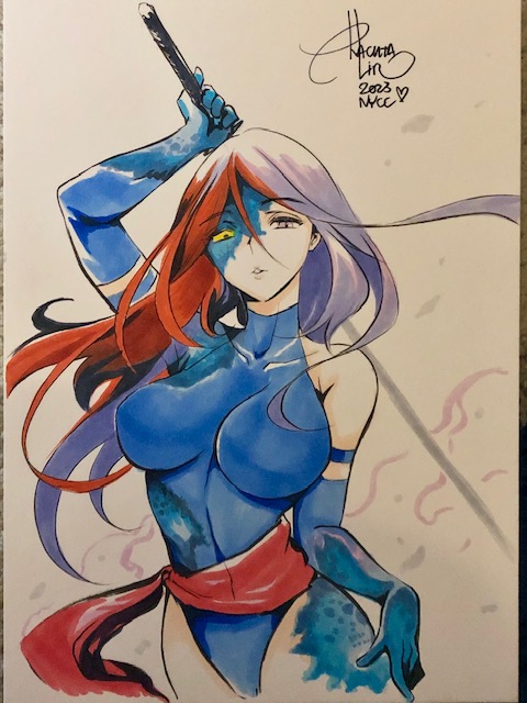
Short spotlight here where I’m going to let the pictures do most of the talking.
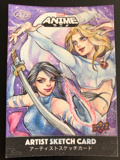
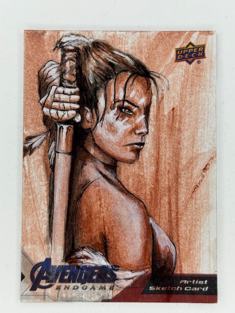
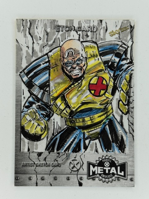
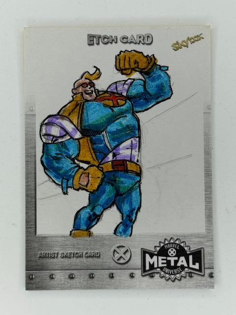
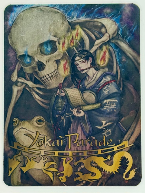
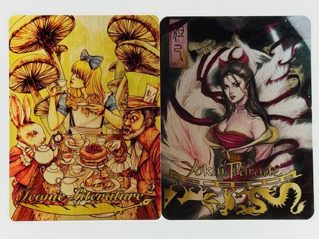
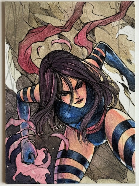
During my appearance on That Card Collectors Podcast I showed a handful of cards and discussed many more. Here’s a look at many of the cards and pieces of art mentioned.
A previous post I did with more details about that appearance, including where to listen or watch and links to several mentioned blog posts, can be found here. Please check the podcast out for more context on the wonderful cards and artists featured below.
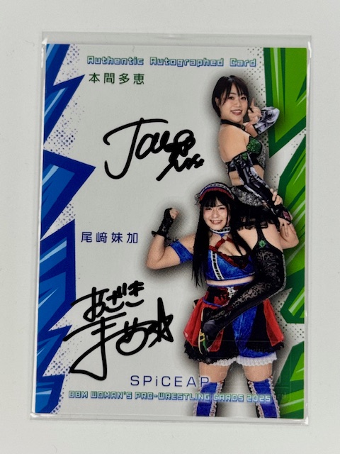
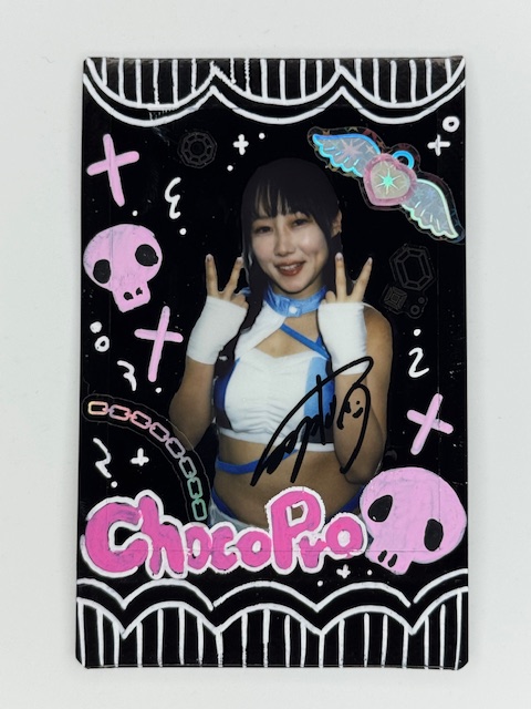
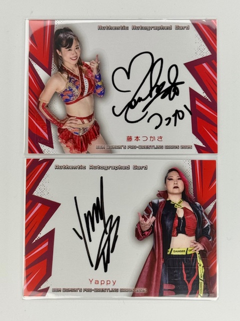
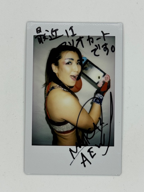
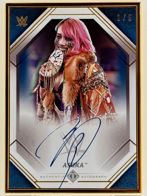
A variety of chekis from BBM’s Women’s Wrestling sets:
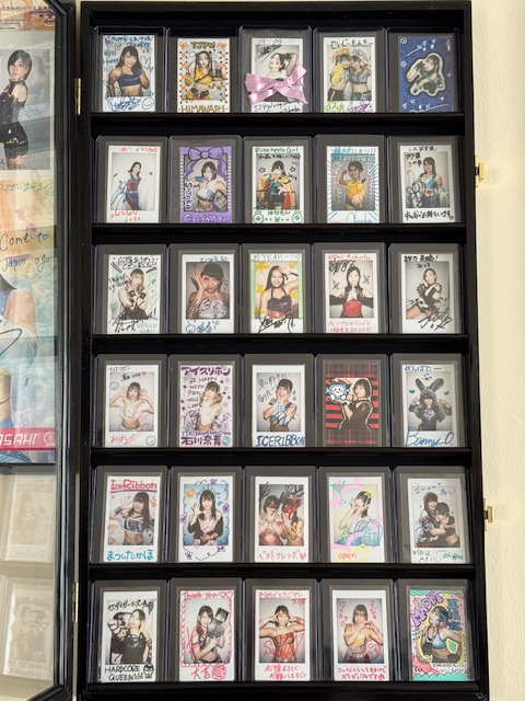
Joshi wrestler PSC collection:
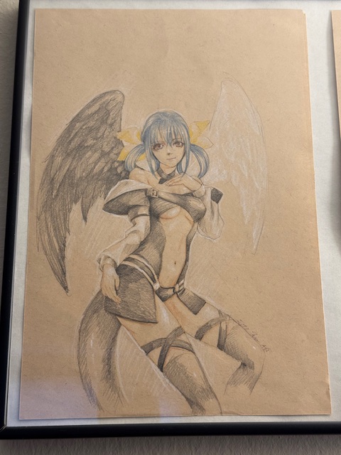
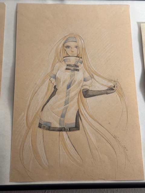
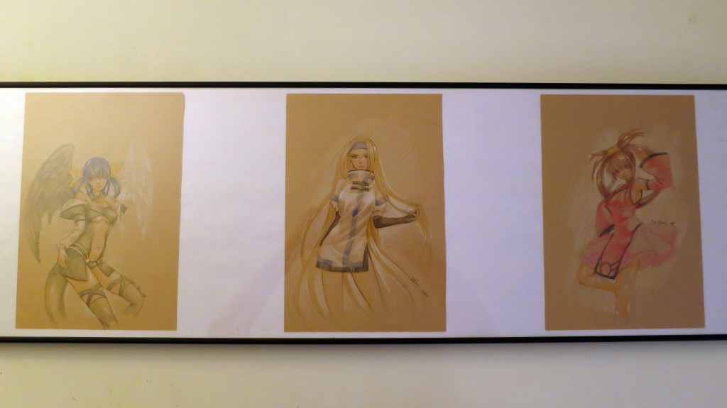
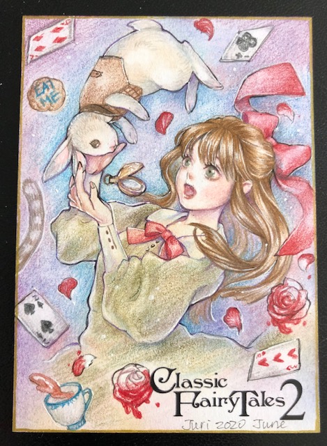
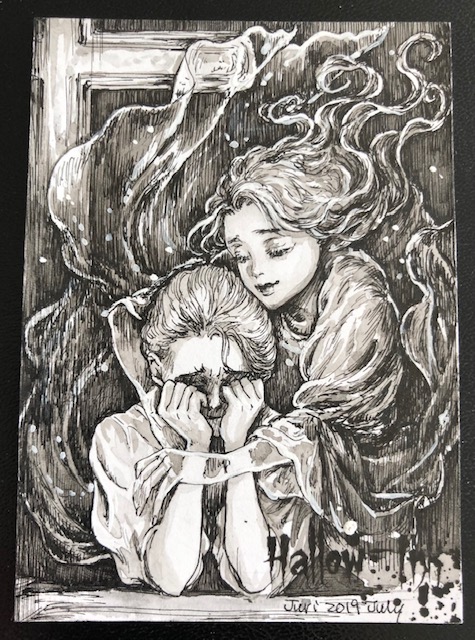
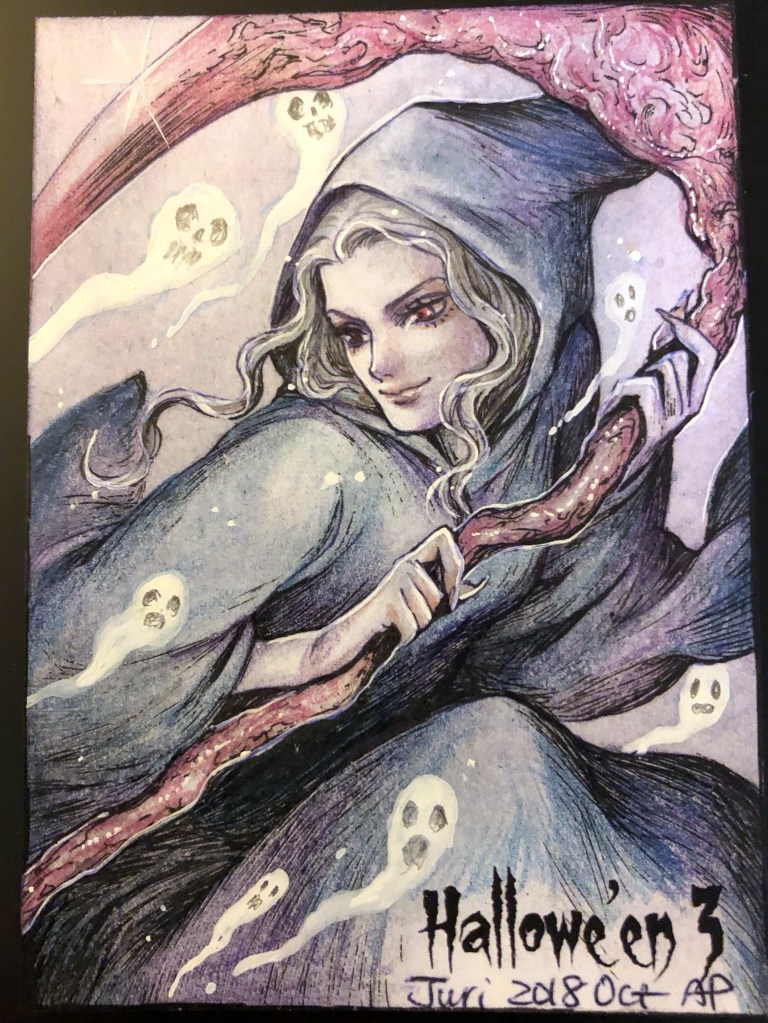
The first art commissions I ever got from Juri Chinchilla:
Dizzy, Millia Rage, and Jam Kuradoberi from Guilty GearKasumi and Ayane PSC by Juri Chinchilla.
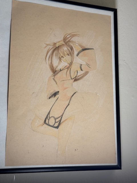
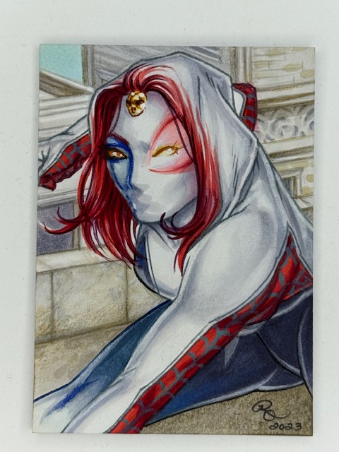
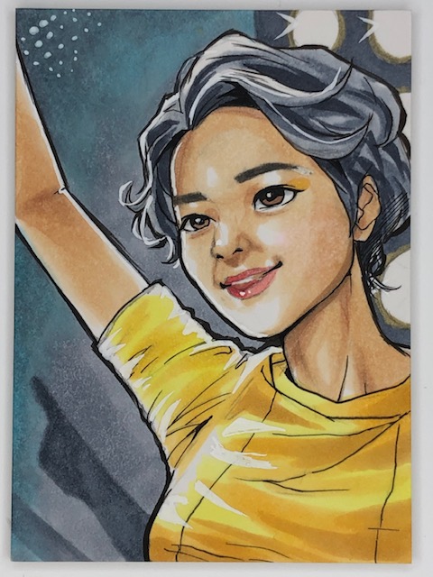
Nonoka Seto PSC by Miki Okazaki.
Best of luck to everyone with whatever shape your collection takes.
Thanks to everyone who’s given this a read. Derailments of Thought currently updates sporadically, but more regular posts will hopefully be on the way soon.
If you enjoy the blog any support is appreciated, including shares on social media and simply continuing to read. If you happened to be inclined and able to help out monetarily please see my Ko-fi page. Every little bit helps.
Quick bit of cross promotion in case anyone’s interested.
I recently chatted about my card collection with Ian and Josh on That Card Collectors Podcast. See that page for links to the episode on Spotify and iTunes, and find it (audio version) on YouTube here.
A video version where a lot of the cards we discussed were shown is also up on their YouTube channel here.
It was a fun time chatting with them about collecting. Please check it out (and see related blog links below).
Nonoka Seto PSC by Miki Okazaki.
We talked a bit about this blog and a number of card related posts I’ve done, including articles about specific card types and sets as well as spotlights on some incredible artists. Here are those posts for easy reference if anyone’s interested in further details.
Ghosts of Christmas “Box Topper” Wooden Sketch Card AP by Juri Chinchilla
Best of luck to everyone with whatever shape your collection takes.
Hikaru Shida cheki.
Thanks to everyone who’s given this a read. Derailments of Thought currently updates sporadically, but more regular posts will hopefully be on the way soon.
If you enjoy the blog any support is appreciated, including shares on social media and simply continuing to read. If you happened to be inclined and able to help out monetarily please see my Ko-fi page. Every little bit helps.
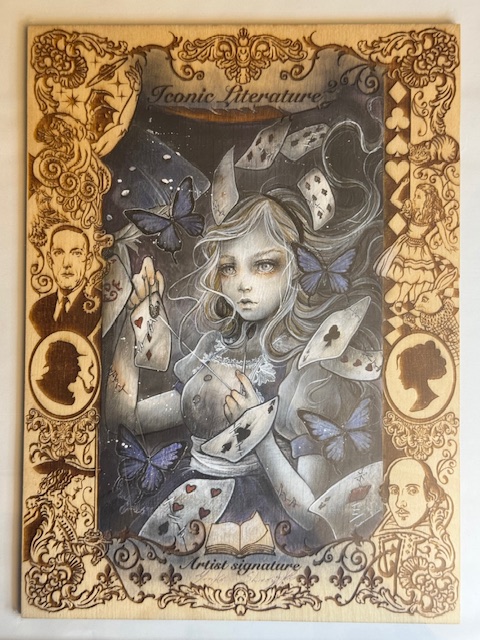
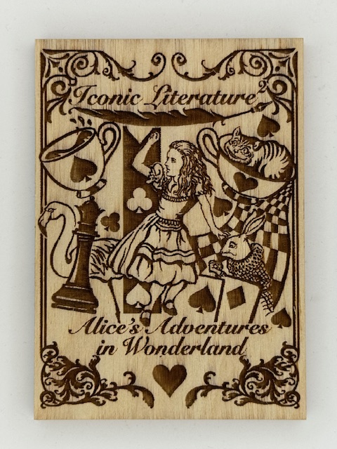
Alice in Wonderland “Box Topper” wooden sketch card by Yuriko Shirou.
I talked about some trading cards that go beyond usual card stock material previously in a look at various cards made of metal. Another even more unusual variation are wooden cards.
It’s as straightforward as it sounds here. Let’s look at some interesting examples of trading cards made of wood.
Wooden cards are generally significantly thicker than their cardboard counterparts, and the main distinguishing characteristic besides the material itself is that images are generally etched or engraved on the card.
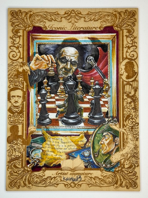
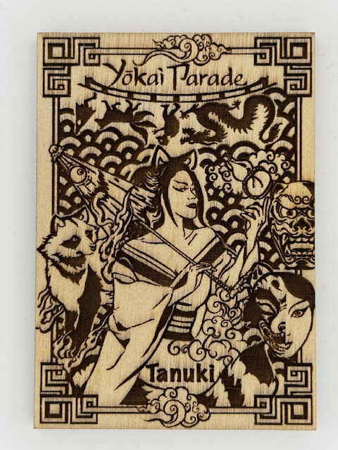
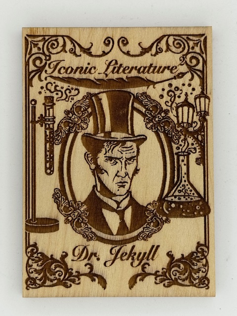
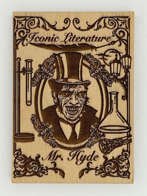
Iconic Creations is a card company headed up by Achilleas Kokkinakis (whose art I’ve spotlighted before). Their sets featured classic stories and historical and mythical figures, ranging from themes taken from classic literature to treasure hunting to Japanese folkloric monsters.
Iconic Creations did more with wooden cards and their variations than any other company I’m familiar with. The main chase subset in many of their sets were wooden cards matching the set’s theme, but with different art than the base cards. These cards make great use of contrast to present striking images.
For a few choice cards, when thematically appropriate like the above Jekyll and Hyde card, there were contrasting images on both sides of the card.
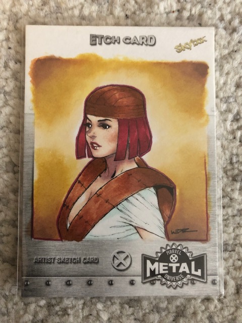
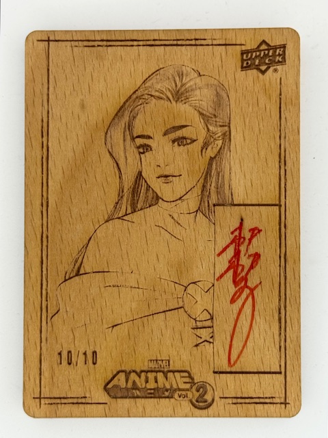
Upper Deck’s Marvel Anime 2 had a wonderful subset called Woodblock Echoes. These wooden cards had etched images that called back to the printed art of the first Upper Deck Marvel Anime set done by Peach Momoko. There were also limited variants of these signed by Peach.
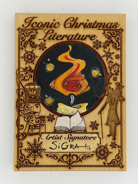
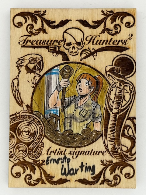
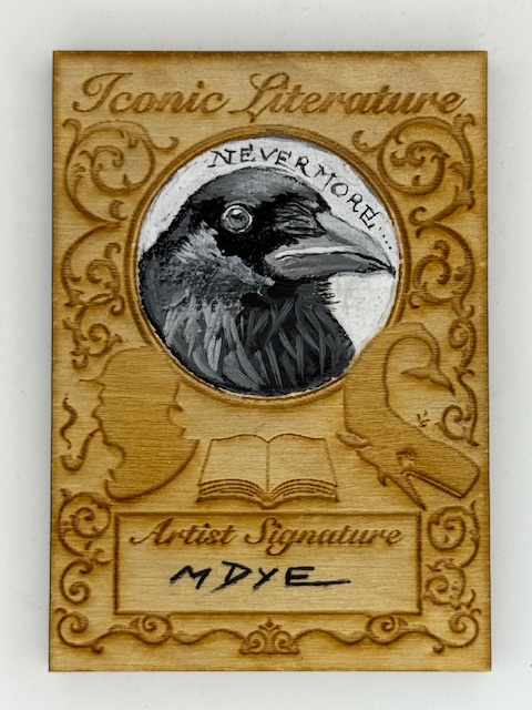
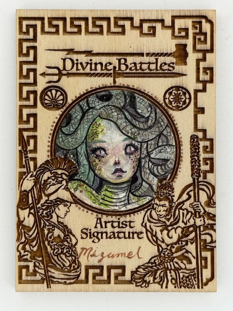
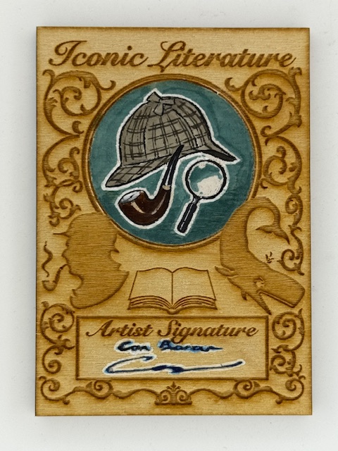
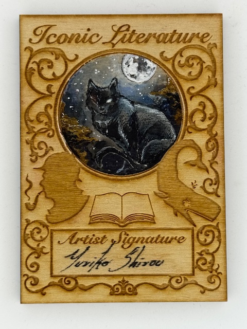
Going back to Iconic Creations for the remainder of this feature, sketch cards of different types were the centerpieces of these sets. Sketch cards are unique pieces of art where an artist has drawn directly on the cards. Perhaps surprisingly Iconic Creations’ sketch cards also had a subset of wooden versions.
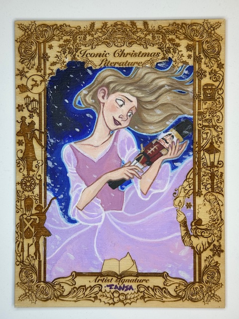
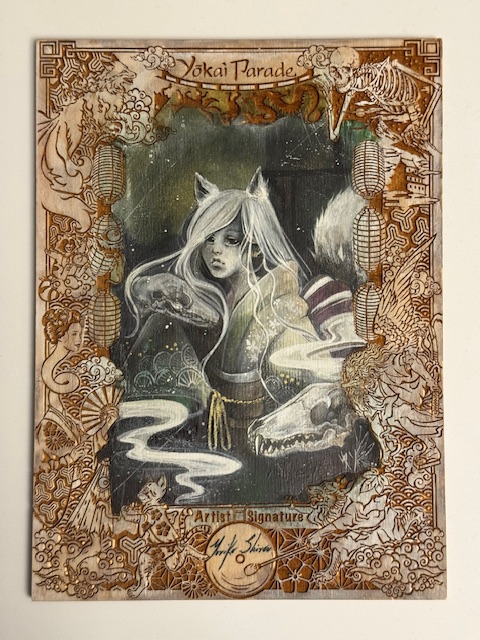
Their normal sized wooden sketch cards were general designed with etched art framing a circle reserved for the art and a separate space for the artist’s signature.
While the format provides an even smaller workspace than the already limited size artists generally have for sketch cards, it highlights the art nicely and the artists all did a great job making the most of the constraints.
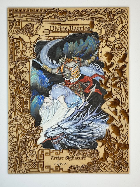
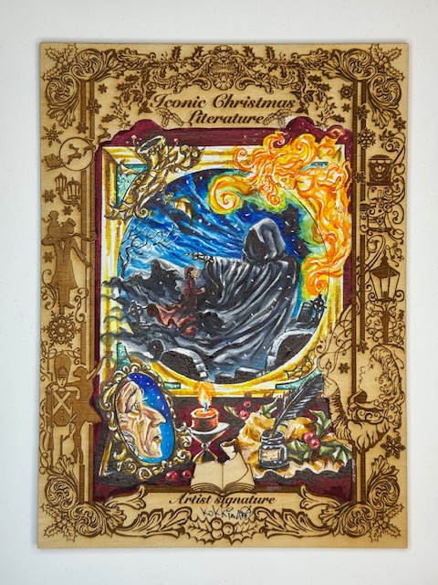
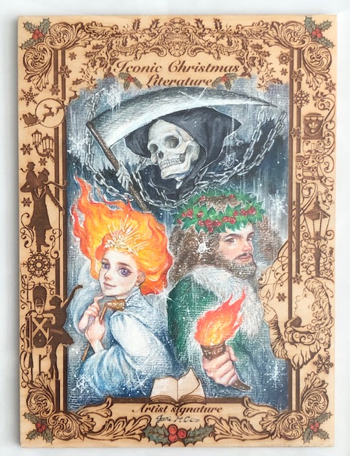
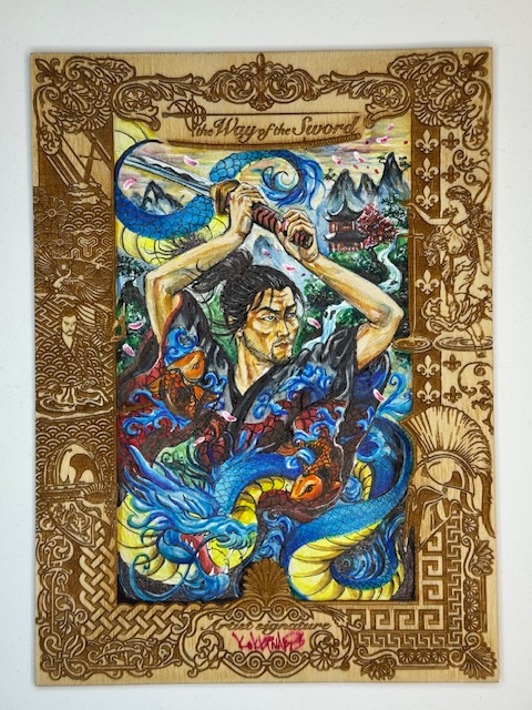
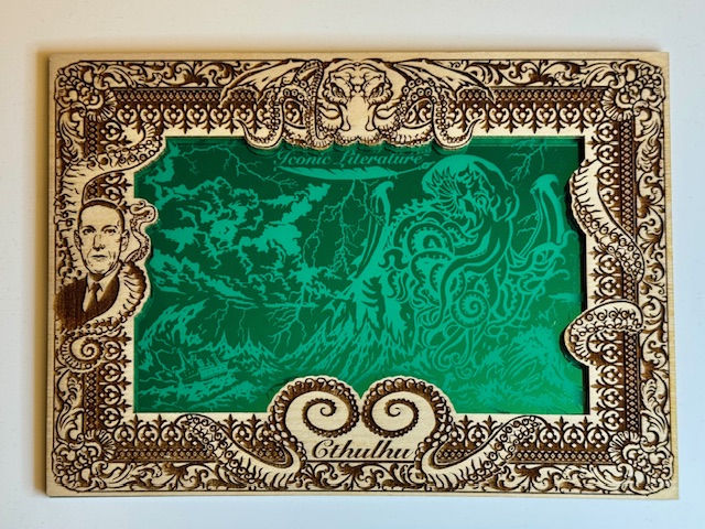
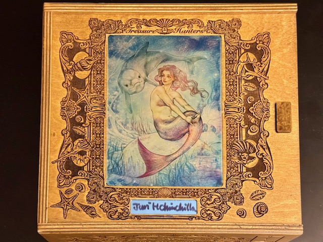
I described above Iconic Creations’ “normal sized” wooden sketch cards. The distinction was made in contrast to another type of wooden sketch card in those sets. The main bonus of Iconic Creations’ premium boxes (more on those to come) was a random pull of one of their “box topper” wooden sketches.
Sherlock Holmes “Box Topper” wooden sketch card by Achilleas Kokkinakis.
These beauties measure 6.5″ x 8.5″ and are absolutely stunning. A set specific etched border surrounds a large central area for the artist to work on.
Ghosts of Christmas “Box Topper” Wooden Sketch Card AP by Juri Chinchilla
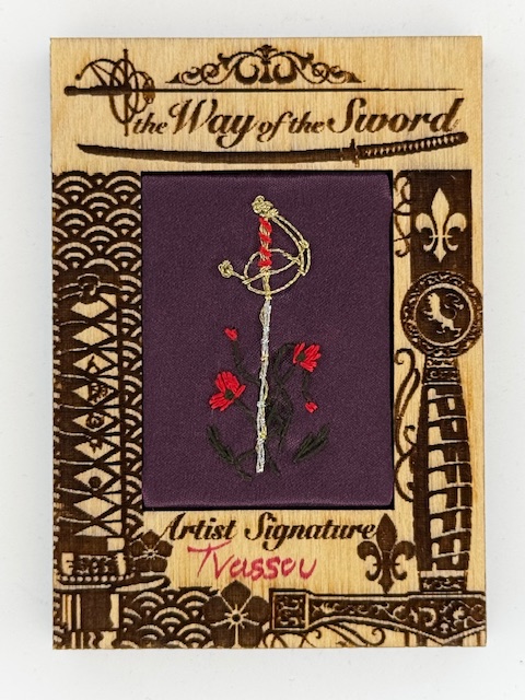
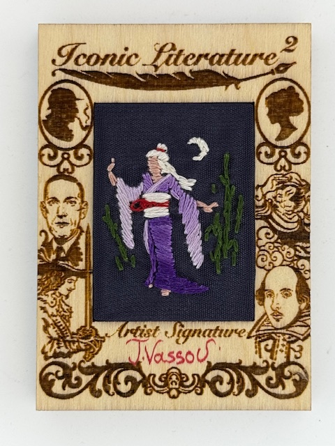
In certain sets a small number of the most unique subset I’ve come across were inserted. These wooden cards had a cloth section in the center featuring hand stitched art by either Niki Konstantinou or Triantafillia Vassou. The creativity and craftsmanship that went into these is phenomenal.
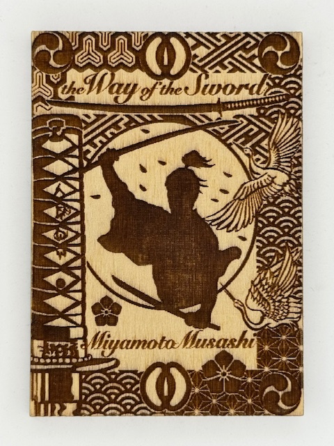
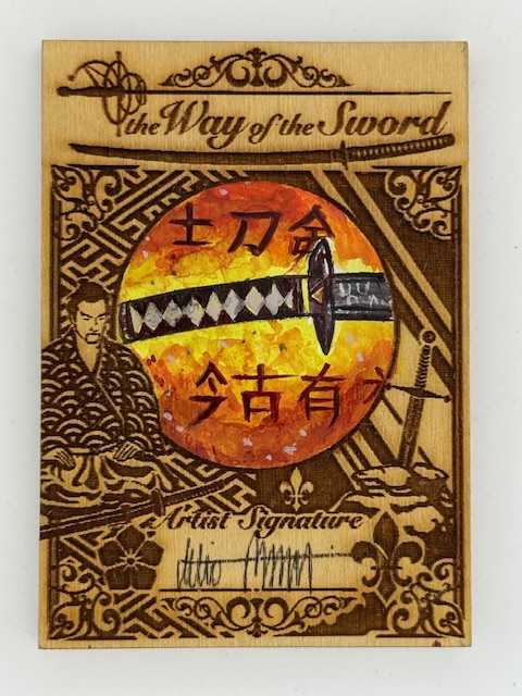
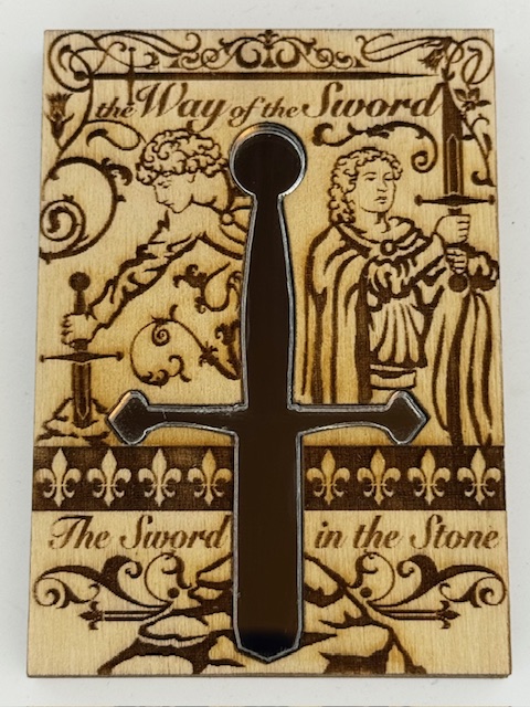
Another really creative way Iconic Creations used wooden cards was the occasional insertion of mirrored surfaces. The Way of The Sword set featured a a simple and elegant mirror chase card with a cutout in the center of the wooden card for a mirror in the shape of a sword.
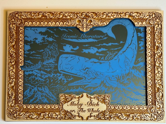
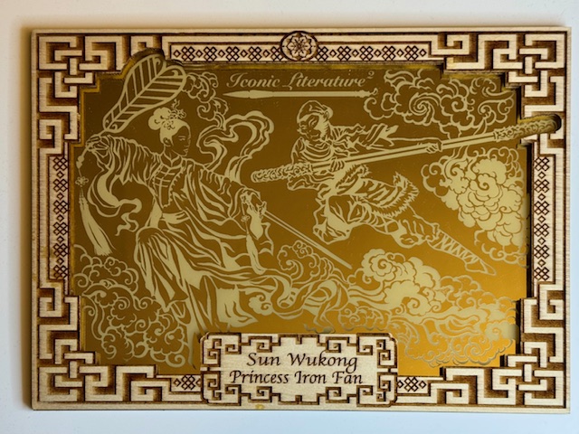
The secondary bonus for the premium boxes was often an oversized metal card, but for Iconic Literature 2 it was one of three large colored mirror images on a wooden card with the usual impressive etched borders.
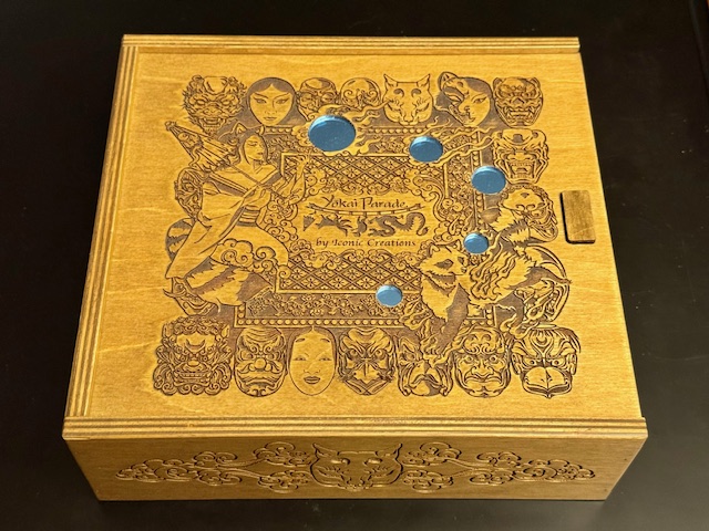
While not cards themselves, the premium boxes I’ve mentioned are another incredible card set related use of wood. The boxes the “box topper” sketches came with were large wooden storage boxes with intricate designs on the top and sides.
The designs varied, with some sets having entirely etched tops and others featuring metallic overlays with a few different images from set artists. These boxes were fantastic works of art in their own right.
Mermaid “Box Topper” wooden sketch card by Juri Chinchilla.
That’s it for this look at some of the ways wood has been used in trading card sets. Best of luck with wherever your personal collecting tendencies take you.
Thanks to everyone who’s given this a read. Derailments of Thought currently updates sporadically, but more regular posts will hopefully be on the way soon.
If you enjoy the blog any support is appreciated, including shares on social media and simply continuing to read. If you happened to be inclined and able to help out monetarily please see my Ko-fi page. Every little bit helps.
Unlike more unusual fare I’ve previously featured like metal cards and comic cuts, minis are one of the most straightforward subsets of trading cards. They’re simply cards that are smaller than the standard 2.5 x 3.5 inch (6.4 x 8.9 cm) size.
For clarity, this spotlight is about small cards with a traditional rectangular shape (although the ratio of the sides can vary). Die Cut cards that can end up smaller due to odd shapes and/or pieces of a standard card being cut away are a different matter that will likely get their own entry in the future.
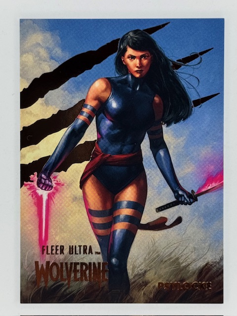
Sometimes a mini subset will literally be a smaller version of another card in the set (often a base card). Just an unusual variant for collectors to chase. The numbered minis from Fleer Ultra Wolverine, for example, were 2″ x 2.75″ versions of certain base cards.
Other mini subsets are unique, with art not otherwise used in the set.
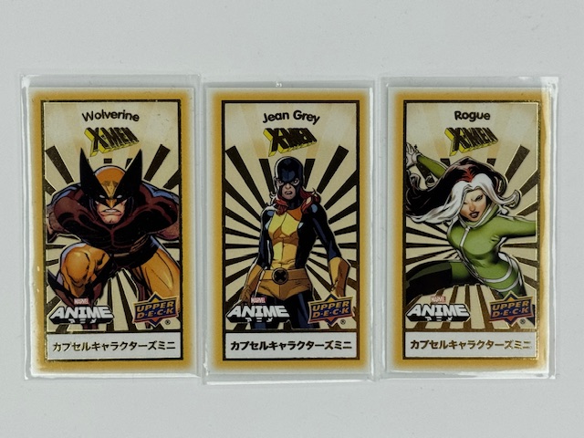
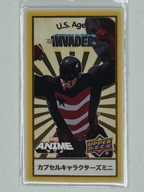
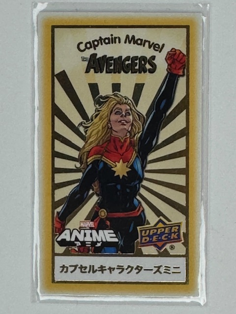
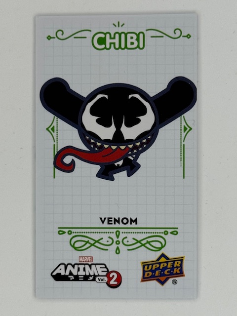
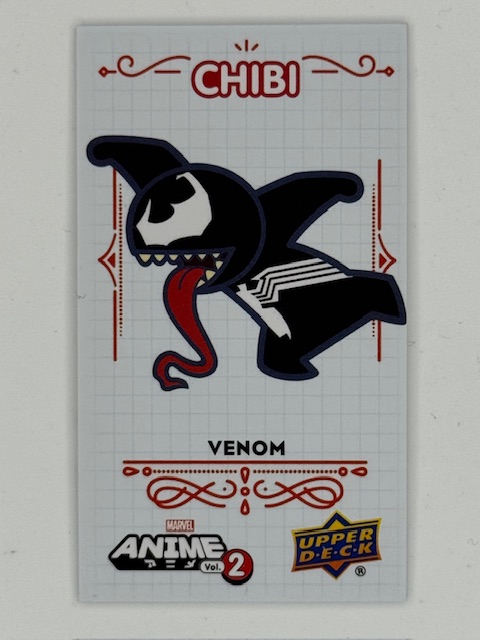
In Upper Deck’s Marvel Anime sets there were both “minis” and “chibis” subsets of tiny 1.5″ x 2.625″ cards. Minis focused on certain teams of heroes or storyline events and were grouped by theme.
Chibi translates literally as small, but is used colloquially as slang affectionately describing small and/or cute things. As an art style it’s also called super deformed and is characterized by large heads, small bodies, and exaggerated features within simplified designs. The chibis subsets featured chibi versions of popular Marvel characters.
These types of minis/chibis (and similar variations in other sets) were usually released in a card within a card format. A standard sized card with a perforated section on the back is what’s actually inserted into packs. The perforated section tears away to reveal the randomized mini within. These minis are often categorized and randomized within a themed capsule card, such as by team, comic storyline, etc.
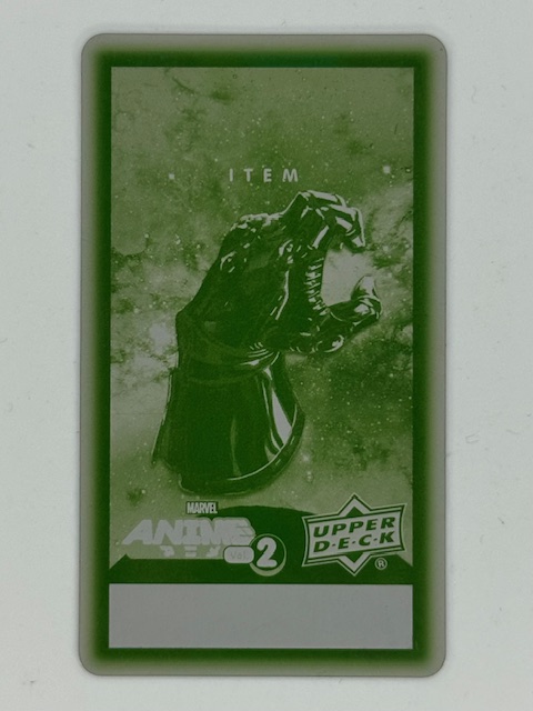
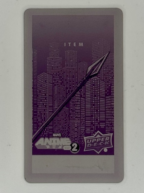
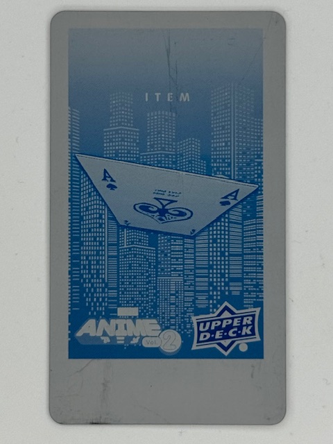
As I’ve written about before, printing plates are thin metal sheets used in the printing process of the card they correspond to. Printing plates for the minis subsets of Upper Deck’s Marvel Anime 2 were available as ePack achievements (prizes for completing certain trading/collecting goals within Upper Deck’s online platform). They’re really unique and interesting pieces of the set.
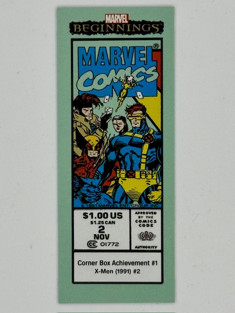
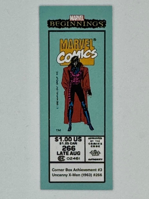
One of the more inspired uses of mini cards in comic related trading card sets recreate comic corner boxes. In the past these boxes appeared in the upper left corner of comic books with Marvel’s logo, character art, and issue information.
They severed as a quick identifier of the Marvel brand and key characters featured in the comic to catch the eye of potential buyers on crowded newsstand shelves and racks.
These corner box cards measure 1″ x 2.5″ and contained card set information around a replicated corner box from key past issues.
Size comparison to a standard sized trading card.
That about does it for this look at trading cards’ smaller siblings. Best of luck with wherever your personal collecting tendencies take you.
Thanks to everyone who’s given this a read. Derailments of Thought currently updates sporadically, but more regular posts will hopefully be on the way soon.
If you enjoy the blog any support is appreciated, including shares on social media and simply continuing to read. If you happened to be inclined and able to help out monetarily please see my Ko-fi page. Every little bit helps.
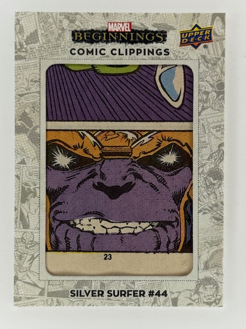
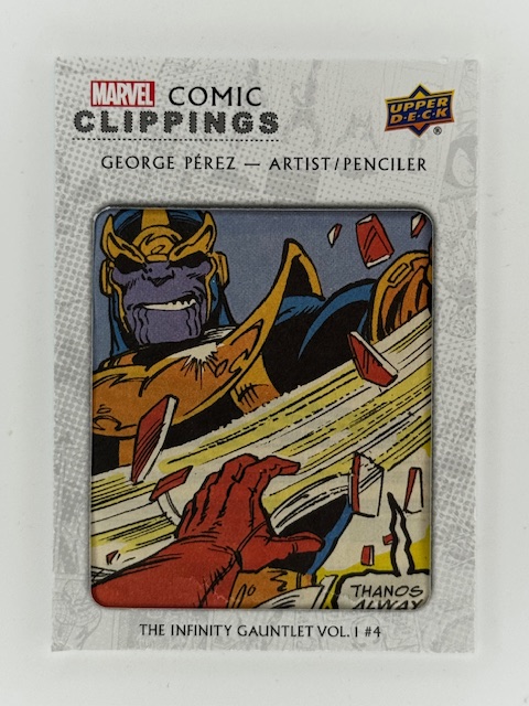
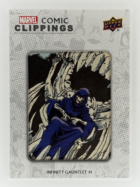
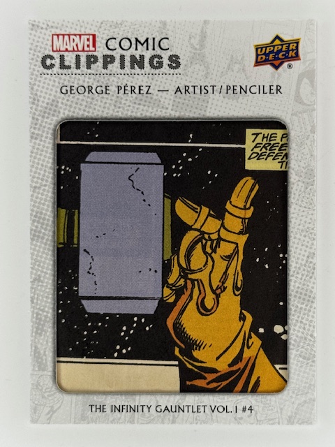
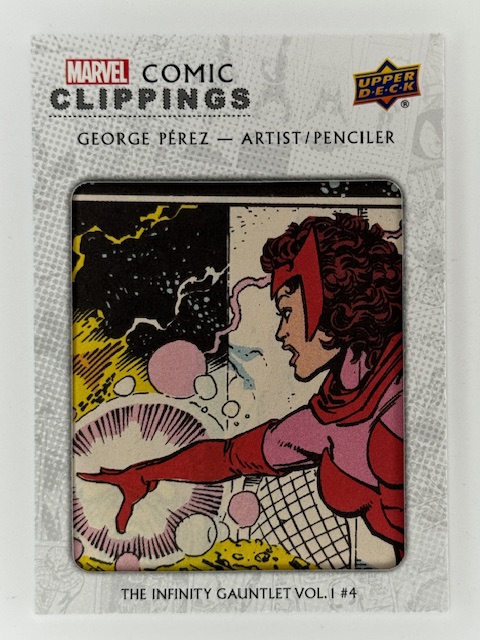
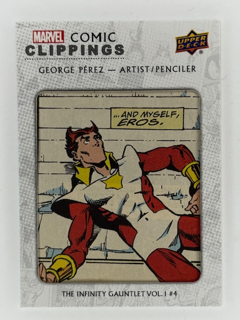
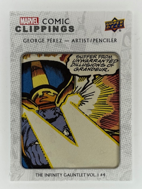
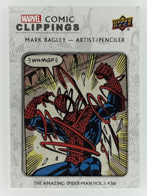
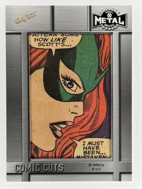
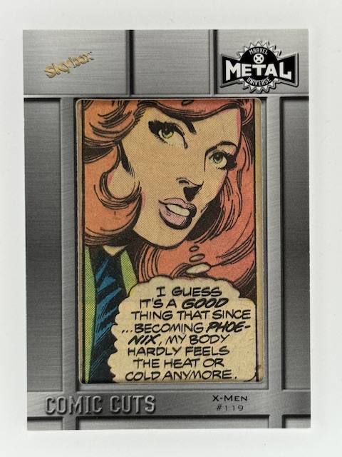
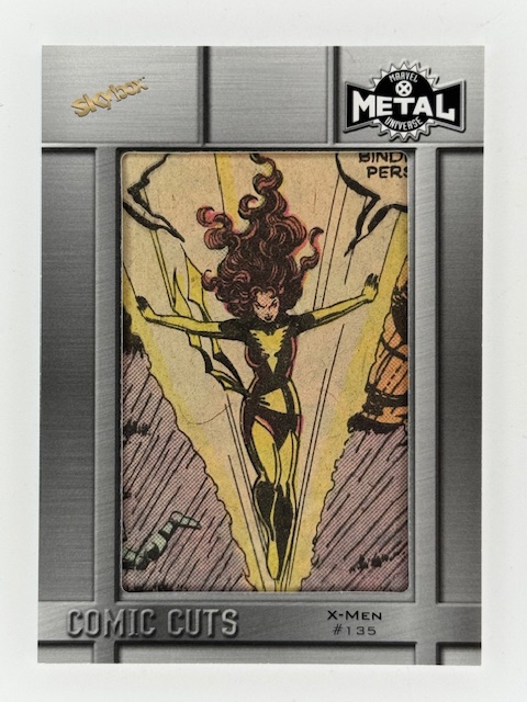
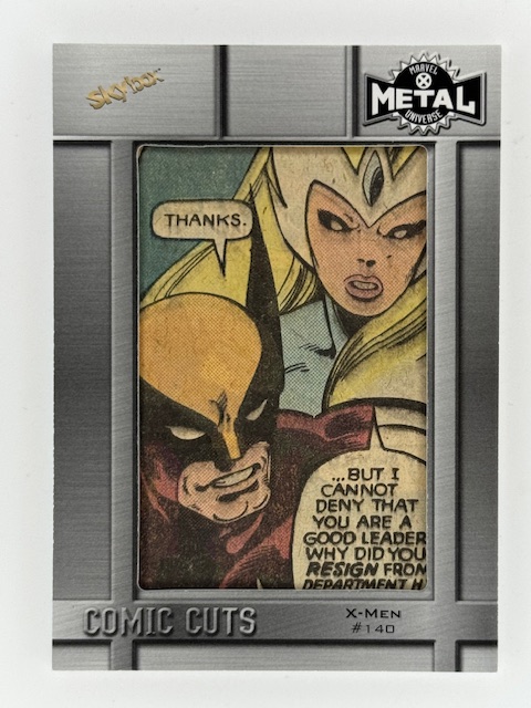
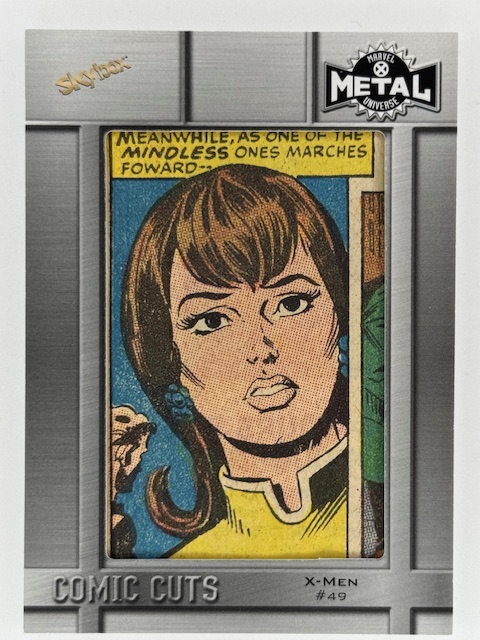
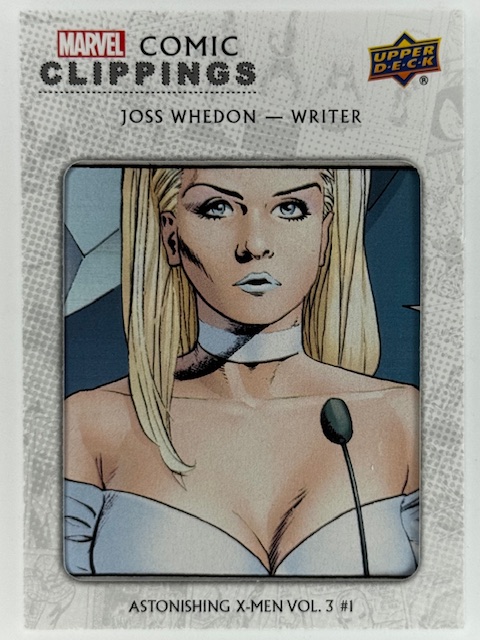
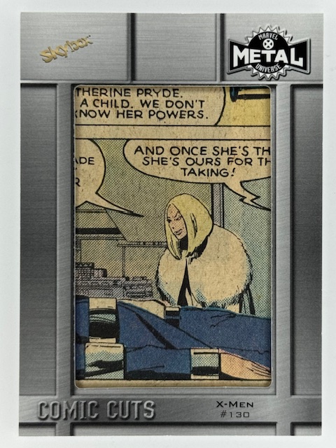
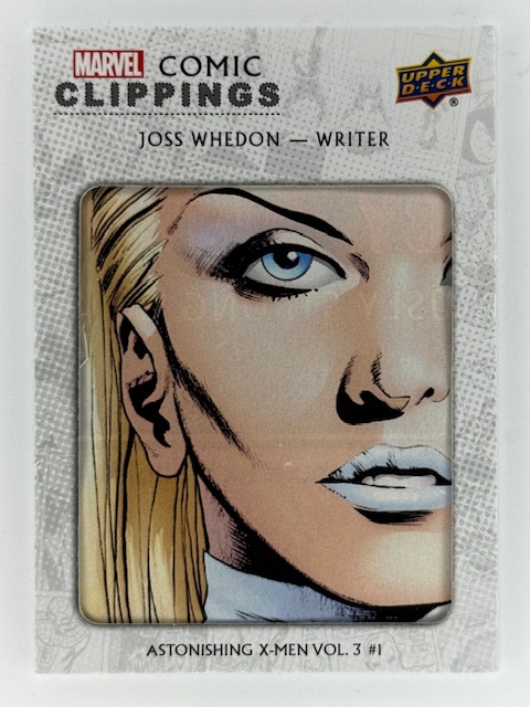
Comic card collecting is normally another format to view and appreciate images of comic book characters. Art can be original for the card set or reproduced from associated comics and can be shown on a variety of materials, but cards are usually a step removed from the inspiring items. However there are types of cards that directly tied to the original material in a physical sense: comic cuts.
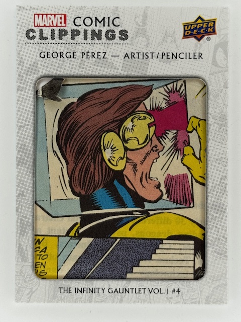
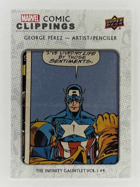
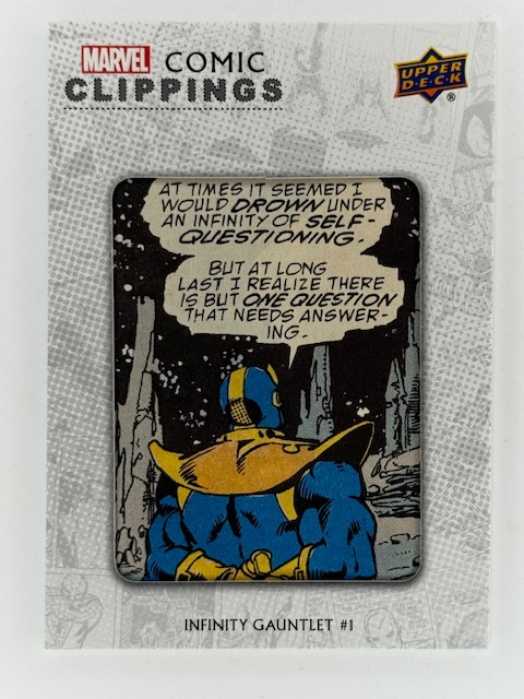
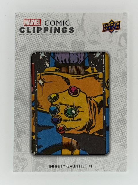
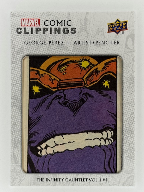
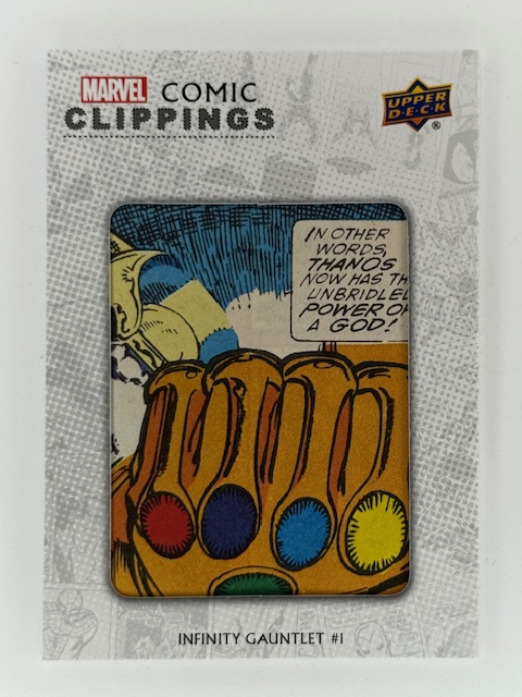
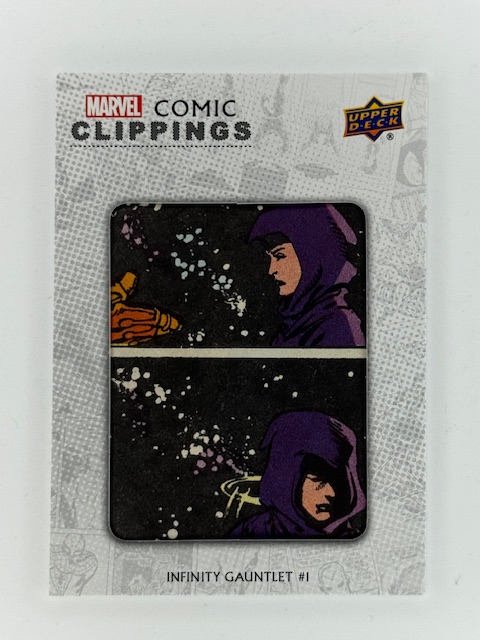
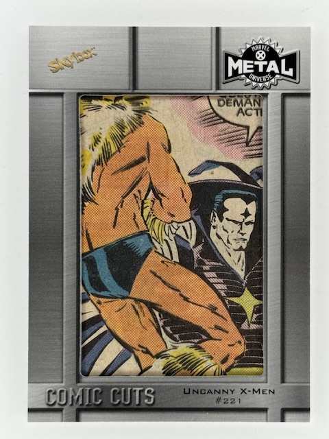
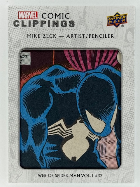
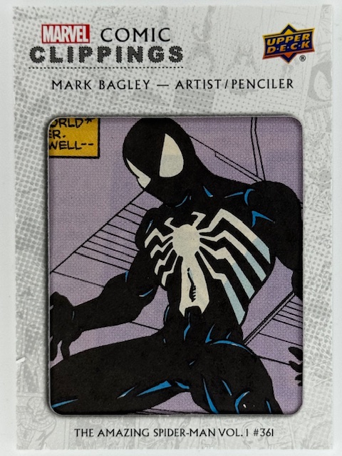
Comic Clippings / Comic Cuts are exactly what they sound like. Some portion of actual printed comics cut out and put into a card. The cardstock has an opening on the front side to frame/show the clipping.
Clippings used to this are most often a single panel that can be spotlighted on the small surface of the standard 2.5 x 3.5 inch size for trading cards.
Comic cuts can be controversial, as some collectors don’t see the point of them and/or object to comics being cut apart to make them. I’m not going to wade into a debate of the merits. I personally like them as unique and unusual chase insert subsets.
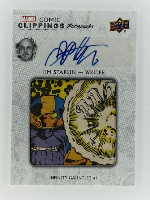
Like many other collectors of this type of insert, I concentrate on collecting cuts of favorite characters and storylines. Infinity Gauntlet, which I read as it came out when it was originally published in 1991, remains one of my favorite comic stories of all time. It contains the broad strokes storyline that was the basis for Thanos’ role in the MCU. A good chunk of my comic cut card collection feature panels from that six issue series, with special focus on Thanos himself, Lady Death, and Nebula’s brief time with the gauntlet.
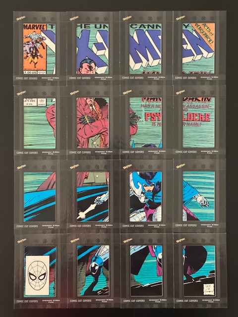
Other cuts I’ve sought out relate to specific favorites, including Emma Frost, Psylocke, and a host of other X-Men characters.
I adore cuts of characters that visually stand out. In particular the Spider-Man related cuts in my collection tend to focus on black suit Spidey and Venom. The design is striking and looks great spotlighted in this format. A couple of these cuts come from another classic, favorite storyline of mine, Kraven’s Last Hunt.
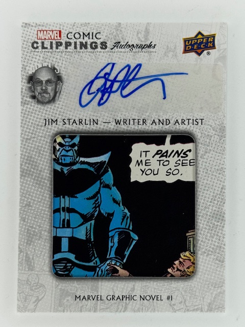
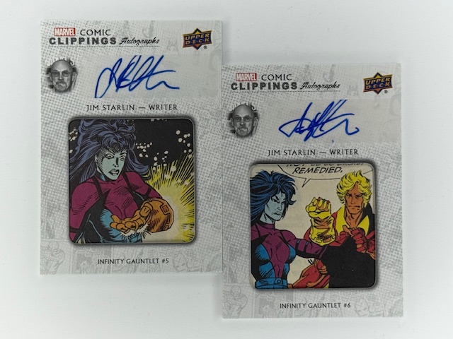
One of the cooler variations of comic cuts feature autographs of creators of the comic issue the cut is from. These can be from the artist of the shown panel, but also the writer or editor of the issue.
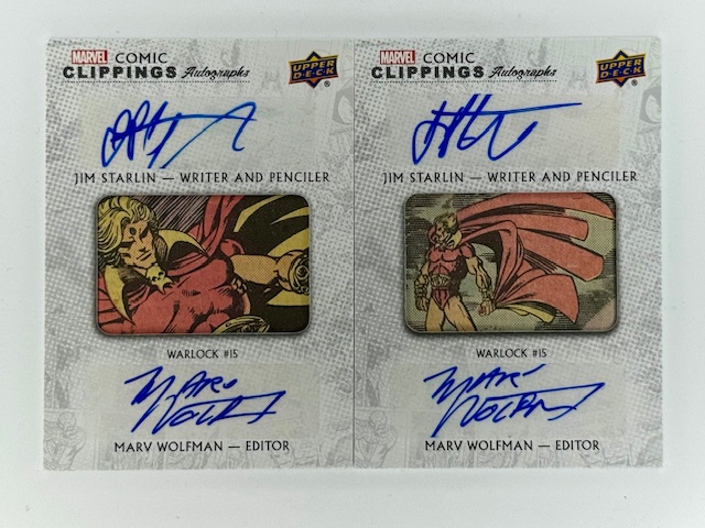
Occasional, rare dual signature cards are signed by writer/artist or writer/editor pairs. I have several with signatures by Jim Starlin, many on Infinity Gauntlet panels and a couple duals from Warlock with editor Marvel Wolfman, as well as some by legendary X-Men writer Chris Claremont.
These cuts feature smaller clippings, as the border surrounding the cut needs to leave room for the autograph. Autos are typically done via sticker rather than directly on card for these likely for both space and production reasons.
Perhaps even more so than regular cards a comic cut’s desirability varies wildly from person to person due to a variety of factors. Personal taste is of course foremost, with individual meaning to stories and characters as discussed above often having even more significance than normal due to these containing actual pieces of the comics.
But there are numerous other considerations as well that don’t apply to other inserts. Cuts from issues that are rare or particularly significant can become more sought after. The condition of clipping is important, as older comics paper quality can have declined and the printed image san fade. Printing mistakes, imprints, or other imperfections can also affect perceived value.
One of the most interesting aspects that’s largely unique to cuts is how well the panel stands on its own. Uncluttered images and poses of popular characters tend to work best as opposed to half cut off panels overrun with text bubbles.
That said some collectors don’t mind mid-story text heavy cuts, and in certain cases a bit of context via speech bubbles or captions can more strongly tie back to the comic the cut was taken from.
Card design varies from set to set, which affects the shape and size of the opening and amount of border that will be surrounding it. This will impact how the cut looks and feels, as panels are very rarely going to measure the exact same as the display opening. As mentioned above pieces of other panels encroaching on the featured image can be less than ideal.
On the other hand cuts forced into displays smaller than the panel can sometimes provide a more dramatic focus on the subject. And so on. These are highly individualized collectibles that have a million little details that can determine whether any particular card speaks to a collector.
Beyond just the graphic design of the card set, there are some variations on the idea of comic cuts that make for unique implementations.
One interesting insert type is Upper Deck’s “Coinage,” in which actual coins are imbedded into the cards. For their comic related sets that had this subset they featured classic comic cuts as well, with the imbedded coin(s) equal to the cover price of the comic the clip is from when it was originally published.
Another interesting variation on the comic cut concept are cover cuts. Cover cuts feature an entire cover from a comic divided into card sized pieces, forming a multi-card “puzzle” that together show the original cover.
Cover cuts are usually only available via special redemption methods that allow multiple cards to be awarded together, such as ePack achievements, so that the collector is getting the whole cover and not just one random 16th of it. These were rewards for difficult to complete collecting tasks.
Milage on these varies, and they are even more susceptible to some of the things I’ve been discussing than normal cuts. Card borders are even more attention grabbing when they are crisscrossing a larger combined image, and can block key parts of the cover. Sometimes obscuring character’s faces, or otherwise hiding key portions of the image.
That said I personally think they look pretty great in some cases, and having a couple of them of key issues of favorite characters is one of the highlights of my collection.
I hope everyone’s enjoyed this look at a literal intersection of cards and the comics they spotlight. Best of luck with wherever your personal collecting tendencies take you.
Thanks to everyone who’s given this a read. Derailments of Thought currently updates sporadically, but more regular posts will hopefully be on the way soon.
If you enjoy the blog any support is appreciated, including shares on social media and simply continuing to read. If you happened to be inclined and able to help out monetarily please see my Ko-fi page. Every little bit helps.
“There are no such things as happy endings. Never. They’re totally manufactured by fiction writers who choose to end the story on a high point.”
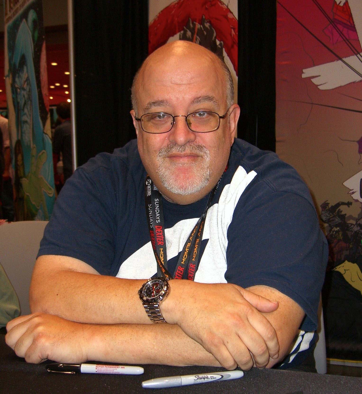
Peter David was self described a Writer of Stuff, and it’s really the perfect epithet. He was a mainstay in comics for decades, also a prolific writer of novels and short stories, and shared opinions of all sorts over the years in essays, blog posts, and his But I Digress column.
Peter was one of my favorite writers and I’ve read a ridiculous amount of his stuff, starting pretty early on in his career.
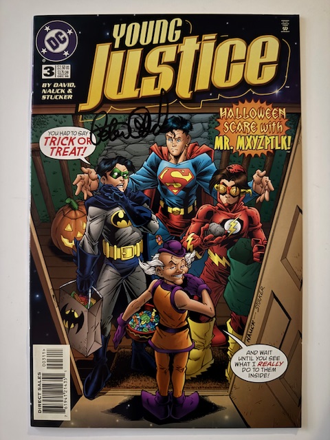
I was an avid comic reader when I was young, and I am one today. In between my interest and ability continue with them waned, except for Peter’s work. There was a period where his comic were pretty much all I was reading, remaining thoroughly engrossed in titles like Aquaman, Supergirl, X-Factor, and Young Justice.
While he did great work on a number of popular characters, one of the things Peter is known for was taking second string characters and making something special with the freedom such things involve.
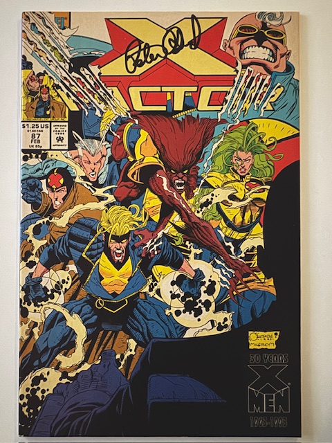
One great example of this was his work on X-Factor, spanning three different conceptual iterations featuring different lineups of misfits over the course of years. During his first run on X-Factor, he’d write one one of the most interesting and beloved single issue stories of all time. X-Factor #87 portrayed his government sponsored X-Factor team going to mandated therapy sessions in the aftermath of an X-men crossover event. It was an unusual aspect of Earth shaking events in comics that was captivating to see explored. Peter dug deep into the characters and created an enduring, compelling tale will little more than 36 pages of characters talking to each other.
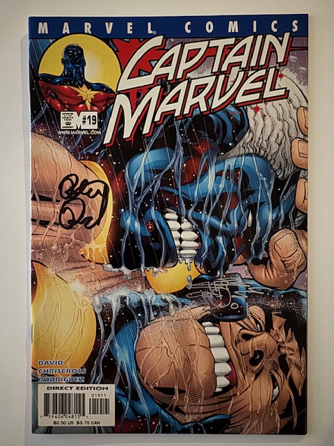
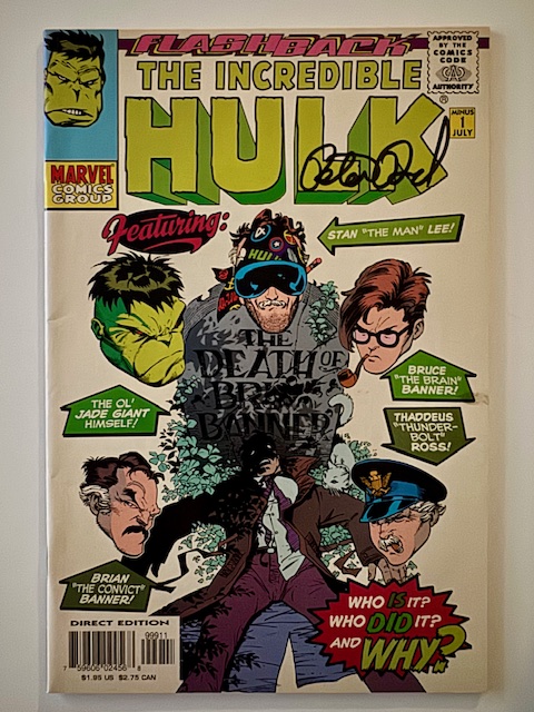
The Incredible Hulk itself, the comic Peter’s best known for, was a low selling title before he originally took it over leading to an award winning run. During that run he notably explored the concept of Hulk as an aspect of Banner’s fractured psyche, leading to his creation of the Banner Hulk combined version of Hulk that would eventually inspire MCU’s “Smart Hulk.”
One of my favorite stories of all time is David’s two part Future Imperfect from 1994, showing the Hulk faced with his own dark potential.
Echos of his work also reverberate through the stories that followed and adaptations, such as Miguel O’Hara’s appearance in Across the Spider-Verse. Peter co-created and was the primary writer of Spider-Man 2099.
Peter pushed boundaries in his work, willing to test limits of subject matter, creative direction, and format.
One of his early comic stories that groundbreaking at the time and helped establish Peter as a writer, The Death of Jean DeWolff, created waves off the bat by proclaiming its intention to kill a popular supporting character in the title of the story.
His work crossed and combined genres and styles. Sometimes his over the top humor with mountains of wordplay and puns inundated the reader. Sometimes drama and heavy topics anchored his stories. And often those elements are more combined in ways no one else would dare.
His approach and convictions sometimes led to controversy and conflict, and occasionally didn’t land in the stories themselves, but Peter always kept trying and overall things came together into an incredible catalog of writing that will endure.
Another of Peter’s strengths was fitting stories within past continuity without heavy reconning, attempts to add context and depth between existing stories. Several of his well loved Star Trek novels took this approach.
A lot of his later work also focused on this concept, including writing stories that fleshed out Spider-Man’s time unknowingly wearing the alien symbiotic costume that would later become Venom. Given Peter’s start as a comic writer was in the aftermath of the original symbiote comics (when Peter was wearing a cloth replica of the black suit), it was nice bookend to an incredible career.
Peter had been facing severe health issues for quite some time, and passed away on May 24, 2025.
Thank you for a lifetime of stories Peter. Rest in Peace.
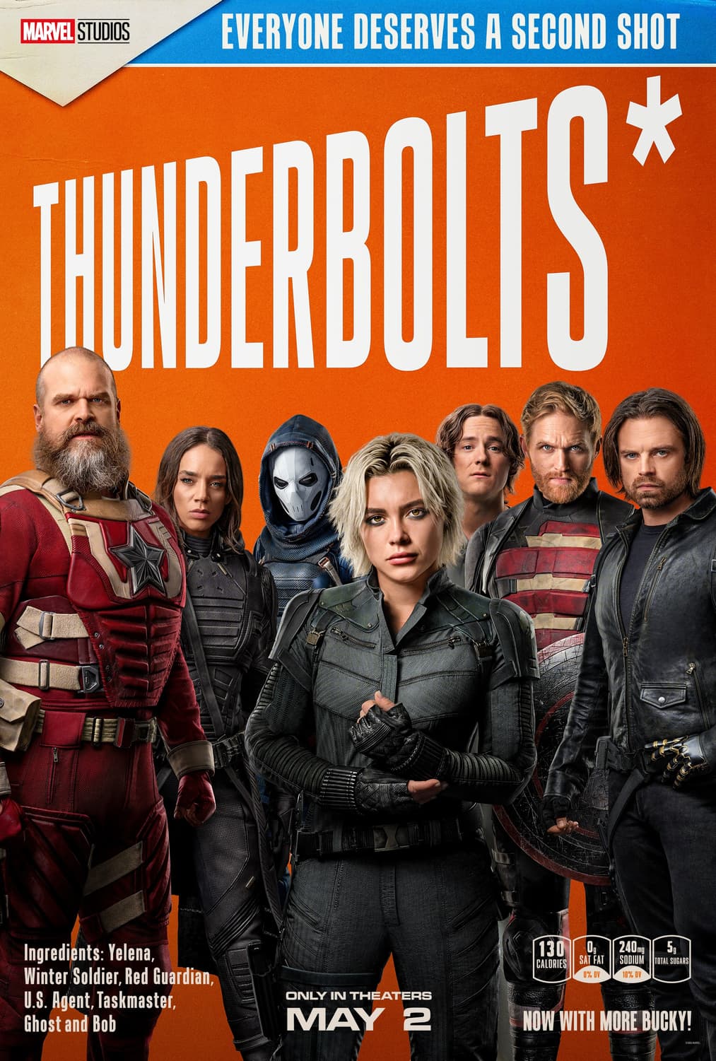
SPOILER WARNING – In depth discussion of certain plot details from the Thunderbolts movie ahead. Please see my spoiler free review of it HERE instead for those who haven’t seen the movie yet.
Last chance to bail before the spoiler wall is fully breached.
With a few weeks passed since its opening and a second viewing under my belt, I wanted to revisit the Thunderbolts movie to share a few specific thoughts on its approach and execution.
Going into Thunderbolts there were a number of things I anticipated. The early movie casualty was no big surprise, both due to expected meta narrative reasons of needing to establish the stakes when such dangerous people were thrown into proximity and from a certain character’s notable absence in key trailer scenes.
But it was well executed and while the deceased character might have had some untapped potential Ghost was shown to be on the threat level of her other more well established teammates-to-be by taking out the Taskmaster. Something being predictable doesn’t necessarily take away from the impact (also I’m sure not everyone saw it coming).
“You’re not alone.”
What I wasn’t expecting however were some of the most prominent undertones and themes of the film. I was ready for an action movie anchored by intersecting quests for redemption. What floored me was how it was equally about loss, depression, and dealing with the Void within (lame pun intended). The writers and actors dug into the emotional core of where each character was at this point in time in a compellingly realistic manner, and the movie shines because of it.
The entire cast, from main stars to all the supporting roles, was fantastic. Florence Plugh and Lewis Pullman in particular were incredible as Yelena and Bob. Yelena is in an extremely vulnerable mental state, which Plugh brilliantly conveys through body language, a disheveled appearance, and superb acting. Thunderbolts is both an ensemble piece and entirely her story simultaneously, and the dichotomy wouldn’t work with a lesser performance.
Bob isn’t fully aware nor in control of himself, and is constantly switching between charmingly docile and effortlessly threatening. Pullman nailed the intricacies of the role. In the pivotal establishing scene for Sentry when he first fights the team the nonchalance with which he wiped them out was terrifying.
One of the most gut wrenching scenes of the movie involves Yelena and Bob simply looking at each other as a couple of overheard sentences from a mostly obscured memory lay bare the trauma of Bob’s past. All Yelena can say is “I’m sorry,” but that simply gesture of sympathy is more than Bob had before and was desperately needed. It was impressive handling of heavy subject matter with the movie’s ultimate lesson that it’s ok and often necessary to open up to and rely on others beginning to take form.
While more connected to the external world happenings, Julia Louis-Dreyfus’s great performance as Valentina Allegra de Fontaine was also crucial. There were a surprising number of important moments that hinged on her non verbal reactions to events and information. If she’d been less than genuine in any the multitude of times the camera lingered on her close up to convey the import of developments the movie’s atmosphere would’ve been completely destroyed.
Wyatt Russell’s John Walker was both an insufferable jerk and a well meaning professional deep down. David Harbour’s Red Guardian had to be an entertaining but not obnoxious buffoon 90% of the time and still believably heartfelt and wise when it’s time to have real conversations with his daughter. And so on.
The movie had more nuance and depth than other MCU movies, contributing to it easily being one of my all time favorites.
In a great touch the post credit scene ties it all together by jumping ahead and showing a short, simple glimpse at the everyday status quo of the New Avengers. A little bit of banter shows how comfortable they’ve become with each other and sets up several threads for future movies in a lighthearted manner. Great stuff.
“We’re just disposable delinquents.”
Changing gears a bit to finish this up, I’d like to present a little history lesson. I’m about to dig into spoilers within spoilers, so consider warning given. That said the concept to be discussed is the punchline to issue #1 of a 25 plus year old comic so is certainly fair game.
Like the vast majority of MCU movies, Thunderbolts adapts elements from a number of stories and eras to present something that both honors the source material while fitting in to a new continuity. Practically nothing is a slavish, direct adaptation from any single comic.
The origin of the Thunderbolts name in the movie is a throwaway joke, but it didn’t bother me. However it came up, and however brief it was, the name felt appropriate and it’s inclusion meant something to me.
The movie draws from later incarnations of the titular team, with members from those eras. I haven’t read a lot from those versions, but the movie concept always felt more like Dark Avengers or New Avengers to me so the end twist was no real shock. But again it was done well and served as a perfect payoff to the journey our unlikely heroes went through.
Being as I was an avid reader and huge fan of the original comic by Kurt Busiek and Mark Bagley, I thought it might be interesting to highlight the difference for those who are unfamiliar. Because in a certain sense the movie skipped some steps.
The concept of the original Thunderbolts comic wasn’t about thrown together villains and anti-heroes overcoming their pasts to be better. It became that in a way, and certain incarnations over the years embodied that more, but there was a fundamental difference in their original concept.
The Thunderbolts started as a team of villains running a con. At the end of the first issue of their comic it was revealed that the new superhero team that came out of nowhere were full on bad guys pretending to be heroes under fake identities to provide cover for their schemes. They were headed up by Baron Zemo (disguised as Citizen V), whose nefarious plan slowly went up in smoke as a majority of his assembled villains decided that there might be something to the thought of being heroes for real after all.
This kind of duplicitous beginning wouldn’t have worked with the chosen movie lineup, and the direction they went made much more sense given what had come before. A bunch of adrift operatives with questionable pasts but no real malice in their motivations coming together after being betrayed allowed for the above mentioned emotional undertones to be featured in a way that wouldn’t have landed if they started as villains trying to bamboozle the public.
Zemo was rumored to be originally planned for the movie, and Daniel Brühl’s been great in his appearances, but his role would have had to be totally rethought. He’s a callback to a version of the team that this incarnation had no resemblance to, and he wouldn’t have fit particularly well with this concept. Especially with them landing as the New Avengers at the end. Given how well it all went I’m personally fine with them not trying to not trying to shoehorn him in, even if having him involved would have been a nod to the original comics.
That’s it for today’s installment of Avengers with a Z. Remember disposable delinquents, “maybe we can be the ones that are coming.”
Thanks to everyone who’s given this a read. Derailments of Thought currently updates sporadically, but more regular posts should be on the way soon.
If you enjoy the blog any support is appreciated, including shares on social media and simply continuing to read. If you happened to be inclined and able to help out monetarily please see my Ko-fi page. Every little bit helps.
So the tagline I used in the title has nothing to do with the version of the Thunderbolts in the movie. But I read the original Thunderbolts comics by Kurt Busiek and Mark Bagley as they came out so have a soft spot for the original concept and couldn’t resist the callback.
I enjoy the idea of taking secondary, often flawed characters from various stories and putting them together to see how they play off each other in general. And the entire lineup here were interesting in their previous MCU appearances with a lot of potential for fleshing out. Pretty much everyone in the movie was someone I was excited to see more of.
So I went into Thunderbolts with high levels of anticipation. I’m inclined to say it was everything I hoped for, but in actuality it was a good deal more than that.
I expected to love it, and I did. I also got the fun interactions and solid action I wanted. On top of all that though, I got a compelling, character driven story that was engaging from start to finish and made this movie an instant favorite.
No spoilers here but I had figured some things out ahead of time. Both in concept and in plot details. But there were also a couple surprises, as well as some things I expected done in unexpected ways. I really have no complaints about how anything played out.
A couple characters were a touch under utilized, but they still made the most of their roles and in an ensemble movie centered by a few key character journeys a few people were going to have to be supporting cast.
As a big comic reader going back decades I’ve been mostly at least peripherally aware of the characters we’ve seen and the big story beats in play for the previous MCU movies. The way things have been adapted to build naturally from how prior movies went nothing is ever slavish to the source material, but I often have the gist of some important points before I see the movie.
In contrast this was one of the first Marvel movies that prominently featured a character I know next to nothing about. It was interesting having no frame of reference for a change. While I can’t speak on how faithful it was to the source, I liked what the movie did with them.
There are SO many interesting implications of the end credits. Won’t say more, but I’m psyched as to where things go from here.
I ended up seeing this in 3D based on availability as to when I could see the movie. Last 3D movie for me was probably pre-pandemic. It was well done. It didn’t feel like the 3D was constantly calling attention to itself, but at the same time there were moments where the 3D made certain shots breathtaking.
Thunderbolts was fantastic. Well acted, looked great, strong plot, and on and on. If at all interested go see it as soon as you can.
Thanks to everyone who’s given this a read. 2024 was a sporadic return for this blog and I hope to sustain more regular updates going forward in 2025. Derailments of Thought currently updates once to twice a week.
If you enjoy the blog any support is appreciated, including shares on social media and simply continuing to read. If you happened to be inclined and able to help out monetarily please see my Ko-fi page. Every little bit helps.
Cabinet of Curiosities Treasure metal variant by Yuriko Shirou.
When thinking of trading cards, small collectible pieces of cardboard/card stock immediately spring to mind. But in modern collecting there are a variety of cards that break the mold a bit and are made from other materials.
Let’s take a look at the interesting case of trading cards made from metal.
Last month I wrote about printing plates, thin metal relics from the card creation process turned into collectables. In contrast here I’m highlighting actual cards made for various sets that are themselves made of metal.
One other side note before delving too deep: there are card sets and subsets that use “metal” as a descriptor, such as the Skybox Metal Universe series. It’s a theming/branding thing and the vast majority of cards in those sets are still card stock. Those are different from what I’m featuring here, which again are cards made of metal.
There are two main types of metal cards I’d like to showcase, with some subcategories. Then at the end of this post I’ll share a few tangentially related cards.
First up are the straightforward case of printed metal cards. These are exactly what one would think of as trading cards, simply printed on metal instead of card stock. They are at a minimum a bit thicker than both standard cards and the thin metal printing plates previously referenced.
While metal cards are inherently more sturdy than standard cardboard cards, proper storage and protection can have some additional things to be wary of. For example stacking regular cards is usually fine for temporary sorting, etc. But metal cards can easily scratch each other if care isn’t taken and as such while it may seem counter intuitive it’s even more important to get them immediately sleeved and protected than normal.
Like other special inserts metal cards can be variants of base cards or their own unique subsets, and vary greatly in terms of rarity and design.
A great example of straight up base set variants are the metal cards featured in Iconic Creations’ sets. These cards are identical to their base set counterparts outside of the material they’re printed on. There’s more gloss to the finish on these than Iconic Creations’ base cards, and the hues end up a touch more subdued.
Perna Studios also does some great metal chase subset versions of their base, chase, and promo cards.
By Juri H. Chinchilla.
While some metal cards have both the front and back printed like their cardboard counterparts, like those done by Perna Studios, Iconic Creations and some other publishers use stickers for the backs on metal cards.
The metallurgy subsets from Marvel Masterpieces are fantastic versions of the base cards from the same sets. The designs on these vary slightly from the base, as the border is more filled in on these and as such the images are slightly cropped compared to the base and other variants.
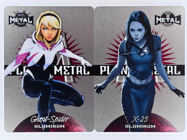
Planet Metal subsets from the previously mentioned SkyBox Metal Universe series (made nowadays by Upper Deck) are an unusual case. In some sets, such as the pictured cards above from Spider-Man Metal and X-Men Metal, they are a metal card chase subset. In others, such as AEW Metal, they are die cut cardboard.
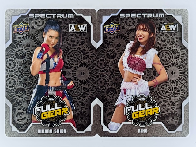
There have been metal AEW cards from Upper Deck in other sets, such as the Full Gear and Chair Shots subsets from AEW Spectrum.
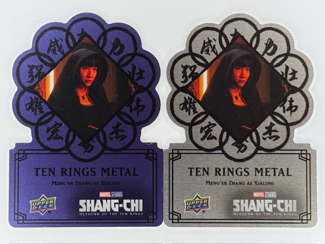
Metal cards can themselves have variants within a set. For example the die cut oval shaped metal cards from Upper Deck’s Shang-Chi set had rarer gold versions, and their logo shaped die cut metal cards had rarer blue variants.
Like “regular” trading cards, special subsets of metal cards are elevated with autographs. Cards may be signed by the athletes or actors featured, by the artist for art based cards, or creators related to the characters or stories referenced for comic related cards.
Often signed metal cards are specific, unique subsets. Although they can also be direct variations on non-autographed metal cards within the same set.
Pictured below is a Black Metal Logo Die Cut card from Upper Deck’s Shang-Chi set featuring Meng’er Zhang as Xialing next to the autographed version featuring the same design and image. Both were available exclusively as achievements via Upper Deck online purchasing and trading platform e-Pack.
Given the nature of the material metal card autos generally feature autographs affixed via sticker. But occasionally there can be direct autographs if done carefully with the right type of markers. The Stainless Stars subsets from Panini’s WWE Impeccable sets are great examples of autos done directly on metal cards.
Meiko Satomura and Io Shirai (now Iyo Sky) blue Stainless Stars cards.
The other major type of metal cards I’d like to spotlight is metal sketch cards.
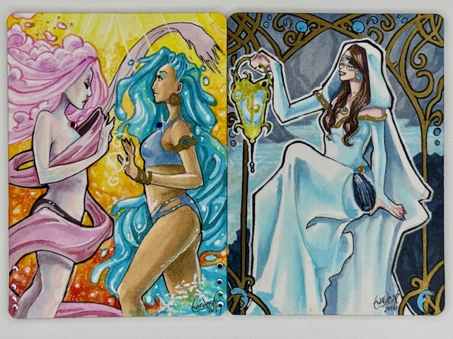
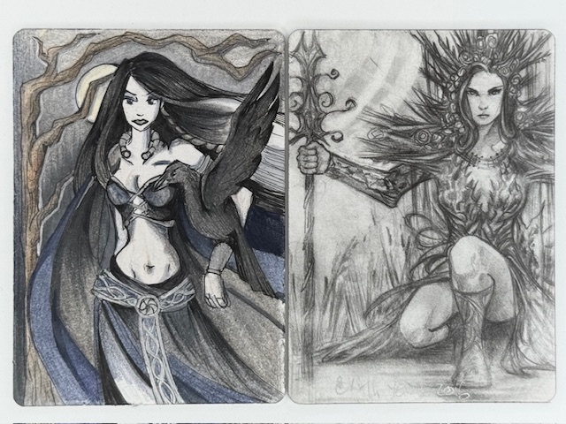
Metal APs from Perna Studios’ Elementals and Hallowe’en Witchcraft sets by Stacey Kardash. Metal sketch cards/APs by Achilleas Kokkinakis from Classic Mythology III.
Like sketch cards done on card stock these are individualized pieces of art created on the cards. One side of the metal card is prepared with a surface meant for drawing directly on it.
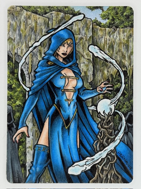
Metal AP from Hallowe’en Witchcraft by Tony Perna.
In past sets Perna Studios had a small number of these metal sketch cards inserted in packs. For those sets artists often had a metal AP (Artist Proof) or two (in addition to their card stock ones) that they could accept commissions for within the content guidelines of the set.
Metal sketch cards/APs by Alexis Sarah Hill and Craig Yeung.
The combination of unique creations on unusual card material made these truly stunning pieces of art.
To wrap up here are a few metal related cards that aren’t exactly either of the types highlighted above, but do involve metal, are all pretty awesome, and are worth a look.
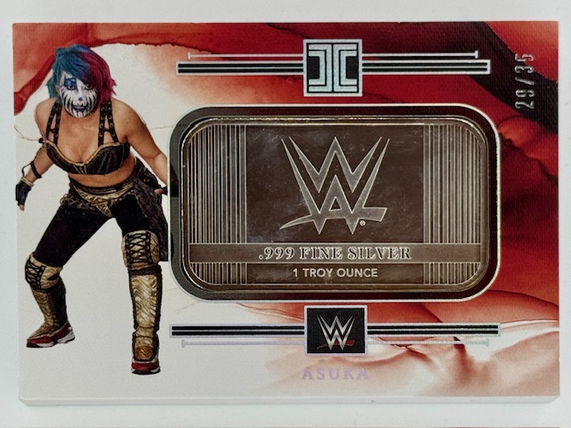
One subset that’s both cool and kind of hilarious is the silver bar cards from Panini Impeccable. There’s just straight up a 1 troy ounce mini silver bar in the card. The card itself is card stock surrounding the bar, but this definitely fits in this feature on metal use in trading cards.
All of the cards in this section are thicker than what most people think of for trading cards. In this case considerably so, as these monsters are 3/8 inch thick.
A really nice looking way to incorporate metal are framed cards. The card itself is still card stock, but it’s encased in a metal border (almost always gold colored in the versions I’ve seen).
Finally here’s an example of a metal card where an image is cast on it rather than printed. The below bronze Psylocke card is a tribute to Joe Jusko’s work on Marvel Masterpieces ’92 and was a reward as part of a Kickstarter for an art book featuring Joe’s images from that set.
That does it for this spotlight on a small sample of the interesting ways metal is used in trading cards. Best of luck with wherever your personal collecting tendencies take you.
Thanks to everyone who’s given this a read. 2024 was a sporadic return for this blog and I hope to sustain more regular updates going forward in 2025. Derailments of Thought currently updates once to twice a week.
If you enjoy the blog any support is appreciated, including shares on social media and simply continuing to read. If you happened to be inclined and able to help out monetarily please see my Ko-fi page. Every little bit helps.
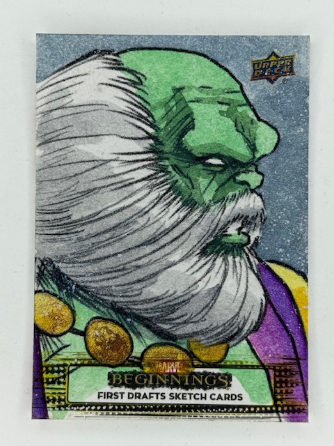
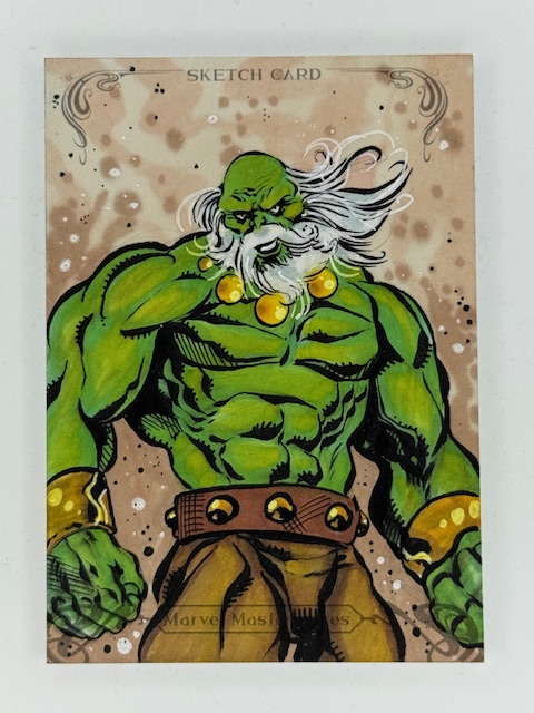
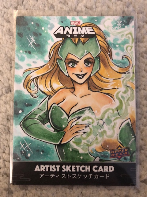
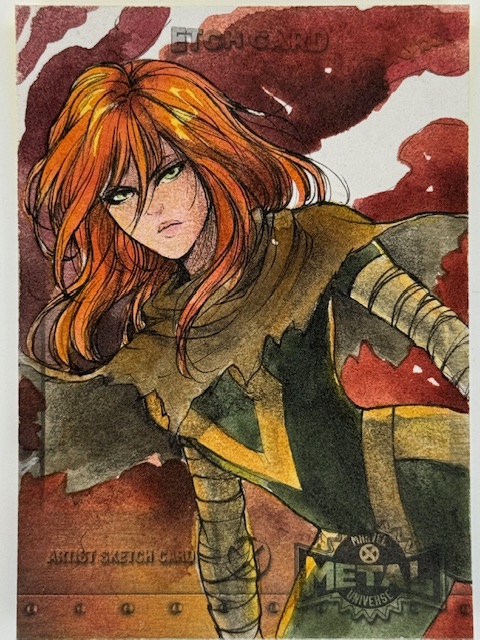
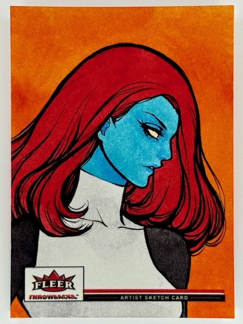
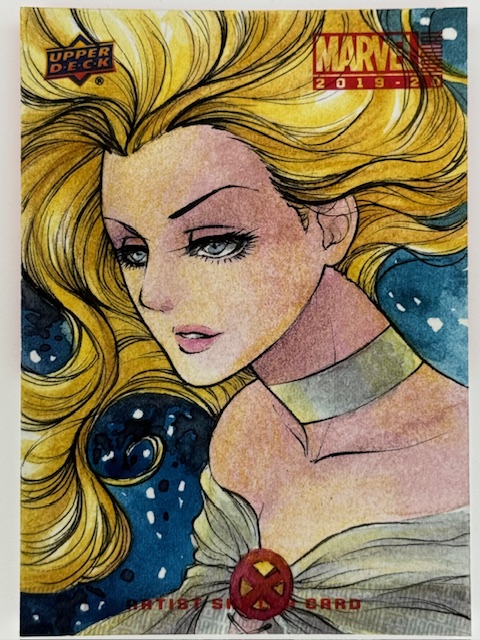
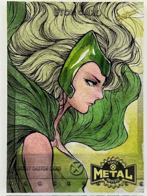
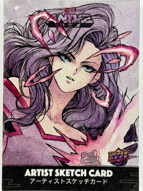
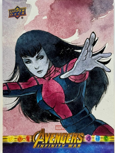
Sketch cards are unique pieces of art impressively created on extremely small workspaces. The Marvel comics related subset of these collectibles features a wide variety of styles from a great number of artists, and one of the very best is the phenomenal Lydi Li.
Lydi’s been a longtime favorite artist of mine. There’s something about her work that jumps out and leaves a lasting impression. Her cards are incredibly popular in general and are often prized possessions for those able to get them.
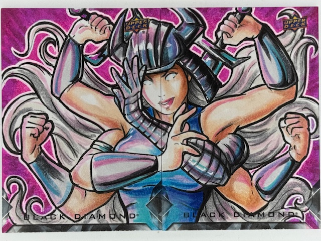
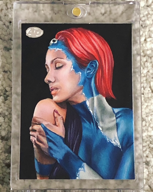
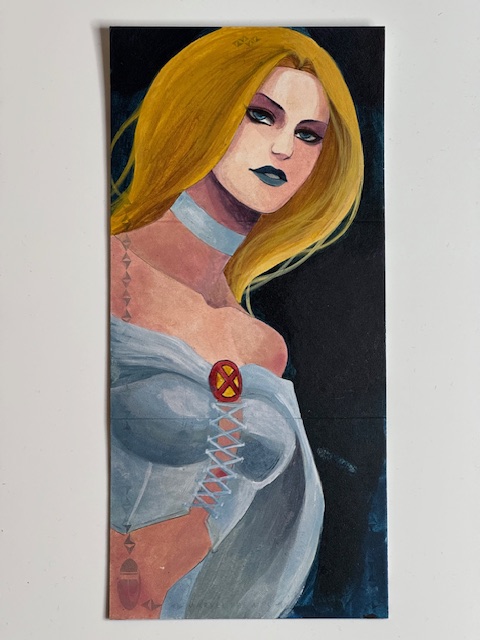
The subtle variety in her art of the same subject over multiple sets is a delight. Differing little touches depending on the theme and mood to be expressed make each masterpiece unique. The bold, saturated coloring on her Mystique from Throwbacks is stunning and perfect for the set.
In contrast her portrayal of the same character for Black Diamond features more muted tones. It’s almost reminiscent of Juri Chinchilla’s work (another absolute favorite of mine). It’s striking in a different way. Both cards are incredible, made even further captivating by their differences.
In general Lydi’s style is a wonderful balance of softness with vibrance. It’s eye catching and immediately recognizable, conveying the essence of the chosen character in a distinct way.
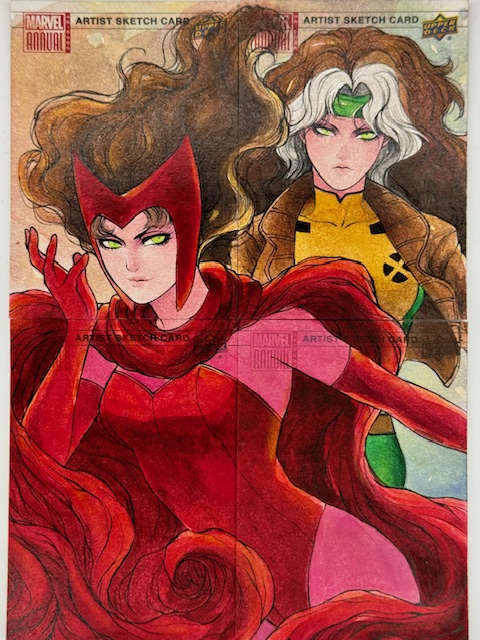
From great depictions of fun secondary characters like Armor to a vivd four card puzzle of powerhouses Scarlet Witch and Rogue every piece I have of hers demands immediate attention. A couple of recently acquired particularly cherished additions to the collection include a gorgeous triple panel of the White Queen Emma Frost and a jaw dropping Thanos framed by his beloved Mistress Death.
There’s a delicate touch to Lydi’s art that makes it evocative, with a sense of atmosphere and emotion simmering just below the surface. Her versatility makes seeing her cards side by side as fascinating as they are beautiful.
I’m extremely lucky to have so many of Lydi’s cards, and greatly appreciate the beauty and depth they add to my collection.
More information about Lydi’s wonderful art can be found on her instagram.